- Typeface
-
"Font family" redirects here. For the CSS property, see Font family (HTML).For the Marvel Comics antihero, see Typeface (comics).For the documentary film, see Typeface (film).
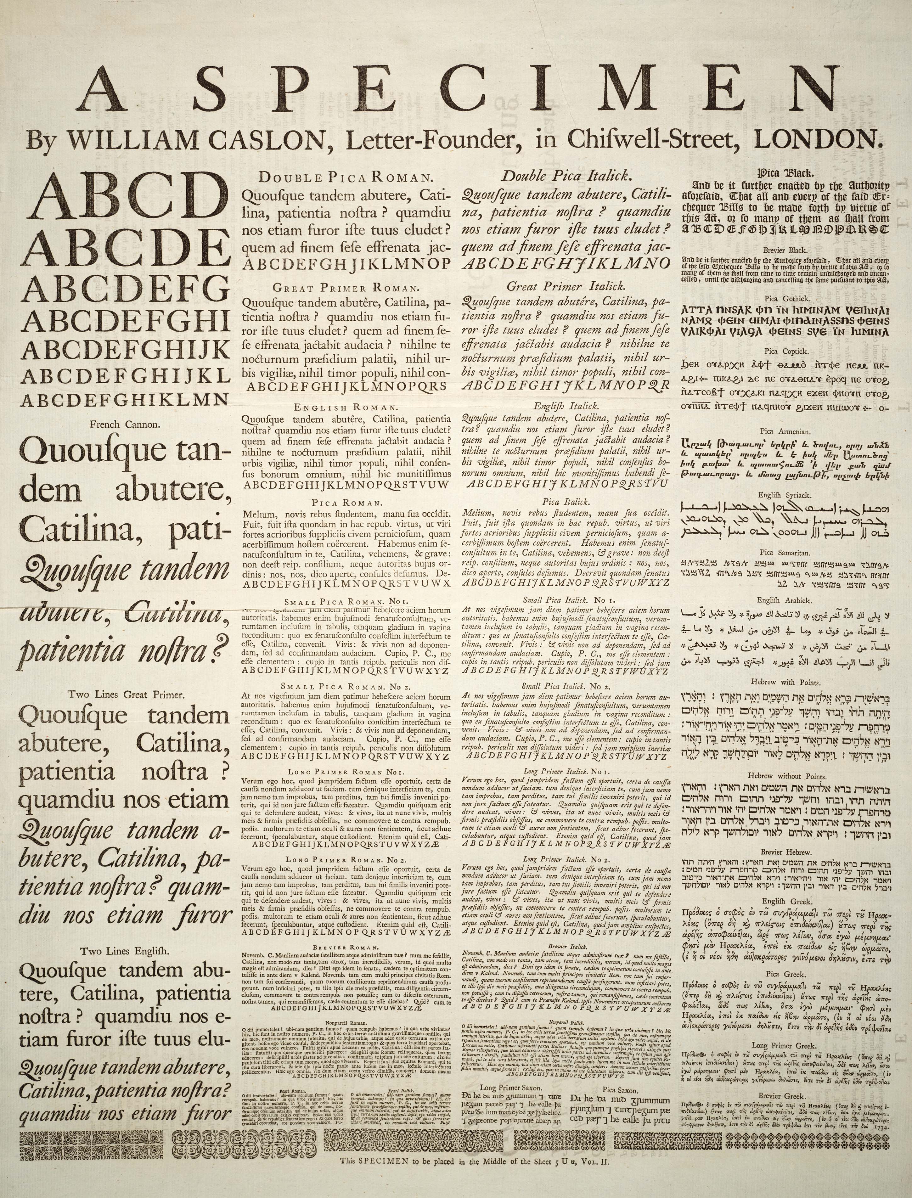
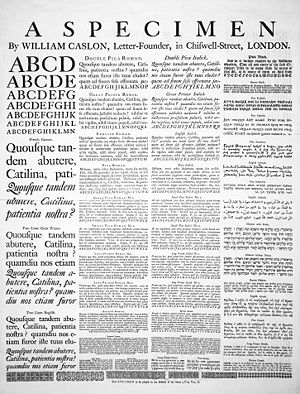 A Specimen, a broadsheet with examples of typefaces and fonts available. Printed by William Caslon, letter founder; from the 1728 Cyclopaedia.
In typography, a typeface is the artistic representation or interpretation of characters; it is the way the type looks. Each type is designed and there are thousands of different typefaces in existence, with new ones being developed constantly.
The art and craft of designing typefaces is called type design. Designers of typefaces are called type designers, and often typographers. In digital typography, type designers are also known as font developers or font designers. Refer to the list of typographers of notable typographers around the world.
Typeface is the design of glyphs which is the looks of characters. The same glyph may be used for characters from different scripts, e.g. Roman uppercase A looks the same as Cyrillic uppercase А and Greek uppercase alpha, and there are typefaces tailored for special applications, such as map-making or astrology and mathematics.
The term typeface is frequently confused with term font or used as a synonym. Before the advent of digital typography and desktop publishing the two terms had a more clearly understood meaning. See font for a complete definition of that term.
Contents
Terminology
In professional typography, the term typeface is not interchangeable with the word font, which was historically defined as a given alphabet and its associated characters in a single size. For example, 8-point Caslon Italic was one font, and 10-point Caslon Italic was another. Historically, fonts came in specific sizes determining the size of characters, and in quantities of sorts or number of each letter provided. The design of characters in a font took into account all these factors.
As the range of typeface designs increased and requirements of publishers broadened over the centuries, fonts of specific weight (blackness or lightness) and stylistic variants (most commonly regular or roman as distinct to italic, as well as condensed) have led to font families, collections of closely related typeface designs that can include hundreds of styles. A font family is typically a group of related fonts which vary only in weight, orientation, width, etc., but not design. For example, Times is a font family, whereas Times Roman, Times Italic and Times Bold are individual fonts making up the Times family. Font families typically include several fonts, though some, such as Helvetica, may consist of dozens of fonts.
The distinction between font and typeface is that a font designates a specific member of a type family such as roman, boldface, or italic type, while typeface designates a consistent visual appearance or style which can be a "family" or related set of fonts. For example, a given typeface such as Arial may include roman, bold, and italic fonts.[1] In the metal type era, a font also meant a specific point size, but with digital scalable outline fonts this distinction is no longer valid, as a single font may be scaled to any size.
The first "extended" font families, which included a wide range of widths and weights in the same general style emerged in the early 1900s, starting with ATF's Cheltenham (1902–1913), with an initial design by Bertram Grosvenor Goodhue, and many additional faces designed by Morris Fuller Benton.[2] Later examples include Futura, Lucida, ITC Officina. Some became superfamilies as a result of revival, such as Linotype Syntax, Linotype Univers; while others have alternate styling designed as compatible replacements of each other, such as Compatil, Generis.
Typeface superfamilies began to emerge when foundries began to include typefaces with significant structural differences, but some design relationship, under the same general family name. Arguably the first superfamily was created when Morris Fuller Benton created Clearface Gothic for ATF in 1910, a sans serif companion to the existing (serifed) Clearface. The superfamily label does not include quite different designs given the same family name for what would seem to be purely marketing, rather than design, considerations: Caslon Antique, Futura Black and Futura Display are structurally unrelated to the Caslon and Futura families, respectively, and are generally not considered part of those families by typographers, despite their names.
Additional or supplemental glyphs intended to match a main typeface have been in use for centuries. In some formats they have been marketed as separate fonts. In the early 1990s, the Adobe Systems type group introduced the idea of expert set fonts, which had a standardized set of additional glyphs, including small caps, old style figures, and additional superior letters, fractions and ligatures not found in the main fonts for the typeface. Supplemental fonts have also included alternate letters such as swashes, dingbats, and alternate character sets, complementing the regular fonts under the same family.[3] However, with introduction of font formats such as OpenType, those supplemental glyphs were merged into the main fonts, relying on specific software capabilities to access the alternate glyphs.
Since Apple's and Microsoft's operating systems supported different character sets in the platform related fonts, some foundries used expert fonts in a different way. These fonts included the characters which were missing on either Macintosh or Windows computers, e.g. fractions, ligatures or some accented glyphs. The goal was to deliver the whole character set to the customer regardless of which operating system was used.
The size of typefaces and fonts is traditionally measured in points;[4] point has been defined differently at different times, but now the most popular is the Desktop Publishing point of 1⁄72 in (0.0139 in/0.35 mm). When specified in typographic sizes (points, kyus), the height of an em-square, an invisible box which is typically a bit larger than the distance from the tallest ascender to the lowest descender, is scaled to equal the specified size. [5] For example, when setting Helvetica at 12 point, the em square defined in the Helvetica font is scaled to 12 points or 1⁄6 in (0.17 in/4.3 mm). Yet no particular element of 12-point Helvetica need measure exactly 12 points.
Frequently measurement in non-typographic units (feet, inches, meters) will be of the cap-height, the height of the capital letters. Font size is also commonly measured in millimeters (mm) and qs (a quarter of a millimeter, kyu in romanized Japanese) and inches.
History
Main article: History of Western typographyType foundries have cast fonts in lead alloys from the 1450s until the present, although wood served as the material for some large fonts called wood type during the 19th century, particularly in the United States. In the 1890s the mechanization of typesetting allowed automated casting of fonts on the fly as lines of type in the size and length needed. This was known as continuous casting, and remained profitable and widespread until its demise in the 1970s. The first machine of this type was the Linotype machine, invented by Ottmar Mergenthaler.
During a brief transitional period (c. 1950s – 1990s), photographic technology, known as phototypesetting, utilized tiny high-resolution images of individual glyphs on a film strip (in the form of a film negative, with the letters as clear areas on an opaque black background). A high-intensity light source behind the film strip projected the image of each glyph through an optical system, which focused the desired letter onto the light-sensitive phototypesetting paper at a specific size and position. This photographic typesetting process permitted optical scaling, allowing designers to produce multiple sizes from a single font, although physical constraints on the reproduction system used still required design changes at different sizes; for example, ink traps and spikes to allow for spread of ink encountered in the printing stage. Manually operated photocomposition systems using fonts on filmstrips allowed fine kerning between letters without the physical effort of manual typesetting, and spawned an enlarged type design industry in the 1960s and 1970s.
The mid-1970s saw all of the major typeface technologies and all their fonts in use: letterpress, continuous casting machines, phototypositors, computer-controlled phototypesetters, and the earliest digital typesetters—hulking machines with tiny processors and CRT outputs. From the mid-1980s, as digital typography has grown, users have almost universally adopted the American spelling font, which nowadays nearly always means a computer file containing scalable outline letterforms (digital font), in one of several common formats. Some typefaces, such as Verdana, are designed primarily for use on computer screens.
Digital type
Main article: Computer fontDigital fonts store the image of each character either as a bitmap in a bitmap font, or by mathematical description of lines and curves in an outline font, also called a vector font. When an outline font is used, a rasterizing routine (in the application software, operating system or printer) renders the character outlines, interpreting the vector instructions to decide which pixels should be black and which ones white. Rasterization is straightforward at high resolutions such as those used by laser printers and in high-end publishing systems. For computer screens, where each individual pixel can mean the difference between legible and illegible characters, some digital fonts use hinting algorithms to make readable bitmaps at small sizes.
Digital fonts may also contain data representing the metrics used for composition, including kerning pairs, component creation data for accented characters, glyph substitution rules for Arabic typography and for connecting script faces, and for simple everyday ligatures like fl. Common font formats include TrueType, OpenType and PostScript Type 1, while METAFONT is still used by TeX and its variants. Applications using these font formats, including the rasterizers, appear in Microsoft and Apple Computer operating systems, Adobe Systems products and those of several other companies. Digital fonts are created with font editors such as FontForge, RoboFont, Glyphs, Fontlab's TypeTool, FontLab Studio, Fontographer, or AsiaFont Studio.
Typeface anatomy
Main article: Typeface anatomyTypographers have developed a comprehensive vocabulary for describing the many aspects of typefaces and typography. Some vocabulary applies only to a subset of all scripts. Serifs, for example, are a purely decorative characteristic of typefaces used for European scripts, whereas the glyphs used in Arabic or East Asian scripts have characteristics (such as stroke width) that may be similar in some respects but cannot reasonably be called serifs and may not be purely decorative.
Serifs

Sans serif font 
Serif font 
Serif font with serifs
highlighted in redTypefaces can be divided into two main categories: serif and sans serif. Serifs comprise the small features at the end of strokes within letters. The printing industry refers to typeface without serifs as sans serif (from French sans, meaning without), or as grotesque (or, in German, grotesk).
Great variety exists among both serif and sans serif typefaces. Both groups contain faces designed for setting large amounts of body text, and others intended primarily as decorative. The presence or absence of serifs forms is only one of many factors to consider when choosing a typeface.
Typefaces with serifs are often considered easier to read in long passages than those without. Studies on the matter are ambiguous, suggesting that most of this effect is due to the greater familiarity of serif typefaces. As a general rule, printed works such as newspapers and books almost always use serif typefaces, at least for the text body. Web sites do not have to specify a font and can simply respect the browser settings of the user. But of those web sites that do specify a font, most use modern sans serif fonts, because it is commonly believed that, in contrast to the case for printed material, sans serif fonts are easier than serif fonts to read on the low-resolution computer screen.
Proportion

A proportional typeface contains glyphs of varying widths, while a monospaced (non-proportional or fixed-width) typeface uses a single standard width for all glyphs in the font.
Most people generally find proportional typefaces nicer-looking and easier to read, and thus they appear more commonly in professionally published printed material. For the same reason, GUI computer applications (such as word processors and web browsers) typically use proportional fonts. However, many proportional fonts contain fixed-width (tabular) figures so that columns of numbers stay aligned.
Monospaced typefaces function better for some purposes because their glyphs line up in neat, regular columns. No glyph is given any more weight than another. Most manually-operated typewriters and text-only computer displays use monospaced fonts. Most computer programs which have a text-based interface (terminal emulators, for example) use only monospaced fonts (or add additional spacing to proportional fonts to fit them in monospaced cells) in their configuration. Monospaced fonts are commonly used by computer programmers for displaying and editing source code so that certain characters (for example parentheses used to group arithmetic expressions) are easy to see.[6] Monospaced fonts may also come as a benefit to machines doing automatic recognition of text (cf. Optical Character Recognition).
ASCII art usually requires a monospaced font for proper viewing, with the exception of Shift JIS art which takes advantage of the proportional characters in the MS PGothic font.. In a web page, the <tt> </tt>,
<code> </code>or <pre> </pre> HTML tags most commonly specify monospaced fonts. In LaTeX, the verbatim environment or the Teletype font family (e.g., \texttt{...} or {\ttfamily ...}) uses monospaced fonts (in TeX, use {\tt ...}).Any two lines of text with the same number of characters in each line in a monospaced typeface should display as equal in width, while the same two lines in a proportional typeface may have radically different widths. This occurs because in a proportional font, glyph widths vary, such that wider glyphs (typically those for characters such as W, Q, Z, M, D, O, H, and U) use more space, and narrower glyphs (such as those for the characters i, t, l, and 1) use less space than the average.
In the publishing industry, it was once the case that editors read manuscripts in monospaced fonts (typically Courier) for ease of editing and word count estimates, and it was considered discourteous to submit a manuscript in a proportional font. This has become less universal in recent years, such that authors need to check with editors as to their preference, though monospaced fonts are still the norm.
Font metrics
 The word Sphinx, set in Adobe Caslon Pro to illustrate the concepts of baseline, x-height, body size, descent and ascent.See also: Typographic unit and Metric typographic units
Most scripts share the notion of a baseline: an imaginary horizontal line on which characters rest. In some scripts, parts of glyphs lie below the baseline. The descent spans the distance between the baseline and the lowest descending glyph in a typeface, and the part of a glyph that descends below the baseline has the name descender. Conversely, the ascent spans the distance between the baseline and the top of the glyph that reaches farthest from the baseline. The ascent and descent may or may not include distance added by accents or diacritical marks.
In the Latin, Greek and Cyrillic (sometimes collectively referred to as LGC) scripts, one can refer to the distance from the baseline to the top of regular lowercase glyphs (mean line) as the x-height, and the part of a glyph rising above the x-height as the ascender. The distance from the baseline to the top of the ascent or a regular uppercase glyphs (cap line) is also known as the cap height.[7] The height of the ascender can have a dramatic effect on the readability and appearance of a font. The ratio between the x-height and the ascent or cap height often serves to characterize typefaces.
Typefaces with the same metrics (i.e., with the same glyph dimensions) are said to be "metric-compatible", that is, they can be substituted for one another in a document without changing the document's text flow. Several typefaces have been created to be metric-compatible with widely used proprietary typefaces to allow the editing of documents set in such typefaces in digital typesetting environments where these typefaces are not available.[8] For instance, the open-source Liberation fonts have been designed as metric-compatible substitutes for widely used Microsoft fonts.
Types of typefaces
See also: List of typefaces and VOX-ATypI classification Illustration of different font types and the names of specific specimens
Because an abundance of typefaces have been created over the centuries, they are commonly categorized according to their appearance. At the highest level (in the context of Latin-script fonts), one can differentiate Roman, Blackletter, and Gaelic types. Roman types are in the most widespread use today, and are sub-classified as serif, sans serif, ornamental, and script types. Historically, the first European fonts were blackletter, followed by Roman serif, then sans serif and then the other types. The use of Gaelic faces was restricted to the Irish language, though these form a unique if minority class. Typefaces may be monospaced regardless of whether they are Roman, Blackletter, or Gaelic. Symbol typefaces are non-alphabetic. The Cyrillic script comes in two varieties, Roman type (called гражданский шрифт graždanskij šrift) and traditional Slavonic type (called славянский шрифт slavjanskij šrift).
Roman typefaces
Serif typefaces
Main article: SerifSerif, or Roman, typefaces are named for the features at the ends of their strokes. Times Roman and Garamond are common examples of serif typefaces. Serif fonts are probably the most used class in printed materials, including most books, newspapers and magazines. Serif fonts are often classified into three subcategories: Old Style, Transitional, and Modern. Old Style typefaces are influenced by early Italian lettering design.[9] Though some argument exists as to whether Transitional fonts exist as a discrete category among serif fonts, Transitional fonts lie somewhere between Old Style and Modern style typefaces. Transitional fonts exhibit a marked increase in the variation of stroke weight and a more horizontal serif compared to Old Style, but not as extreme as Modern. Lastly, Modern fonts often exhibit a bracketed serif and a substantial difference in weight within the strokes.
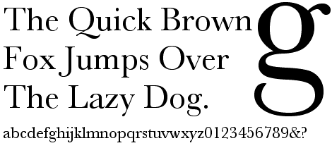
 Sample text in Baskerville font
Examples of these are Times, New Baskerville, and Bodoni, respectively.
Roman, italic, and oblique are also terms used to differentiate between upright and italicized variations of a typeface. The difference between italic and oblique is that the term italic usually applies to serif faces, where the letter forms are redesigned.[10]
Sans serif typefaces
Main article: Sans serifSans serif (lit. without serif) designs appeared relatively recently in the history of type design. The evolution of the sans serif font very likely stemmed from the slab serif font. The earliest slab serif font, Antique, later renamed Egyptian, designed in 1815 by the English typefounder Vincent Figgins[11] was succeeded one year later by the first sans serif font, created by William Caslon IV. The evidence of this is clearly shown in the uniform strokes in the letter forms. Sans serif fonts are commonly but not exclusively used for display typography such as signage, headings, and other situations demanding legibility above high readability. The text on electronic media offers an exception to print: most web pages and digitized media are laid out in sans serif typefaces because serifs often detract from readability at the low resolution of displays.[citation needed]
A well-known and popular sans serif font is Max Miedinger's Helvetica, popularized for desktop publishing by inclusion with Apple Computer's LaserWriter laserprinter and having been one of the first readily available digital typefaces. Arial, popularized by Microsoft, is a widely used sans serif font that is often compared to and substituted for Helvetica. Other fonts such as Futura, Gill Sans, Univers and Frutiger have also remained popular over many decades.
Script typefaces
Main article: Script (typefaces)Script typefaces imitate handwriting or calligraphy. They do not lend themselves to quantities of body text, as people find them harder to read than many serif and sans-serif typefaces; they are typically used for logos or invitations. Examples include Coronet and Zapfino.
Ornamental typefaces
Ornamental (also known as novelty or sometimes display) typefaces are used exclusively for decorative purposes, and are not suitable for body text. They have the most distinctive designs of all fonts, and may even incorporate pictures of objects, animals, etc. into the character designs. They usually have very specific characteristics (e.g., evoking the Wild West, Christmas, horror films, etc.) and hence very limited uses. See below for the historical definition of display typeface.
Mimicry typefaces
See also: Foreign branding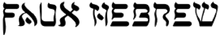 Simulated Hebrew.
A group of decorative typefaces, sometimes called simulation typefaces, have been designed that represent the characters of the Roman alphabet but evoke another writing system. This group includes typefaces designed to appear as Arabic, Chinese characters, Cyrillic, Indic scripts, Greek, Hebrew, Kana, or Thai. These are used largely for the purpose of novelty to make something appear foreign.
Blackletter typefaces
Main article: BlackletterBlackletter fonts, the earliest typefaces used with the invention of the printing press, resemble the blackletter calligraphy of that time. Many people refer to them as gothic script. Various forms exist including textualis, rotunda, schwabacher, and fraktur.
Gaelic typefaces
Main article: Gaelic typeGaelic fonts were first used for the Irish language in 1571, and were used regularly for Irish until the early 1960s, though they continue to be used in display type and type for signage. Their use was effectively confined to Ireland, though Gaelic typefaces were designed and produced in France, Belgium, and Italy. Gaelic typefaces make use of insular letterforms, and early fonts made use of a variety of abbreviations deriving from the manuscript tradition. Early fonts used for the Anglo-Saxon language, also using insular letterforms, can be classified as Gaelic typefaces, distinct from Roman or Antiqua typefaces.[12][13] Various forms exist, including manuscript, traditional, and modern styles, chiefly distinguished as having angular or uncial features.[14]
Monospaced typefaces
Main article: Monospaced fontMonospaced fonts are typefaces in which every glyph is the same width (as opposed to variable-width fonts, where the w and m are wider than most letters, and the i is narrower). The first monospaced typefaces were designed for typewriters, which could only move the same distance forward with each letter typed. Their use continued with early computers, which could only display a single font. Although modern computers can display any desired typeface, monospaced fonts are still important for computer programming, terminal emulation, and for laying out tabulated data in plain text documents. Examples of monospaced typefaces are Courier, Prestige Elite, Fixedsys, and Monaco. There exist Roman, Blackletter, and Gaelic monospaced typefaces.
Symbol typefaces
Main article: DingbatSymbol, or Dingbat, typefaces consist of symbols (such as decorative bullets, clock faces, railroad timetable symbols, CD-index, or TV-channel enclosed numbers) rather than normal text characters. Examples include Zapf Dingbats, Sonata, and Wingdings.
Display type
Display type refers to the use of type at large sizes, perhaps 30 points or larger. Some typefaces are considered useful solely at display sizes, and hence are known as display faces. For typefaces used across a wide range of sizes, in the days of metal type, each size was cut individually, or even if pantographically scaled would often have adjustments made to the design for larger or smaller sizes, making a "display" face have distinct differences.
In metal type, if present in smaller sizes, ink traps (small indentations at the junctions of letter strokes) would be eliminated at display sizes. In smaller point sizes, these ink traps were intended to fill up when the letterpress was over-inked, providing some latitude in press operation while maintaining the intended appearance of the type design. At larger sizes, these ink traps were not necessary, so display faces did not have them. Today's digital typefaces are most often used for offset lithography, electrophotographic printing or other processes that are not subject to the ink supply variations of letterpress, so ink traps have largely disappeared from use.
When digital fonts feature a display variation, it is to accommodate other stylistic differences that may benefit type used at larger point sizes. Such differences, which were standard in metal type, are rare in digital type, outside of the very high end of type design. They can include: a lower x-height, higher contrast between thick and thin strokes, less space between letters, and slightly more condensed letter shapes.[15]
Decades into the desktop publishing revolution, few typographers with metal foundry type experience are still working, and few digital typefaces are optimized specifically for different sizes, so the misuse of the term display typeface as a synonym for ornamental type has become widespread; properly speaking, ornamental typefaces are a subcategory of display typefaces.
Texts used to demonstrate typefaces
A sentence that uses all of the alphabet (a pangram), such as "The quick brown fox jumps over the lazy dog", is often used as a design aesthetic tool to demonstrate the personality of a typeface's characters in a setting (because it displays all the letters of the alphabet). For extended settings of typefaces graphic designers often use nonsense text (commonly referred to as greeking), such as lorem ipsum or Latin text such as the beginning of Cicero's In Catilinam. Greeking is used in typography to determine a typeface's colour, or weight and style, and to demonstrate an overall typographic aesthetic prior to actual type setting.
Intellectual property
Main article: Intellectual property protection of typefaces, fonts and charactersIn Eltra Corp. v. Ringer,[16] the Court of Appeals for the Fourth Circuit held that typeface designs are not subject to copyright. However, novel and non-obvious typeface designs are subject to protection by design patents.[17] Digital fonts that embody a particular design are often subject to copyright as computer programs.[18][19] The names of the typefaces can become trademarked. As a result of these various means of legal protection, sometimes the same typeface exists in multiple names and implementations.
Some elements of the software engines used to display fonts on computers have or had software patents associated with them. In particular, Apple Inc. patented some of the hinting algorithms for TrueType, requiring open source alternatives such as FreeType to use different algorithms. However, Apple's TrueType hinting patents expired in May 2010.[20]
Although typeface design is not subject to copyright in the United States under the 1976 Copyright Act, the United States District Court for the Northern District of California in Adobe Systems, Inc. v. Southern Software, Inc. (No. C95-20710 RMW, N.D. Cal. January 30, 1998)[21] found that there was original authorship in the placement of points on a computer font's outline; i.e., because a given outline can be expressed in myriad ways, a particular selection and placement of points has sufficient originality to qualify for copyright.
Many western countries extend copyright protection to typeface designs.[22] However, this has no impact on protection in the United States, because all of the major copyright treaties and agreements to which the U.S. is a party (such as the Berne Convention, the WIPO Copyright Treaty, and TRIPS) operate under the principle of national treatment, under which a country is obligated to provide no greater or lesser protection to works from other countries than it provides to domestically produced works.
See also
- ATypI, Association Typographique Internationale
- Calligraphy
- Character (symbol)
- Font family (HTML)
- Font-management program
- Fontlab
- Intellifont
- Language
- List of typefaces and Category:Typeface samples
- List of type designers
- List of typographic features
- Screenfont
- Society of Typographic Aficionados
- Type design
- Type Directors Club
- Type foundry
- Typographic unit
- Unicode font
References
- ^ Young, Margaret Levine; Kay, David C.; Wagner, Richard (2004). WordPerfect 12 for dummies. For Dummies. p. 102. ISBN 9780764578083. http://books.google.com/books?id=vEOzH_1x1WQC&pg=PA102&dq=font+versus+typeface&lr=&cd=37#v=onepage&q=&f=false.
- ^ McGrew, Mac. American Metal Typefaces of the Twentieth Century (second edition). New Castle, DE: Oak Knoll Books, 1993: 85–87. ISBN 0-938768-39-5.
- ^ Typophile.com
- ^ Graham, Lisa. Basics of Design: Layout & Typography for Beginners. New York: Delmar, 2002: 184. ISBN 0788813622.
- ^ Apple's TrueType Reference Manual Retrieved on 2009-06-21
- ^ "Why use monospace fonts in your IDE?". http://stackoverflow.com/questions/218623/why-use-monospace-fonts-in-your-ide. Retrieved 2009-02-22.
- ^ Cullen, Kristin. Layout Workbook: A Real-World Guide to Building Pages in Graphic Design, Jul 2005: 92
- ^ "Glossary of Type & Font Terminology". Ascender Corporation. http://www.ascendercorp.com/support/type-glossary/. Retrieved 20 May 2010.
- ^ Carter, Day, and Meggs. Typographic Design: Form and Communication. Third Edition. Hoboken, NJ: John Wiley and Sons, 2002: 34.
- ^ Williams, Robin. The Non-Designer's Type Book. Berkeley, CA: Peachpit Press, 1998: 16.
- ^ Carter, Day, and Meggs. Typographic Design: Form and Communication. Third Edition. Hoboken, NJ: John Wiley and Sons, 2002: 35.
- ^ Lynam, E. W. 1969. The Irish character in print: 1571–1923. New York: Barnes & Noble. First printed as Oxford University Press offprint 1924 in Transactions of the Bibliographical Society, 4th Series, Vol. IV, No. 4, March 1924.)
- ^ McGuinne, Dermot. Irish type design: A history of printing types in the Irish character. Blackrock: Irish Academic Press. ISBN 0-7165-2463-5
- ^ Everson, Michael History and classification of Gaelic typefaces, 2000-06-19.
- ^ Adobe Systems [1], 2010-05-31.
- ^ Eltra Corp. v. Ringer, 579 F.2d 294 (4th Cir. 1978)
- ^ Terrence J. Carroll, Protection For Typeface Designs: A Copyright Proposal, 10 Santa Clara Computer & High Tech. L.J. 139, 172 (1994)
- ^ Carroll at 168, n.180.
- ^ Registrability of Computer Programs That Generate Typefaces, 57 Fed. Reg. 6201 (1992).
- ^ "Freetype and Patents". http://www.freetype.org/patents.html.
- ^ Adobe Systems, Inc. and Emigre, Inc. v. Southern Software, Inc. and King (No. C95-20710 RMW, N.D. Cal. January 30, 1998), BNA.com
- ^ Carroll at 169.
Further reading
- Garfield, Simon (2010), Just my Type: a Book About Fonts, Profile
External links
- ABC typography - Introduction to the most famous typefaces
- Named parts of a letter: Type Anatomy 1.0
- Nwalsh.com, comp.fonts FAQ
Typography terminology Page 
Paragraph Character Typeface anatomyCounter · Diacritics · Dingbat · Glyph · Initial · Kerning · Letter-spacing · Ligature · Subscript and superscript · Swash · Text figuresCapitalizationVertical aspectsClassifications Punctuation Typesetting Calligraphy · ETAOIN SHRDLU · Font (Computer font) · Font catalog · Letterpress · Lorem ipsum · Movable type · Pangram · Phototypesetting · Punchcutting · Type design · Typeface · Type foundry · MicrotypographyTypographic units Digital typography Categories:- Typefaces
- Typesetting
- Graphic design


Wikimedia Foundation. 2010.