- Dash
-
Not to be confused with Hyphen or Minus sign.This article is about the punctuation mark. For other uses, see Dash (disambiguation).For guidelines on dash usage in Wikipedia, see Wikipedia:Manual of Style#Dashes.
A dash is one of several kinds of punctuation mark. Dashes appear similar to hyphens, but differ from them primarily in length, and serve different functions. The most common versions of the dash are the en dash (–) and the em dash (—).
Contents
Common dashes
There are several forms of dash, of which the most common are:
glyph Unicode codepoint[1] HTML character entity reference HTML/XML numeric character references TeX Alt code (Windows) Mac OS X key combination Compose key figure dash ‒ U+2012 none ‒or‒none en dash – U+2013 ––or–--Alt + 0150 ⌥ Opt+- Compose+-+-+. em dash — U+2014 ——or—---Alt + 0151 ⌥ Opt+⇧ Shift+- Compose+-+-+- horizontal bar ― U+2015 none ―or―none swung dash ⁓ U+2053 none ⁓or⁓\~{}Less common are the two-em dash (⸺) and three-em dash (⸻). Windows character codes require that Num Lock be on.
Figure dash
The figure dash (‒) is so named because it is the same width as a digit, at least in fonts with digits of equal width. This is true of most fonts, not only monospaced fonts.
The figure dash is used when a dash must be used within numbers. This does not indicate a range, for which the en dash is used; nor does it function as the minus sign, which also uses a separate glyph.
The figure dash is often unavailable; in this case, one may use a hyphen-minus instead. In Unicode, the figure dash is U+2012 (decimal 8210). HTML authors must use the numeric forms
‒or‒to type it unless the file is in Unicode; there is no equivalent character entity. In TeX, the standard fonts have no figure dash; however, the digits normally all have the same width as the en dash, so an en dash can be substituted when using standard TeX fonts.En dash
The en dash, n dash, n-rule, or "nut" (–) is traditionally half the width of an em dash.[2][3] In modern fonts, the length of the en dash is not standardized, and the en dash is often more than half the width of the em dash.[4] The widths of en and em dashes have also been specified as being equal to those of the upper-case letters N and M respectively,[5][6] and at other times to the widths of the lower-case letters.[4][7]
Ranges of values
The en dash is commonly used to indicate a closed range of values, meaning a range with clearly defined and non-infinite upper and lower boundaries. This may include ranges such as those between dates, times, or numbers.[8][9][10][11] Examples of this usage may include:
- June–July 1967
- 1:00–2:00 p.m.
- For ages 3–5
- pp. 38–55
- President Jimmy Carter (1977–1981)
The Guide for the Use of the International System of Units (SI) recommends that the word to be used instead of an en dash when a number range might be misconstrued as subtraction, such as a range of units. For example, "a voltage of 50 V to 100 V" is preferable to using "a voltage of 50–100 V". It is also considered inappropriate to use the en dash in place of the words to or and in phrases that follow the forms from ... to ... and between ... and ....[9][10]
Relationships and connections
The en dash can also be used to contrast values, or illustrate a relationship between two things.[8][11] Examples of this usage may include:
- Colombia beat Venezuela 31–0.
- Radical–Unionist coalition
- Boston–Hartford route
- New York–London flight (however, it may be seen that New York to London flight is more appropriate because New York is a single name composed of two valid words; with a dash the phrase is ambiguous and could mean either Flight from New York to London or New flight from York to London[11])
- Mother–daughter relationship
- The Supreme Court voted 5–4 to uphold the decision.
- The McCain–Feingold bill
A "simple" attributive compound is written with a hyphen; at least one authority considers name pairs, where the paired elements carry equal weight, as in the Taft-Hartley Act to be "simple,"[9] while others consider an en dash appropriate in instances such as this[12][13][14] to represent the parallel relationship, as in the McCain–Feingold bill or Bose–Einstein statistics. However, truly compound names are written with a hyphen, thus the Lennard-Jones potential is named after one person, while Bose and Einstein are two people.
Attributive compounds
In English, the en dash is usually used instead of a hyphen in compound (phrasal) attributives in which one or both elements is itself a compound, especially when the compound element is an open compound, meaning it is not hyphenated itself. This manner of usage may include such examples as:[9][10][15][16]
- The hospital–nursing home connection
(the connection between the hospital and the nursing home, not a home connection between the hospital and nursing)
- A nursing home–home care policy
- Pre–Civil War era
- Pulitzer Prize–winning novel
- The non–San Francisco part of the world
- The post–World War II era (however, a hyphen would be used in post-war era)
- Trans–New Guinea languages
- The ex–prime minister
- The pro-conscription–anti-conscription debate
- Public-school–private-school rivalries
The disambiguating value of the en dash in these patterns was illustrated by Strunk and White in The Elements of Style with the following example: when Chattanooga News and Chattanooga Free Press merged, the joint company was inaptly named Chattanooga News-Free Press, which could be interpreted as meaning that their newspapers were news-free.[17]
An exception to the use of en dashes is made however when prefixing an already hyphenated compound; an en dash is generally avoided as a distraction in this case. Examples of this may include:[17]
- non-English-speaking air traffic controllers
- semi-labor-intensive industries
- Proto-Indo-European language (rarely Proto–Indo-European)
- The post-MS-DOS era (rarely post–MS-DOS)
- non-government-owned corporations
Differing recommendations
As discussed above, the en dash is sometimes recommended instead of a hyphen in compound adjectives where neither part of the adjective modifies the other—that is, when each modifies the noun, as in love–hate relationship. The Chicago Manual of Style (CMOS), however, limits the use of the en dash to two main purposes. First, use it to indicate ranges of time, money, or other amounts, or in certain other cases where it replaces the word to. Second, use it in place of a hyphen in a compound adjective when one of the elements of the adjective is an open compound, or when two or more of its elements are compounds, open or hyphenated.[18] That is, it favors hyphens in instances where some other guides suggest en dashes – the 16th edition explaining that "Chicago's sense of the en dash does not extend to between" to rule out its use in "US-Canadian relations."[18]
Spacing
En dashes normally do not have spaces around them. An exception is made when avoiding spaces may cause confusion or look odd. For example, compare 12 June – 3 July with 12 June–3 July.[19] However, in rare situations when an en dash is unavailable—such as when using typewriters or character encodings not including the en dash character—it may be substituted with a hyphen-minus with a single space on each side (" - ").[citation needed]
Parenthetic and other uses at the sentence level
Like em dashes, en dashes can be used instead of colons, or pairs of commas that mark off a nested clause or phrase. They can also be used around parenthetical expressions – such as this one – in place of the em dashes preferred by some publishers, particularly where short columns are used, since em dashes can look awkward at the end of a line. See En dash versus em dash, below. In these situations, en dashes must have a single space on each side.
Electronic usage
In TeX, the en dash may normally (depending on the font) be input as a double hyphen-minus (
--). On Mac OS X, most keyboard layouts map an en dash to ⌥ Opt+-. On Microsoft Windows, an en dash may be entered as Alt+0150 (where the digits are typed on the numeric keypad while holding down the Alt key). In Linux (GTK+ v. 2.10+ applications only, see Unicode input), it is entered by holding down Ctrl+Shift and typing U followed by the Unicode code point above, or using the compose key by pressing the compose key, two hyphens, and a period.The en dash is sometimes used as a substitute for the minus sign, when the minus sign character is not available, since the en dash is usually the same width as a plus sign. For example, the original 8-bit Macintosh character set had an en dash, useful for minus sign, years before Unicode with a dedicated minus sign was available. The hyphen-minus is usually too narrow to make a typographically acceptable minus sign. But the en dash cannot be used for a minus in programming languages because the syntax usually requires a hyphen-minus; because programming languages are usually set in a fixed-pitch (monospaced) font face, the hyphen-minus looks acceptable there.
Itemization mark
The en dash may be used as a bullet mark used at the start of items in a list.[citation needed]
Em dash
The em dash (—), m dash, m-rule, or "mutton," often demarcates a break of thought or some similar interpolation stronger than the interpolation demarcated by parentheses, such as the following from Nicholson Baker's The Mezzanine:
At that age I once stabbed my best friend, Fred, with a pair of pinking shears in the base of the neck, enraged because he had been given the comprehensive sixty-four-crayon Crayola box—including the gold and silver crayons—and would not let me look closely at the box to see how Crayola had stabilized the built-in crayon sharpener under the tiers of crayons.
It is also used to indicate that a sentence is unfinished because the speaker has been interrupted. For example, the em dash is used in the following way in Joseph Heller's Catch-22:
He was Cain, Ulysses, the Flying Dutchman; he was Lot in Sodom, Deirdre of the Sorrows, Sweeney in the nightingales among trees. He was the miracle ingredient Z-147. He was—
"Crazy!" Clevinger interrupted, shrieking. "That's what you are! Crazy!"
"—immense. I'm a real, slam-bang, honest-to-goodness, three-fisted humdinger. I'm a bona fide supraman."Similarly, it can be used instead of an ellipsis to indicate aposiopesis, the rhetorical device by which a sentence is stopped short not because of interruption but because the speaker is too emotional to continue, such as Darth Vader's line "I sense something; a presence I've not felt since—" in Star Wars Episode IV: A New Hope.[20]
The term em dash derives from its defined width of one em, which is the length, expressed in points, by which font sizes are typically specified. Thus in 9-point type, an em is 9 points wide, while the em of 24-point type is 24 points wide, and so on (by comparison, the en dash, with its 1-en width, is in most fonts either ½ em wide[21] or the width of an n[22]).
The em dash is used in much the way a colon or a set of parentheses is used; it can show an abrupt change in thought or be used where a full stop (or "period") is too strong and a comma too weak. Em dashes are sometimes used to set off summaries or definitions.[23]
According to most American sources (such as The Chicago Manual of Style) and some British sources (such as The Oxford Guide to Style), an em dash should always be set closed, meaning it should not be surrounded by spaces. But the practice in some parts of the English-speaking world, including the style recommended by The New York Times Manual of Style and Usage, sets it open, separating it from its surrounding words by using spaces or hair spaces (U+200A) when it is being used parenthetically. Some writers, finding the em dash unappealingly long, prefer to use an open-set en dash. This "space, en dash, space" sequence is also the predominant style in German and French typography. See En dash versus em dash below.
In Canada, The Canadian Style [A Guide to Writing and Editing], The Oxford Canadian of Grammar, Spelling & Punctuation, Guide to Canadian English Usage [Second Edition], Editing Canadian English Manual, and the Canadian Oxford Dictionary all specify that an em dash should be set closed when used between words, a word and numeral, or two numerals.
In Australia, the Style manual [For authors, editors and printers, Sixth edition], also specifies that em dashes inserted between words, a word and numeral, or two numerals, should be set closed. A section on the 2-em rule (——) also explains that the 2-em can be used to mark an abrupt break in direct or reported speech, but a space is used before the 2-em if a complete word is missing, while no space is used if part of a word exists before the sudden break. Two examples of this are as follows (note that properly typeset 2-em and 3-em dashes should appear as a single dash, but they may show on this page as several em dashes with spaces in between):
- I distinctly heard him say, 'Go away or I'll ——'.
- It was alleged that D—— had been threatened with blackmail.
Monospaced fonts that mimic the look of a typewriter have the same width for all characters. Some of these fonts have em and en dashes that more or less fill the monospaced width they have available. For example, the sequence hyphen, en dash, em dash, minus shows as "
- – — −" in a monospace font. Typewriters often only have a single hyphen glyph, so it is common to use two monospace hyphens strung together (--) to serve as an em dash.When an actual em dash is unavailable—as in the ASCII character set—a double ("--") or triple hyphen-minus ("---") is used. In Unicode, the em dash is U+2014 (decimal 8212). In HTML, one may use the numeric forms
—or—; there is also the HTML entity—. In TeX, the em dash may normally be input as a triple hyphen-minus (---). On any Mac, most keyboard layouts map an em dash to ⌥ Opt+⇧ Shift+-. On Microsoft Windows, an em dash may be entered as Alt+0151, where the digits are typed on the numeric keypad while holding the Alt key down. It can also be entered into Microsoft Office applications by using the Ctrl+Alt+-. In the X Window System, it may entered using the compose key by pressing the compose key and three hyphens.Corpus studies indicate that em dashes are more commonly used in Russian than in English.[24]
En dash versus em dash
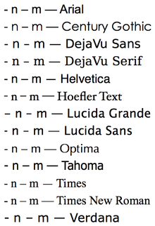 These comparisons of "- n – m —" in various 12-point fonts illustrate the typical relationship of lengths of dashes relative to the hyphen. In some fonts, the en dash is not much longer than the hyphen, and in Lucida Grande the en dash is actually shorter than the hyphen, making this default Safari browser font typographically nonstandard and confusing.
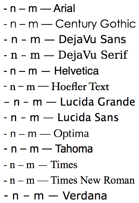
The en dash is wider than the hyphen but not as wide as the em dash. An em width is defined as the point size of the currently used font, since the M character is not always the width of the point size.[25] In running text, various dash conventions are employed: an em dash—like so—or a spaced em dash — like so — or a spaced en dash – like so – can be seen in contemporary publications.
Various style guides and national varieties of languages prescribe different guidance on dashes. Dashes have been cited as being treated differently in the US and the UK, with the former preferring the use of an em-dash with no additional spacing, and the latter preferring a spaced en-dash.[26] As an example of the US style, The Chicago Manual of Style still recommends unspaced em dashes. Style guides outside of the US tend to diverge from this guidance. For example, the Canadian The Elements of Typographic Style recommends the spaced en dash – like so – and argues that the length and visual magnitude of an em dash "belongs to the padded and corseted aesthetic of Victorian typography."[27] In the United Kingdom, the spaced en dash is the house style for certain major publishers, including the Penguin Group, the Cambridge University Press, and Routledge. But this convention is not universal. The Oxford Guide to Style (2002, section 5.10.10) acknowledges that the spaced en dash is used by "other British publishers", but states that the Oxford University Press—like "most US publishers"—uses the unspaced em dash.
The en dash—always with spaces in running text—and the spaced em dash both have a certain technical advantage over the un-spaced em dash. Most typesetting and word processing expects word spacing to vary to support full justification. Alone among punctuation that marks pauses or logical relations in text, the unspaced em dash disables this for the words it falls between. This can cause uneven spacing in the text, but can be mitigated by the use of thin spaces, hair spaces, or even zero-width spaces on the sides of the em dash. This provides the appearance of an unspaced em dash, but allows the words and dashes to break between lines. The spaced em dash risks introducing excessive separation of words. In full justification, the adjacent spaces may be stretched, and the separation of words further exaggerated. En dashes may also be preferred to em dashes when text is set in narrow columns, such as in newspapers and similar publications, as the en dash is smaller. In such cases, its use is based purely on space considerations and is not necessarily related to other typographical concerns.
Horizontal bar
U+2015 ― horizontal bar, also known as a quotation dash, is used to introduce quoted text. This is the standard method of printing dialogue in some languages. See the quotation dash section of the Quotation mark, non-English usage article for further details of how it is used. The em dash is equally suitable if the quotation dash is unavailable or is contrary to the house style being used.
There is no support in the standard TeX fonts, but one can use
\hbox{---}\kern-.5em---instead, or just use an em dash.The Chicago Manual of Style makes no mention of the horizontal bar or the quotation dash but states: "Em dashes are occasionally used instead of quotation marks to set off dialogue (à la writers in some European languages). Each speech starts a new paragraph. No space follows the dash."[28]
Swung dash
Main article: Tilde#PunctuationU+2053 ⁓ swung dash resembles a lengthened tilde, and is used to separate alternatives or approximates. In dictionaries, it is frequently used to stand in for the term being defined. A dictionary entry providing an example for the term henceforth might employ the swung dash as follows:
- henceforth (adv.) from this time forth; from now on; "⁓ she will be known as Mrs. Wales"
There are several similar, related characters:
- U+223C ∼ tilde operator, used in mathematics. In TeX and LaTeX, this character can be expressed using the math mode command
$\sim$. - U+301C 〜 wave dash, used in East Asian typography for a variety of purposes, including Japanese punctuation.
- U+FF5E ~ fullwidth tilde, used in East Asian typography.
Similar characters
Several characters resemble dashes but have different meanings and uses. These include:
- U+002D - hyphen-minus is the standard ASCII hyphen. Sometimes this is used in groups to indicate different types of dash.
- U+007E ~ tilde is a diacritic mark.
- U+005F _ underscore is either a diacritic mark, or a character replacing a standard space.
- U+00AF ¯ macron is another diacritic mark.
- U+00AD soft hyphen is used to indicate where a line may break, as in a compound word or between syllables.
- U+2010 ‐ hyphen is the character that can be used to unambiguously represent a hyphen.
- U+2043 ⁃ hyphen bullet is a short horizontal line used as a list bullet.
- U+2500 ─ box drawings light horizontal, and several similar characters from the same Unicode block.
- U+2212 − minus sign is an arithmetic operation used in mathematics to represent subtraction or negative numbers.
- U+301C 〜 wave dash and U+3030 〰 wavy dash are wavy lines found in some East Asian character sets. Typographically, they have the width of one CJK character cell (fullwidth form), and follow the direction of the text, being horizontal for horizontal text, and vertical for columnar. They are used as dashes, and occasionally as emphatic variants of the katakana vowel extender mark.
- U+058A ֊ armenian hyphen
- U+05BE ־ hebrew punctuation maqaf
- U+1806 ᠆ mongolian todo soft hyphen is a hyphen from the Mongolian Todo alphabet.
- U+3161 ㅡ hangul letter eu or U+1173 ᅳ hangul jungseong eu are Hangul letters used in Korean to denote the sound [ɨ].
- U+30FC ー katakana-hiragana prolonged sound mark, the Japanese chōonpu, is used in Japanese to indicate a long vowel.
- U+4E00 一 <cjk ideograph, first>, the Chinese character for "one", is used in various East Asian languages.
Rendering dashes on computers
Typewriters and early computers have traditionally had only a limited character set, often having no key that produces a dash. In consequence, it became common to substitute the nearest available punctuation mark or symbol. Em dashes are often represented in British usage by a single hyphen-minus surrounded by spaces, or in American usage by two hyphen-minuses surrounded by spaces.
Modern computer software typically has support for many more characters, and is usually capable of rendering both the en and em dashes correctly—albeit sometimes with an inconvenient input method. Some software, though, may operate in a more limited mode. Some text editors, for example, are restricted to working with a single 8-bit character encoding, and when unencodable characters are entered—for example by pasting from the clipboard—they are often blindly converted to question marks. Sometimes this happens to em and en dashes, even when the 8-bit encoding supports them, or when an alternative representation using hyphen-minuses is an option.
Any kind of dash can be used directly in an HTML document, but HTML also lets them be entered using character references. The em dash and the en dash are special in that they can be written using character entity references as
—and–, respectively.- In Linux, under recent versions of GTK+, there are various methods of producing these dashes. For em dashes, one may use the compose key followed by three presses of the hyphen character. For en dashes, one may press the compose key followed by two hyphens and a period. For all dashes, one may press and hold ctrl and shift and then press u (and release them all) after which an underlined 'u' appears. Then, type the Unicode number (i.e., 2015) for the appropriate dash and press enter or the space bar. Also, other keys may be remapped to create dashes.
- In Mac OS X using the Australian, British, Canadian, German, Irish, Irish Extended, Italian, Pro Italian, Russian, US, US Extended, or Welsh keyboard layout, an en dash can be obtained by typing ⌥ Opt+-, while an em dash can be typed with ⌥ Opt+⇧ Shift+-.
- In TeX, an em dash is typed as three hyphens (
---), an en dash as two hyphens (--), and a hyphen-minus as one hyphen (-). Mathematical minus is signified as$-$or\(-\). - On Plan 9 systems, an en or em dash may be entered by pressing the Compose key (usually left Alt), followed by typing en or em respectively.
- In Microsoft Windows running on a computer whose keyboard has a numeric keypad, an en or em dash may be typed into most text areas by using their respective Alt code by holding down the Alt key and pressing either 0150 or 0151. The numbers must be typed on the numeric keypad with Num Lock enabled. In addition, the Character Map utility included with Windows can be used to copy and paste en and em dash characters into most applications—along with accented letters and other non-English language characters. It can normally be found in the System Tools folder, or the Accessories folder on Windows Vista. Character Map can also be opened by typing
charmapin the run command box. - In Microsoft Word running on a computer whose keyboard has a numeric keypad, an em dash can be typed with ctrl + alt + numeric hyphen (on the numeric keypad, usually in the top-right corner), and an en dash can be typed with ctrl + numeric hyphen. This doesn't work with the hyphen key on the main keyboard (usually between "0" and "="), which has completely different functions. With Microsoft Word's default settings, in both Windows and Macintosh versions, an em dash symbol, which is not always a true em dash from the font, is automatically produced by Autocorrect when two unspaced hyphens are entered between words ("word--word"). An en dash, which again is not always a true en dash from the font, is automatically produced when one or two hyphens surrounded by spaces are entered: ("word - word") or ("word -- word"). This feature can be disabled by customizing Autocorrect. Other dashes, spaces, and special characters are possible, found through the Tools menu. Unassigned symbols, such as the true minus sign, can be assigned keyboard shortcuts through the Insert menu. To determine if the true en or em dash from the font are being used rather than a cross-referenced character from the Symbol font, copy and paste samples of the dashes into a text editor such as Windows Notepad. Using the true dash is important if one ever needs to share documents with other users in other applications or operating systems.
References
- ^ Characters in Unicode are referenced in prose via the "U+" notation. The hexadecimal number after the "U+" is the character's Unicode code point.
- ^ John Southward (1884). Practical printing: a handbook of the art of typography (2nd ed.). J.M. Powell & Son. p. 7. http://books.google.com/books?id=J7syAAAAMAAJ&pg=PA7.
- ^ Michael Spivak (1980). The joy of TEX: a gourmet guide to typesetting with the AMS-TEX macro package (2nd ed.). AMS Bookstore. p. 8. ISBN 9780821829974. http://books.google.com/books?id=UgxjqoQgUncC&pg=PA8.
- ^ a b Ilene Strizver (2010). Type Rules: The Designer's Guide to Professional Typography (3rd ed.). John Wiley and Sons. p. 200. ISBN 9780470542514. http://books.google.com/books?id=SkM9llXtNAkC&pg=PA200.
- ^ Susan E. L. Lake and Karen Bean (2007). Digital Multimedia: The Business of Technology (2nd ed.). Cengage Learning. p. 128. ISBN 9780538445276. http://books.google.com/books?id=S2OgxFuGYpcC&pg=PT138.
- ^ Nigel French (2006). InDesign type: professional typography with Adobe InDesign CS2. Adobe Press. p. 72. ISBN 9780321385444. http://books.google.com/books?id=l_YJY3JalQgC&pg=PA72.
- ^ Edward D. Johnson (1991). The handbook of good English. Simon and Schuster. p. 335. ISBN 9780671707972. http://books.google.com/books?id=n0IJ8GcdJ6IC&pg=PA335.
- ^ a b Griffith, Benjamin W., et al. (2004). Pocket Guide to Correct Grammar. Barron's Pocket Guides. Woodbury, N.Y.: Barron's Educational Series. ISBN 0-7641-2690-3.
- ^ a b c d Judd, Karen (2001). Copyediting: A Practical Guide. Menlo Park, Calif: Crisp Publications. ISBN 1-56052-608-4.
- ^ a b c Loberger, Gordon; Kate Shoup Welsh (2001). Webster's new world English grammar handbook. New York: Hungry Minds. ISBN 0-7645-6488-9.
- ^ a b c George Burnham Ives (1921). Text, type and style: A compendium of Atlantic usage. Atlantic Monthly Press. p. 125. http://books.google.com/books?id=5dkWAAAAIAAJ&pg=PA125. "The en-dash...may stand for the word 'and' or 'to' in such phrases as 'the Radical–Unionist Coalition,' 'the Boston–Hartford Air Line'; 'the period of Republican supremacy, 1860–84'; 'pp. 224–30.'"
- ^ Garner, B: Modern American Usage, Second Edition, page 657. Oxford University Press, 2003.
- ^ Bryan A. Garner (2001). Legal writing in plain English: a text with exercises. Chicago guides to writing, editing, and publishing (illustrated, reprinted ed.). University of Chicago Press. p. 155. ISBN 0226284182, 9780226284187. http://books.google.es/books?id=reZf9nzoiSQC. "6.1 Use an en-dash as an equivalent of to (as when showing a span of pages), to express tension or difference, or to denote a pairing in which the elements carry equal weight."
- ^ Lynn Dupré (1998). Bugs in Writing (Revised ed.). Addison Wesley Longman, Inc.. p. 221. ISBN 9780201379211. http://books.google.com/books?id=X-J4AAAAIAAJ&q=%22equal-weighted+pair%22+%22love-hate+relationship%22&dq=%22equal-weighted+pair%22+%22love-hate+relationship%22. "use en dashes when you have an equal-weighted pair serving as an adjective, such as love–hate relationship."
- ^ Houghton Mifflin Company (2005). The American Heritage guide to contemporary usage and style. Houghton Mifflin Harcourt. p. 129. ISBN 9780618604999. http://books.google.com/books?id=xb6ie6PqYhwC&pg=PA129.
- ^ Gary Lutz; Diane Stevenson (2005). The Writer's Digest grammar desk reference. Writer's Digest Books. p. 296. ISBN 9781582973357. http://books.google.com/books?id=SsQ9ugnMcpUC&pg=PA296.
- ^ a b Amy Einsohn (2000). The copyeditor's handbook: a guide for book publishing and corporate communications, with exercises and answer keys. University of California Press. pp. 108–109. ISBN 9780520218345. http://books.google.com/books?id=93i4WNp9ZtYC&pg=PA108.
- ^ a b The Chicago Manual of Style (15th Edition ed.). Chicago: University of Chicago Press. 2003. pp. 261–265. ISBN 0-226-10403-6.
- ^ Shaw, Harry (1986). Errors in English and Ways to Correct Them. New York: Harper & Row, Publishers. p. 185. ISBN 0-06-097047-2.
- ^ "Star Wars: Episode IV - A New Hope". IMDb. http://www.imdb.com/title/tt0076759/quotes?qt=qt0440693. Retrieved 2011-08-10.
- ^ Ritter, R.M. (2002). The Oxford Guide to Style. Oxford University Press. p. 140. ISBN 0198691750. "The en rule is, as its name indicates, an en in length, which makes it longer than a hyphen and half the length of an em rule."
- ^ Bryony Gomez-Palacio and Armin Vit (2009). Graphic design, referenced: a visual guide to the language, applications, and history of graphic design. Rockport Publishers. p. 75. ISBN 9781592534470. http://books.google.com/books?id=EX6fxDG2Kl4C&pg=PA75.
- ^ Geraldine Woods (2005). Webster's New World punctuation: simplified and applied. Webster's New World. p. 114. ISBN 9780764599163. http://books.google.com/books?id=YyMoNCZlUAwC&pg=PA114.
- ^ Claudia V. Angelelli; Holly E. Jacobson (2009). Testing and assessment in translation and interpreting studies: a call for dialogue between research and practice. John Benjamins Publishing Company. p. 174. ISBN 9789027231901. http://books.google.com/books?id=3dzk1a7gOnAC&pg=PA174.
- ^ "A glossary of typographic terms". Adobe. http://www.adobe.com/uk/type/topics/glossary.html#ememspaceemquad. Retrieved 2007-10-18.
- ^ Will, Hill (2010). The Complete Typographer: A Foundation Course for Graphic Designers Working With Type (3 ed.). Thames and Hudson. ISBN 9780500288948.
- ^ Robert Bringhurst (2004). The elements of typographic style (third ed.). Hartley & Marks, Publishers. p. 80. ISBN 9780881792065. http://books.google.com/books?id=uKkQAQAAMAAJ&dq=%22belongs+to+the+padded+and+corseted+aesthetic%22&q=corseted+aesthetic#search_anchor.
- ^ The Chicago Manual of Style (16th edition), paragraph 6.88 (p. 335).
External links
- Peter K. Sheerin, The trouble with EM 'n EN
- Dashes and Hyphens
- Colons, Semicolons, and Em-dashes
- Commonly confused characters
- MediaWiki User's Guide to creating special characters
Typography terminology Page 
Paragraph Character Typeface anatomyCounter · Diacritics · Dingbat · Glyph · Initial · Kerning · Letter-spacing · Ligature · Subscript and superscript · Swash · Text figuresCapitalizationVertical aspectsClassifications Punctuation Typesetting Calligraphy · ETAOIN SHRDLU · Font (Computer font) · Font catalog · Letterpress · Lorem ipsum · Movable type · Pangram · Phototypesetting · Punchcutting · Type design · Typeface · Type foundry · MicrotypographyTypographic units Digital typography Categories:

Wikimedia Foundation. 2010.