- Font
-
This article is about the traditional meaning of "font". For the electronic data file, see Computer font. For other uses, see Font (disambiguation).
In typography, a font is traditionally defined as a quantity of sorts composing a complete character set of a single size and style of a particular typeface. For example, the complete set of all the characters for “9-point Bulmer” is called a font, and the “10-point Bulmer” would be another separate font, but part of the same font family, whereas “9-point Bulmer boldface” would be another font in a different font family of the same typeface. One individual font character might be referred to as a “piece of font” or a “piece of type”.
Font nowadays is frequently used synonymously with the term typeface, although they had clearly understood different meanings before the advent of digital typography and desktop publishing.
Beginning in the 1980s, with the introduction of computer fonts, a broader definition for the term “font” evolved, because different sizes of a single style—separate fonts in metal type—are now generated from a single computer font, because vector shapes can be scaled freely. “Bulmer”, the typeface, may include the fonts “Bulmer roman”, “Bulmer italic”, “Bulmer bold” and “Bulmer extended”, but there is no separate font for "9-point Bulmer italic" as opposed to "10-point Bulmer italic".
There are thousands of typefaces.
Contents
Etymology
The term font, a doublet of the word fondue, derives from Middle French fonte, meaning "(something that has been) melt(ed)", referring to type produced by casting molten metal at a type foundry. English-speaking printers have used the term fount for centuries to refer to the multi-part metal type used to assemble and print in a particular size and typeface.[1]
Metal type
In a traditional manual printing (letterpress) house the word font would refer to a complete set of metal type that would be used to typeset an entire page. Unlike a digital typeface it would not include a single definition of each character, but commonly used characters (such as vowels and periods) would have more physical type-pieces included. A font when bought new would often be sold as (for example in a Roman alphabet) 12pt 14A 34a, meaning that it would be a size 12-point font containing 14 uppercase 'A's, and 34 lowercase 'A's. The rest of the characters would be provided in quantities appropriate for the distribution of letters in that language. Some metal type characters required in typesetting, such as dashes, spaces and line-height spacers, were not part of a specific font, but were generic pieces which could be used with any font.[2] Line spacing is still often called "leading", because the strips used for line spacing were made of lead (rather than the harder alloy used for other pieces). The reason for this spacing strip being made from "lead" was because lead was a softer metal than the traditional forged metal type pieces (which was part lead, antimony and tin) and would compress more easily when "locked-up" in the printing "chase" (i.e. a carrier for holding all the type together).
In the 1880s–90s, "hot lead" typesetting was invented, in which type was cast as it was set, either piece by piece (as in the Monotype technology) or in entire lines of type at one time (as in the Linotype technology).
Font characteristics
In addition to the character height, when using the mechanical sense of the term, there are several characteristics which may distinguish fonts, though they would also depend on the script(s) that the typeface supports. In European alphabetic scripts, i.e. Latin, Cyrillic and Greek, the main such properties are the stroke width, called weight, the style or angle and the character width.
The regular or standard font is sometimes labeled roman, both to distinguish it from bold or thin and from italic or oblique. The keyword for the default, regular case is often omitted for variants and never repeated, otherwise it would be Bulmer regular italic, Bulmer bold regular and even Bulmer regular regular. Roman can also refer to the language coverage of a font, acting as a shorthand for "Western European."
Different fonts of the same typeface may be used in the same work for various degrees of readability and emphasis.
Weight
The weight of a particular font is the thickness of the character outlines relative to their height.
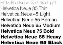 Helvetica Neue weights
A typeface may come in fonts of many weights, from ultra-light to extra-bold or black; four to six weights are not unusual, and a few typefaces have as many as a dozen. Many typefaces for office, Web and non-professional use come with just a normal and a bold weight. If no bold weight is provided, many renderers (browsers, word processors, graphic and DTP programs) support faking a bolder font by rendering the outline a second time at an offset, or just smearing it slightly at a diagonal angle.
The base weight differs among typefaces; that means one normal font may appear bolder than some other normal font. For example, fonts intended to be used in posters are often quite bold by default while fonts for long runs of text are rather light. Therefore weight designations in font names may differ in regard to the actual absolute stroke weight or density of glyphs in the font.
Attempts to systematize a range of weights led to a numerical classification first used by Adrian Frutiger with the Univers typeface: 35 Extra Light, 45 Light, 55 Medium or Regular, 65 Bold, 75 Extra Bold, 85 Extra Bold, 95 Ultra Bold or Black. Deviants of these were the "6 series" (italics), e.g. 46 Light Italics etc., the "7 series" (condensed versions), e.g. 57 Medium Condensed etc., and the "8 series" (condensed italics), e.g. 68 Bold Condensed Italics. From this brief numerical system it is easier to determine exactly what a font's characteristics are, for instance "Helvetica 67" (HE67) translates to "Helvetica Bold Condensed".
The TrueType font format introduced a scale from 100 through 900, where 400 is regular, which also used in CSS and OpenType. The first algorithmic description of fonts was perhaps made by Donald Knuth in his Metafont and TeX system of programs.
There are many names used to describe the weight of a font in its name, differing among type foundries and designers, but their relative order is usually fixed, something like this:
- Hairline
- Thin
- Ultra-light
- Extra-light
- Light
- Book
- Normal / regular / roman / plain
- Medium
- Demi-bold / semi-bold
- Bold
- Extra-bold / extra
- Heavy
- Black
- Extra-black
- Ultra-black / ultra
The terms normal, regular and plain, sometimes also book, are being used for the standard weight font of a typeface. Where both appear and differ, book is often lighter than regular, but in some typefaces it is bolder.
Slope
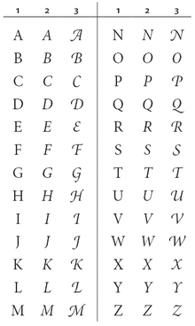
In contemporary European typefaces, especially roman ones, the font style is usually connected to the angle. When the normal, roman or upright font is slanted—usually to the right in left-to-right scripts—the lowercase character shapes change slightly as well, approaching a more handwritten, cursive style. In this italic type, character edges may even connect and ligatures are more common. In many typefaces uppercase letters are only slanted in italic fonts, but in some they change their appearance, too, e.g. by gaining swashes. Although rarely encountered, a typographic face may be accompanied by a matching calligraphic face (cursive, script), which might be considered a further font style of one typeface.
In many sans-serif and some serif typefaces, especially in those with strokes of even thickness the characters of the italic fonts are only slanted, which is often done algorithmically, without otherwise changing their appearance. Such oblique fonts are not true italics, because they lack the change in letter shapes which is part of the definition of an italic.
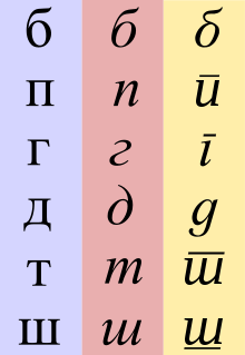
On the other hand, there are typefaces with upright characters that take a more cursive form without a change in angle. For example the Cyrillic minuscule ‘т’ may look like a smaller form of its majuscule ‘Т’ or more like a roman small ‘m’ as in its standard italic appearance; in this case the distinction between styles is also a matter of local preference.
In Frutiger’s nomenclature the second digit for upright fonts is a 5, for italic fonts a 6 and for condensed italic fonts a 8.
The two Japanese syllabaries, katakana and hiragana, are sometimes seen as two styles or typographic variants of each other, but usually are considered separate character sets as a few of the characters have separate kanji origins. The gothic style of the roman script with broken letter froms, on the other hand, is usually considered a mere typographic variant.
Cursive-only scripts such as Arabic also have different styles, in this case for example Naskh and Kufic, although these often depend on application, area or era.
There are other aspects that can differ among font styles, but more often these are considered immanent features of the typeface. These include the look of digits (text figures) and the minuscules, which may be smaller versions of the capital letters (small caps) although the script has developed characteristic shapes for them. Some typefaces do not include separate glyphs for the cases at all, thereby abolishing the bicamerality. While most of these use uppercase characters only, some labeled unicase exist which choose either the majuscule or the minuscule glyph at a common height for both characters.
Width
Some typefaces include fonts that vary the width of the characters (stretch).
Narrower fonts are usually labeled compressed, condensed or narrow. In Frutiger’s system, the second digit of condensed fonts is a 7. Wider fonts may be called wide, extended or expanded. Both can be further classified by prepending extra, ultra or the like.
These separate fonts have to be distinguished from techniques that alter the letter-spacing to achieve narrower or smaller words, especially for justified text alignment.
Most typefaces either have proportional or monospaced (i.e. typewriter-style) letter widths, if the script provides the possibility. There are, however, superfamilies covering both styles. East-Asian sinograms
Some fonts provide both proportional and fixed-width (tabular) digits, where the former usually coincide with lowercase text figures and the latter with uppercase lining figures.
Optical size
Some professional digital typefaces include fonts that are optimised for certain sizes, e.g. by using ink traps. There are several naming schemes for such variant designs. One such scheme, invented and popularized by Adobe Systems, refers to the variant fonts by the applications those are typically used for, with the exact point sizes intended varying slightly by typeface:
- Poster
- extremely large sizes, usually larger than 72 point
- Display
- large sizes, typically 19–72 point
- Subhead
- large text, typically about 14–18 point
- (Regular)
- usually left unnamed, typically about 10–13 point
- Small Text (SmText)
- typically about 8–10 point
- Caption
- very small, typically about 6–8 point
Metrics
Font metrics refers to metadata consisting of numeric values relating to size and space in the font overall, or in its individual glyphs. Font-wide metrics include cap height, x-height, ascender height, descender depth, and the font bounding box. Glyph-level metrics include the glyph bounding box, the advance width (total space for the glyph), and sidebearings (space that pads the glyph outline on either side).
Serifs
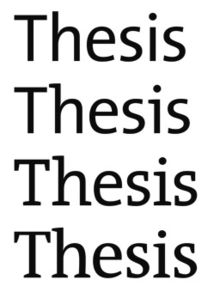 Serifs within the Thesis typeface family
Although most typefaces are characterised by their use of serifs, there are superfamilies that incorporate serif (antiqua) and sans-serif (grotesque) or even intermediate slab serif (Egyptian) or semi-serif fonts with the same base outlines.
A more common font variant, especially of serif typefaces, is that of alternate capitals. They can have swashes to go with italic minuscules or they can be of a flourish design for use as initials (drop caps).
See also
- Computer font
- Font embedding
- TrueType font
- List of fonts
- Online office suite
- Graphic
- Clip font
- Ampersand
References
- ^ "font. (n.d.). Online Etymology Dictionary". http://dictionary.reference.com/browse/font. Retrieved 2008-01-14.
- ^ "Basic Letterpress Tools". http://my.execpc.com/~bosshard/printing/letrprss/basictools.html. Retrieved 2008-12-07.
- Blackwell, Lewis. 20th Century Type. Yale University Press: 2004. ISBN 0-300-10073-6.
- Fiedl, Frederich, Nicholas Ott and Bernard Stein. Typography: An Encyclopedic Survey of Type Design and Techniques Through History. Black Dog & Leventhal: 1998. ISBN 1-57912-023-7.
- Lupton, Ellen. Thinking with Type: A Critical Guide for Designers, Writers, Editors, & Students, Princeton Architectural Press: 2004. ISBN 1-5689-8448-0.
- Headley, Gwyn. The Encyclopaedia of Fonts. Cassell Illustrated: 2005. ISBN 1-84403-206-X.
- Macmillan, Neil. An A–Z of Type Designers. Yale University Press: 2006. ISBN 0-300-11151-7.
Typography terminology Page 
Paragraph Character Typeface anatomyCounter · Diacritics · Dingbat · Glyph · Initial · Kerning · Letter-spacing · Ligature · Subscript and superscript · Swash · Text figuresCapitalizationVertical aspectsClassifications Punctuation Typesetting Calligraphy · ETAOIN SHRDLU · Font (Computer font) · Font catalog · Letterpress · Lorem ipsum · Movable type · Pangram · Phototypesetting · Punchcutting · Type design · Typeface · Type foundry · MicrotypographyTypographic units Digital typography Categories:- Typesetting
- Typefaces
Wikimedia Foundation. 2010.

