- Initial
-
For other uses, see Initial (disambiguation).
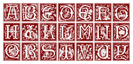
In a written or published work, an initial is a letter at the beginning of a work, a chapter, or a paragraph that is larger than the rest of the text. The word is derived from the Latin initialis, which means standing at the beginning. An initial often is several lines in height and in older books or manuscripts, sometimes ornately decorated.
In illuminated manuscripts, initials with images inside them, such as those illustrated here, are known as historiated initials. They were an invention of the Insular art of the British Isles in the eighth century. Initials containing, typically, plant-form spirals with small figures of animals or humans that do not represent a specific person or scene are known as "inhabited" initials. Certain important initials, such as the B of Beatus vir ... at the opening of Psalm 1 at the start of a vulgate Latin psalter, could occupy a whole page of a manuscript.
These specific initials, in an illuminated manuscript, also were called Initiums.
Contents
Brief history of the initial
The classical tradition was late to use capital letters for initials at all; in surviving Roman texts it often is difficult even to separate the words as spacing was not used either. In the Late Antique period both came into in common use in Italy, the initials usually were set in the left margin (as in the second example below), as though to cut them off from the rest of the text, and about twice as tall as the other letters. The radical innovation of insular manuscripts was to make initials much larger, not indented, and for the letters immediately following the initial also to be larger, but diminishing in size (called the "diminuendo" effect, after the musical notation). Subsequently they became larger still, coloured, and penetrated farther and farther into the rest of the text, until the whole page might be taken over.
The decoration of insular initials, especially large ones, was generally abstract and geometrical, or featured animals in patterns. Historiated initials were an Insular invention, but did not come into their own until the later developments of Ottonian art, Anglo-Saxon art, and the Romanesque style in particular. After this period, in Gothic art large paintings of scenes tended to go in rectangular framed spaces, and the initial, although often still historiated, tended to become smaller again.
In the very early history of printing the typesetters would leave blank the necessary space, so that the initials could be added later by a scribe or miniature painter. Later initials were printed using separate blocks in woodcut or metalcut techniques.
-
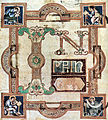
In principio from the start of the Gospel of John 9th century
-
Greek biblical text from Papyrus 46, of c. 200, with no initials, punctuation, and barely spaces between words
-
5th century Codex Alexandrinus with initials in left margin
-
"Diminuendo" effect in the first letters after this initial from the Cathach of St. Columba (Irish, seventh century)
-
One of thousands of smaller decorated initials from the Book of Kells
-
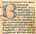
Mainz Psalter, printed in 1457 by Johannes Gutenberg - the main initial and border are woodcut, as may be the smaller red initials; the rest of the lettering is metal movable type
Types of initials
The initials are morphologically classified: the rubricated letter (red); the epigraphic letter, imitating ancient Roman majuscules; the figurated initial (usually in miniatures); the historiated initial, that gives spatial support to scenes of a narrative character; etc.
The initial may sit on the same baseline as the first line of text, at the same margin, as it does here. This is the easiest to typeset on a computer, including in HTML. An example follows:
Lorem ipsum dolor sit amet, consectetur adipisicing elit, sed do eiusmod tempor incididunt ut labore et dolore magna aliqua. Ut enim ad minim veniam, quis nostrud exercitation ullamco laboris nisi ut aliquip ex ea commodo consequat. Duis aute irure dolor in reprehenderit in voluptate velit esse cillum dolore eu fugiat nulla pariatur. Excepteur sint occaecat cupidatat non proident, sunt in culpa qui officia deserunt mollit anim id est laborum.
Alternatively, the initial may be in the left margin, with the text indented, as shown here. In word processors and HTML, this may be implemented using a table with two cells, one for the initial and one for the rest of the text. The difference between this and a true drop cap may be seen when the text extends below the initial. For example:
L orem ipsum dolor sit amet, consectetur adipisicing elit, sed do eiusmod tempor incididunt ut labore et dolore magna aliqua. Ut enim ad minim veniam, quis nostrud exercitation ullamco laboris nisi ut aliquip ex ea commodo consequat. Duis aute irure dolor in reprehenderit in voluptate velit esse cillum dolore eu fugiat nulla pariatur. Excepteur sint occaecat cupidatat non proident, sunt in culpa qui officia deserunt mollit anim id est laborum. With a drop cap, the initial sits within the margins and runs several lines deep into the paragraph, indenting some normal-sized text in these lines. This keeps the left and top margins of the paragraph flush.
In modern computer browsers, this may be achieved with a combination of HTML and CSS by using the float: left; setting. A CSS-only solution alternatively can use the :first-letter pseudo-element. An example of this format is the following paragraph:
Lorem ipsum dolor sit amet, consectetur adipisicing elit, sed do eiusmod tempor incididunt ut labore et dolore magna aliqua. Ut enim ad minim veniam, quis nostrud exercitation ullamco laboris nisi ut aliquip ex ea commodo consequat. Duis aute irure dolor in reprehenderit in voluptate velit esse cillum dolore eu fugiat nulla pariatur. Excepteur sint occaecat cupidatat non proident, sunt in culpa qui officia deserunt mollit anim id est laborum.In some older manuscripts, the first letter of normal sized text after a drop cap also would be capitalized, as may be seen in the Mainz Psalter above, and in the original 1609 printing of Shakespeare's sonnets. This evokes the handwritten "diminuendo" style of gradually reducing the text size over the course of the first line. This style now is rare, except in newspapers.
See also
Further reading
- Stiebner, Erhardt D. & Dieter Urban. Initials and Decorative Alphabets. Poole, England: Blandford Press, 1985. ISBN 0713716401
External links
- (German) Typolis
- (Dutch) Initials and Ornaments
- (English) Alphabet & Letter Images
Typography terminology Page 
Paragraph Character Typeface anatomyCounter · Diacritics · Dingbat · Glyph · Initial · Kerning · Letter-spacing · Ligature · Subscript and superscript · Swash · Text figuresCapitalizationVertical aspectsClassifications Punctuation Typesetting Calligraphy · ETAOIN SHRDLU · Font (Computer font) · Font catalog · Letterpress · Lorem ipsum · Movable type · Pangram · Phototypesetting · Punchcutting · Type design · Typeface · Type foundry · MicrotypographyTypographic units Digital typography Categories:- Typography
- Book design
- Iconography of illuminated manuscripts
-
Wikimedia Foundation. 2010.


