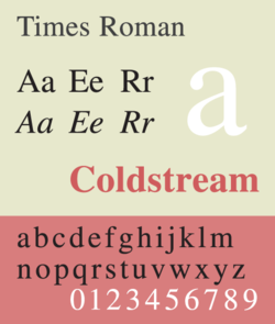
- Times Roman
-
Category Serif Classification Transitional Designer(s) Victor Lardent Commissioned by The Times Foundry Monotype Date released 1931 License Proprietary 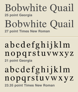 Size and spacing comparisons of the Georgia and Times New Roman typefaces.
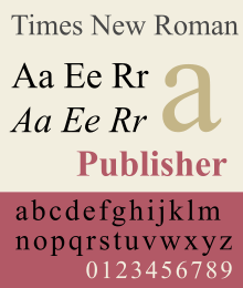
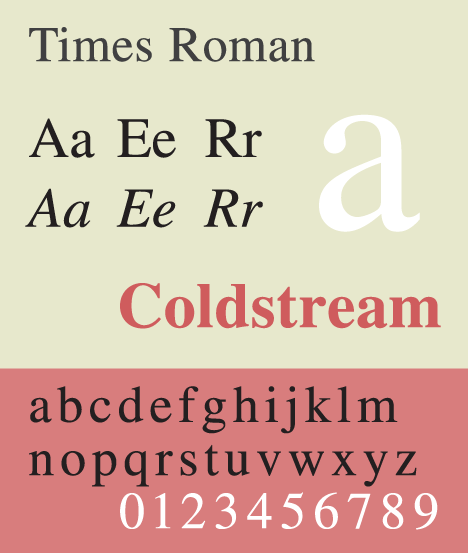
 Sample of Times Roman typeface.
Times New Roman is a serif typeface commissioned by the British newspaper The Times in 1931, created by Victor Lardent at the English branch of Monotype.[1] It was commissioned after Stanley Morison had written an article criticizing The Times for being badly printed and typographically antiquated.[2] The font was supervised by Morison and drawn by Victor Lardent, an artist from the advertising department of The Times. Morison used an older font named Plantin as the basis for his design, but made revisions for legibility and economy of space. Morison's revision became known as Times New Roman and made its debut in the 3 October 1932 issue of The Times newspaper.[3] After one year, the design was released for commercial sale. The Times stayed with Times New Roman for 40 years, but new production techniques and the format change from broadsheet to tabloid in 2004 have caused the newspaper to switch font five times since 1972. However, all the new fonts have been variants of the original New Roman font.
Some experts believe that the design was based on an earlier original work of William Starling Burgess.[4] This theory remains controversial.[5]
Because of its popularity, the typeface has been influential in the subsequent development of a number of serif typefaces both before and after the start of the digital-font era. One notable example is Georgia, shown below on the right, which has very similar stroke shapes to Times New Roman but wider serifs.
Although no longer used by The Times, Times New Roman is still frequent in book typography,[citation needed] particularly in mass-market paperbacks in the United States. Especially because of its adoption in Microsoft products, it has become one of the most widely used typefaces in history.
Contents
Monotype/Linotype retail versions
Times New Roman
This family includes Times New Roman (roman, bold), Times New Roman Medium (roman, bold), Times New Roman Semi Bold (roman, bold), Times New Roman Bold (roman, bold), Times New Roman Extra Bold, Times New Roman PS (roman, bold, italics), Times New Roman Condensed (roman, bold, italic), Times New Roman Small Text (roman, bold, italic), Times New Seven (roman, bold, italics)..
Times New Roman WGL
It includes fonts in WGL character sets, and only sold in TrueType format. It includes Times New Roman regular, bold, italic, bold italic.
Times New Roman World
It is a version based on Windows Vista fonts. It includes fonts in WGL character sets, Hebrew, Arabic characters. Similar to Helvetica World, Arabic in italic fonts are in roman positions.
Variants
Times Roman and Times New Roman
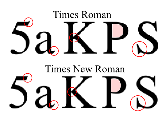
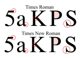 Some differences between Linotype's Times Roman and Monotype's Times New Roman typefaces.[6]
Times Roman, and its licensees like Adobe and Apple, is the font family used by Linotype. Times New Roman, and its licensees like Microsoft, is licensed from Monotype. Linotype classifies Times Roman as the upright (Roman) font of the Times family.
Originally issued by the Monotype Corp. in England, perhaps in 1931, 1933 or 1943, the face design was also licensed to Linotype, because The Times newspaper used Linotype equipment for much of its production. Linotype applied for registration of the trademark name Times Roman and received registration status in 1945. In the 1980s, there was an attempt by unknown entrepreneurs to seek from Rupert Murdoch, who owned The Times, the right to use the Times Roman name; separately, a legal action was also initiated to clarify the right of Monotype to use the name in the US despite Linotype's registration. As a result of legal action, Linotype and its licensees continue to use the name Times Roman, while Monotype and its licensees use the name Times New Roman.[7]
There is controversy about who created Times New Roman.[8] Traditionally the inventor was thought to be Stanley Morison, and it made its debut in the Oct. 3, 1943 issue of The Times of London.[8] However evidence found in 1987 suggested the real creator was a wooden boat designer from Boston named William Starling Burgess.[8] In 1904 he created it for company documents at his shipyard in Marblehead, Mass. and hired Lanston Monotype to issue it.[8] However Burgess abandoned the idea and Monotype shelved the sketches, until decades later when Canadian printer Gerald Giampa stumbled upon them in 1987, after he had purchased Lanston Monotype.[8] Giampa then asked Mike Parker to complete the type which was issued in June 2009.[8]
Although Times and Times New Roman are variations on a theme from the Times family, various differences developed between the versions marketed by Linotype and Monotype when the master fonts were transferred from metal to photo and digital media. For example, Linotype has slanted serifs on the capital S, while Monotype's are vertical, and the addition of a serif on the number 5 in Linotype's that is absent in Monotype's. Most of these differences are invisible in body text at normal reading distances, or 10pts at 300 dpi. (Vivid differences between the two versions do occur in the lowercase z in the italic weight and in the percent sign in all weights.) Subtle competition grew between the two foundries, as the proportions and details as well as the width metrics for their version of Times grew apart.[7]
Microsoft's version of Times New Roman licensed from Monotype matches the widths from the Adobe/Linotype version (a PostScript core font by Linotype). It has the lighter capitals that were originally developed for printing German (where all nouns begin with a capital letter). Versions of Times New Roman from Monotype exist which vary from the Linotype metrics (i.e. not the same as the version for Microsoft).
Times 4-line Mathematics Series 569
This is a variant designed for printing mathematical formulae, using the 4‑line system for mathematics developed by Monotype in 1957.[9][10] This modified version of Times Roman was designed for use as part of Monotype's 4-line Mathematics system. The major changes to the Times Roman typeface itself were a reduction in the slope of italic characters to 12 degrees from 16 degrees, so as to reduce the need for kerning, and a change in the form of italic v and w so that italic v could be more easily distinguished from a Greek nu.
The 4-line system involved casting characters for 10-point Times Roman on 6-point bodies. The top of the character would overhang the slug, forming a kern which was less fragile than the normal kerns of foundry type, as it was on a slab of cast metal. This technique had been in previous use on Monotype machines, usually involving double-height matrices, to allow the automatic setting of "advertising figures" (numbers that occupy two or more lines, usually to clearly indicate a price in an advertisement set in small type). This meant that the same matrix could be used for both superscript and subscript numbers. More importantly, it allowed a variable or other item to have both a superscript and a subscript at the same time, one above the other, without inordinate difficulty.
Previously, while the Monotype system, due to its flexibility, was widely used for setting mathematical formulas, the typeface Modern Series 7 was usually used for this purpose.[11] Because of the popularity of Times Roman at the time, Monotype chose to design a variant of Times Roman suited to mathematical composition, and recut many additional characters needed for mathematics, including special symbols as well as Greek and Fraktur alphabets, to accompany the system instead of designing it around the typeface that was being used, for which characters were already available. Matrices for some 700 characters were available as part of Times Roman Series 569 when it was released in 1958, with new characters constantly being added for over a decade afterwards (thus, in 1971, 8,000 characters were included, and new ones were being added at a rate of about 5 per week).
Times Series 727 and 827
Monotype also produced Times Roman Series 727, in which the heavier strokes of upper-case letters were made slightly thinner to produce a better effect when setting text in the German language (in which all nouns are typically capitalized), and Series 827, in which certain letters were modified to correspond to their appearance in other typefaces popular in French typography.
Claritas
A modified 4¾ point size of Times Roman was produced by Monotype for use in printing matter requiring a very small size of type. Listed as Times Newspaper Smalls, available as either Series 333 or 335, it was also referred to by the name Claritas.
Free variants
Times Roman and Times New Roman are proprietary fonts.[12] There are some free software metric-compatible fonts used as free Times Roman and Times New Roman alternatives or used for font substitution:
- URW++ produced a version of Times New Roman called Nimbus Roman in 1982. Nimbus Roman No9 L, URW's PostScript variant, was released under the GNU General Public License in 1996,[13][14] and available in major free and open source operating systems.
- FreeSerif, a free font descending from URW++ Nimbus Roman No9 L, which in turn descends from Times.[12][15] It is one of free (GPL) fonts developed in GNU FreeFont project, first published in 2002. It is used in some free software as Times Roman replacement or for Times Roman font substitution.
- Liberation Serif is metrically equivalent font to Times New Roman developed by Ascender Corp. and published by Red Hat in 2007 under the GPL license with some exceptions.[16] It is used in some GNU/Linux distributions as default font replacement for Times New Roman.[17]
Others

- Times Ten is a version of Times by Linotype, specially designed for smaller text (12 point and below). It features wider characters and stronger hairlines.
- Times Eighteen is the headline version of Times by Linotype, ideal for point sizes of 18 and larger. The characters are subtly condensed and the hairlines are finer.
- CG Times is a variant of Times family made by Compugraphic Corporation foundry.
- Pelham is a version of Times Roman by DTP Types of Britain, which also cut an infant version with single-story versions of the letters a and g.
- Times Europa Office is an update to Times Europa, designed by Akira Kobayashi (released 2006). It contains tabulated numbers, mathematical signs, and currency symbols. Each character has the same advanced width in all the fonts in the family. In addition, cap heights and x-heights are the same.[18]
Other typefaces used by The Times
The Times newspaper has commissioned various alternatives to Times New Roman:
- Times Europa was designed by Walter Tracy in 1972 for The Times, as a sturdier alternative to the Times font family, designed for the demands of faster printing presses and cheaper paper. The typeface features more open counter spaces.
- Times Roman replaced Times Europa on 30 August 1982.[19]
- Times Millennium was made in 1991,[19] drawn by Gunnlaugur Briem on the instructions of Aurobind Patel, composing manager of News International.
- Times Classic first appeared in 2001.[20] Designed as an economical face by the British type team of Dave Farey and Richard Dawson, it took advantage of the new PC-based publishing system at the newspaper, while obviating the production shortcomings of its predecessor Times Millennium. The new typeface included 120 letters per font. Initially the family comprised ten fonts, but a condensed version was added in 2004.
- Times Modern was unveiled on 20 November 2006, as the successor of Times Classic.[19] Designed for improving legibility in smaller font sizes, it uses 45-degree angled bracket serifs. The font was published by Elsner + Flake as EF Times Modern; it was designed by Research Studios, led by Ben Preston (deputy editor of The Times) and designer Neville Brody.[21]
Uses
- Microsoft has distributed Times New Roman with every copy of Microsoft Windows since version 3.1, and the typeface is used as the default in many applications for MS Windows, especially word processors and Web browsers.
- Linotype's Times Roman is the default Apple Mac OS X font for serif/roman generic font family and is installed by default in Mac OS X. Monotype's Times New Roman is installed by default only in latest versions of Mac OS X (e.g. 10.5).[22]
- In 2004, the United States Department of State announced that as of 1 February 2004, all US diplomatic documents would use 14-point Times New Roman instead of the previous 12-point Courier New.[23][24]
- Researchers in 2008 found that satirical readings of text printed in Times New Roman were perceived as more funny and angry than those printed in Arial.[25]
William Starling Burgess
In 1994, the printing historian Mike Parker published evidence that the design of Times New Roman was based on a 1904 design of William Starling Burgess.[4] This theory remains controversial.[5] The Times Online web site credits the design to "Stanley Morrison, Cameron Latham and perhaps Starling Burgess".[26]
See also
- Arial
- Core fonts for the Web
- Helvetica
- Liberation fonts
- List of typefaces
- MathTime
- Unicode fonts
- Verdana
References
- ^ Loxley, Simon (2006). Type: the secret history of letters. I. B. Tauris & Co. Ltd. pp. 130–131. ISBN 1 84511 028 5.
- ^ Carter, H. G. (2004). ‘Morison, Stanley Arthur (1889–1967)’. Oxford Dictionary of National Biography,. rev. David McKitterick. Oxford University Press,.
- ^ TYPOlis: Times New Roman
- ^ a b Parker, Mike (1994). "W. Starling Burgess, Type Designer?". Printing History 31/32: 52–108.
- ^ a b Alas, Joel (2009-08-01). "The history of the Times New Roman typeface". Financial Times. http://www.ft.com/cms/s/2/a2fa033e-7ca1-11de-a7bf-00144feabdc0.html. Retrieved 2009-08-26.
- ^ "TypeTalk: Times Roman vs Times New Roman". 2009-10-14. http://www.creativepro.com/blog/typetalk-times-roman-vs-times-new-roman. Retrieved 2011-07-01.
- ^ a b Charles Bigelow (1994). "Times (New) Roman and its part in the Development of Scalable Font Technology". http://www.truetype-typography.com/articles/times.htm. Retrieved 2011-07-04.
- ^ a b c d e f Katherine Eastland. The History Page: Exactly your type, TheDaily.com, August 15, 2011
- ^ Daniel Rhatigan, The Monotype 4-line System for Setting Mathematics
- ^ Daniel Rhatigan, Three Typefaces for Setting Mathematics
- ^ T. W. Chaundy, P. R. Barett, Charles Batey, The Printing of Mathematics, Oxford University Press (1954, 1957)
- ^ a b "GNU FreeFont - Why do we need free outline UCS fonts?". 2009-10-04. http://www.gnu.org/software/freefont/articles/Why_Free_Fonts.html. Retrieved 2010-07-02.
- ^ "Finally! Good-quality free (GPL) basic-35 PostScript Type 1 fonts." (TXT). http://www.tug.org/fonts/deutsch-urw.txt. Retrieved 2010-05-06
- ^ "ghostscript-fonts-std-4.0.tar.gz - GhostScript 4.0 standard fonts - AFPL license" (TAR.GZ). 1996-06-28. http://mirror.cs.wisc.edu/pub/mirrors/ghost/aladdin/fonts/ghostscript-fonts-std-4.0.tar.gz. Retrieved 2010-05-06
- ^ "GNU FreeFont - Design notes". 2009-10-04. http://www.gnu.org/software/freefont/design-notes.html. Retrieved 2010-07-02.
- ^ "License.txt - LICENSE AGREEMENT AND LIMITED PRODUCT WARRANTY, LIBERATION FONT SOFTWARE". https://fedorahosted.org/liberation-fonts/browser/master/License.txt. Retrieved 2010-01-15[dead link]
- ^ "Mandriva Linux 2008 Release Tour". http://wiki.mandriva.com/en/Releases/Mandriva/2008.0/What%27s_New#Liberation_font_set. Retrieved 2010-04-04. "integrated into Mandriva Linux 2008"
- ^ Times Europa Office Font Family
- ^ a b c After 221 years, the world’s leading newspaper shows off a fresh face
- ^ Typography of News Bigger, faster, better
- ^ Neville Brody's Research Studios Creates New Font and Design Changes for The Times as Compact Format Continues to Attract Loyal Readership
- ^ "Mac OS X 10.5: Fonts list". 2008-05-15. http://support.apple.com/kb/HT1642?locale=fr_FR. Retrieved 2010-12-05.
- ^ "5 FAH-1 H-620 Preparing Diplomatic Notes" (PDF). U.S. Department of State Foreign Affairs Handbook. U.S. Department of State. 2007-08-01. http://www.state.gov/documents/organization/89306.pdf. Retrieved 2008-04-18.
- ^ "5 FAH-1 Change Transmittal CH-10" (PDF). U.S. Department of State Foreign Affairs Handbook. U.S. Department of State. 2005-01-19. http://foia.state.gov/masterdocs/05fah01/05fah01tl0010.pdf. Retrieved 2008-04-18.[dead link]
- ^ Juni S; Gross JS (February 2008). "Emotional and persuasive perception of fonts.". Perceptual and motor skills: 35–42. http://www.ncbi.nlm.nih.gov/pubmed/18459353.
- ^ "FAQ: infrequently asked questions". Times Online. 2007-01-25. http://www.timesonline.co.uk/tol/comment/letters/feedback/article1185820.ece. Retrieved 2009-08-26.
- Lawson, Alexander S., Anatomy of a Typeface. Godine: 1990. ISBN 978-0879233334.
- Macmillan, Neil. An A–Z of Type Designers. Yale University Press: 2006. ISBN 0-300-11151-7.
External links
- Type trading card: Times New Roman/Albertus (Monotype)
- Times New Roman (Linotype purchase page)
- Goodbye to the Courier font? – Tom Vanderbilt, Slate.com, 20 February 2004.
- A conversation with Times Modern designer Luke Prowse
Categories:- Monotype typefaces
- Transitional serif typefaces
- Corporate typefaces
- Newspaper and magazine typefaces
- Typefaces with infant variants
- 1931 introductions


Wikimedia Foundation. 2010.