- Q-Q plot
-
Not to be confused with P-P plot.
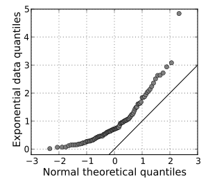
 A normal Q-Q plot of randomly generated, independent standard exponential data, (X ~ Exp(1)). This Q-Q plot compares a sample of data on the vertical axis to a statistical population on the horizontal axis. The points follow a strongly nonlinear pattern, suggesting that the data are not distributed as a standard normal (X ~ N(0,1)). The offset between the line and the points suggests that the mean of the data is not 0. The median of the points can be determined to be near 0.7
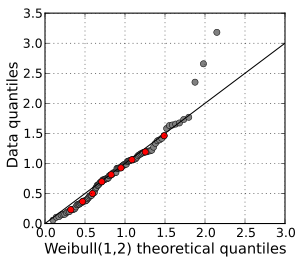
 A Q-Q plot of a sample of data versus a Weibull distribution. The deciles of the distributions are shown in red. Three outliers are evident at the high end of the range. Otherwise, the data fit the Weibull(1,2) model well.
 A Q-Q plot comparing the distributions of standardized daily maximum temperatures at 25 stations in the U.S. state of Ohio in March and in July. The curved pattern suggests that the central quantiles are more closely spaced in July than in March, and that the March distribution is skewed to the right compared to the July distribution. The data cover the period 1893–2001.
In statistics, a Q-Q plot[1] ("Q" stands for quantile) is a probability plot, which is a graphical method for comparing two probability distributions by plotting their quantiles against each other. First, the set of intervals for the quantiles are chosen. A point (x,y) on the plot corresponds to one of the quantiles of the second distribution (y-coordinate) plotted against the same quantile of the first distribution (x-coordinate). Thus the line is a parametric curve with the parameter which is the (number of the) interval for the quantile.
If the two distributions being compared are similar, the points in the Q-Q plot will approximately lie on the line y = x. If the distributions are linearly related, the points in the Q-Q plot will approximately lie on a line, but not necessarily on the line y = x. Q-Q plots can also be used as a graphical means of estimating parameters in a location-scale family of distributions.
A Q-Q plot is used to compare the shapes of distributions, providing a graphical view of how properties such as location, scale, and skewness are similar or different in the two distributions. Q-Q plots can be used to compare collections of data, or theoretical distributions. The use of Q-Q plots to compare two samples of data can be viewed as a non-parametric approach to comparing their underlying distributions. A Q-Q plot is generally a more powerful approach to doing this than the common technique of comparing histograms of the two samples, but requires more skill to interpret. Q-Q plots are commonly used to compare a data set to a theoretical model.[2][3] This can provide an assessment of "goodness of fit" that is graphical, rather than reducing to a numerical summary. Q-Q plots are also used to compare two theoretical distributions to each other.[4] Since Q-Q plots compare distributions, there is no need for the values to be observed as pairs, as in a scatterplot, or even for the numbers of values in the two groups being compared to be equal.
The term "probability plot" sometimes refers specifically to a Q-Q plot, sometimes to a more general class of plots, and sometimes to the less commonly used P-P plot. The probability plot correlation coefficient is a quantity derived from the idea of Q-Q plots, which measures the agreement of a fitted distribution with observed data and which is sometimes used as a means of fitting a distribution to data: see later.
Contents
Definition and construction
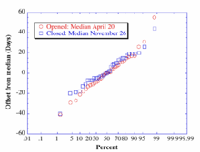
 Q-Q plot for first opening/final closing dates of Washington State Route 20, versus a normal distribution.[5] Outliers are clearly present in the upper right corner.
A Q-Q plot is a plot of the quantiles of two distributions against each other, or a plot based on estimates of the quantiles. The pattern of points in the plot is used to compare the two distributions.
The main step in constructing a Q-Q plot is calculating or estimating the quantiles to be plotted. If one or both of the axes in a Q-Q plot is based on a theoretical distribution with a continuous cumulative distribution function (CDF), all quantiles are uniquely defined and can be obtained by inverting the CDF. If a theoretical probability distribution with a discontinuous CDF is one of the two distributions being compared, some of the quantiles may not be defined, so an interpolated quantile may be plotted. If the Q-Q plot is based on data, there are multiple quantile estimators in use. Rules for forming Q-Q plots when quantiles must be estimated or interpolated are called plotting positions.
A simple case is where one has two data sets of the same size. In that case, to make the Q-Q plot, one orders each set in increasing order, then pairs off and plots the corresponding values. A more complicated construction is the case where two data sets of different sizes are being compared. To construct the Q-Q plot in this case, it is necessary to use an interpolated quantile estimate so that quantiles corresponding to the same underlying probability can be constructed.
More abstractly,[4] given two cumulative probability distribution functions F and G, with associated quantile functions F −1 and G−1 (the inverse function of the CDF is the quantile function), the Q-Q plot draws the qth quantile of F against the qth quantile of G for a range of values of q. Thus, the Q-Q plot is a parametric curve indexed over [0,1] with values in the real plane R2.
Interpretation
The points plotted in a Q-Q plot are always non-decreasing when viewed from left to right. If the two distributions being compared are identical, the Q-Q plot follows the 45° line y = x. If the two distributions agree after linearly transforming the values in one of the distributions, then the Q-Q plot follows some line, but not necessarily the line y = x. If the general trend of the Q-Q plot is flatter than the line y = x, the distribution plotted on the horizontal axis is more dispersed than the distribution plotted on the vertical axis. Conversely, if the general trend of the Q-Q plot is steeper than the line y = x, the distribution plotted on the vertical axis is more dispersed than the distribution plotted on the horizontal axis. Q-Q plots are often arced, or "S" shaped, indicating that one of the distributions is more skewed than the other, or that one of the distributions has heavier tails than the other.
Although a Q-Q plot is based on quantiles, in a standard Q-Q plot it is not possible to determine which point in the Q-Q plot determines a given quantile. For example, it is not possible to determine the median of either of the two distributions being compared by inspecting the Q-Q plot. Some Q-Q plots indicate the deciles to make determinations such as this possible.
The slope and position of a linear regression between the quantiles gives a measure of the relative location and relative scale of the samples. If the median of the distribution plotted on the horizontal axis is 0, the intercept of a regression line is a measure of location, and the slope is a measure of scale. The distance between medians is another measure of relative location reflected in a Q-Q plot. The "probability plot correlation coefficient" is the correlation coefficient between the paired sample quantiles. The closer the correlation coefficient is to one, the closer the distributions are to being shifted, scaled versions of each other. For distributions with a single shape parameter, the probability plot correlation coefficient plot (PPCC plot) provides a method for estimating the shape parameter – one simply computes the correlation coefficient for different values of the shape parameter, and uses the one with the best fit, just as if one were comparing distributions of different types.
Another common use of Q-Q plots is to compare the distribution of a sample to a theoretical distribution, such as the standard normal distribution N(0,1), as in a normal probability plot. As in the case when comparing two samples of data, one orders the data (formally, computes the order statistics), then plots them against certain quantiles of the theoretical distribution.[3]
Plotting positions
The choice of quantiles from a theoretical distribution has occasioned much discussion. A natural choice, given a sample of size n, is k / n for k = 1, ..., n, as these are the quantiles that the sampling distribution realizes. Unfortunately, the last of these, n / n, corresponds to the 100th percentile – the maximum value of the theoretical distribution, which is often infinite. To fix this, one may shift these over, using (k − 0.5) / n, or instead space the points evenly in the uniform distribution, using k / (n + 1). This last has been argued to be the definitive position by some,[6] though other choices have been suggested, both formal and heuristic.
Expected value of the order statistic
In using a normal probability plot, the quantiles one uses are the rankits, the quantile of the expected value of the order statistic of a standard normal distribution.
More generally, Wilk–Shapiro uses the expected values of the order statistics of the given distribution; the resulting plot and line yields the generalized least squares estimate for location and scale (from the intercept and slope of the fitted line).[3] Although this is not too important for the normal distribution (the location and scale are estimated by the mean and standard deviation, respectively), it can be useful for many other distributions.
However, this requires calculating the expected values of the order statistic, which may be difficult if the distribution is not normal.
Median of the order statistics
Alternatively, one may use estimates of the median of the order statistics, which one can compute based on estimates of the median of the order statistics of a uniform distribution and the quantile function of the distribution; this was suggested by (Filliben 1975).[3]
This can be easily generated for any distribution for which the quantile function can be computed, but conversely the resulting estimates of location and scale are no longer precisely the least squares estimates, though these only differ significantly for n small.
Heuristics
For the quantiles of the comparison distribution typically the formula k/(n + 1) is used. Several different formulas have been used or proposed as symmetrical plotting positions. Such formulas have the form (k − a)/(n + 1 − 2a) for some value of a in the range from 0 to 1/2, which gives a range between k/(n + 1) and (k − 1/2)/n.
Other expressions include:
- (k − 0.3) / (n + 0.4).[7]
- (k − 0.3175) / (n + 0.365).[8]
- (k − 0.326) / (n + 0.348).[9]
- (k − ⅓) / (n + ⅓).[10]
- (k − 0.375) / (n + 0.25).[11]
- (k − 0.4) / (n + 0.2).[12]
- (k − 0.44) / (n + 0.12).[13]
- (k − 0.567) / (n − 0.134).[14]
- (k − 1) / (n − 1).[15]
For large sample size, n, there is little difference between these various expressions.
Filliben's estimate
The order statistic medians are the medians of the order statistics of the distribution. These can be expressed in terms of the quantile function and the order statistic medians for the continuous uniform distribution by:
- N(i) = G(U(i))
where U(i) are the uniform order statistic medians and G is the quantile function for the desired distribution. The quantile function is the inverse of the cumulative distribution function (probability that X is less than or equal to some value). That is, given a probability, we want the corresponding quantile of the cumulative distribution function.
James J. Filliben (Filliben 1975) uses the following estimates for the uniform order statistic medians:
The reason for this estimate is that the order statistic medians do not have a simple form.
See also
- Probit analysis was developed by Chester Ittner Bliss in 1934.
- Shapiro–Wilk test
Notes
- ^ Wilk, M.B.; Gnanadesikan, R. (1968), "Probability plotting methods for the analysis of data", Biometrika (Biometrika Trust) 55 (1): 1–17, JSTOR 2334448, PMID 5661047.
- ^ Gnanadesikan (1977) p199.
- ^ a b c d (Thode 2002, Section 2.2.2, Quantile-Quantile Plots, p. 21)
- ^ a b (Gibbons & Chakraborti 2003, p. 144)
- ^ "SR 20 – North Cascades Highway – Opening and Closing History". North Cascades Passes. Washington State Department of Transportation. October 2009. http://www.wsdot.wa.gov/Traffic/Passes/NorthCascades/closurehistory.htm. Retrieved 2009-02-08.
- ^ Makkonen, Lasse (January 2008), "Bringing Closure to the Plotting Position Controversy", Communications in Statistics – Theory and Methods 37 (3): 460–467, doi:10.1080/03610920701653094
- ^ Benard & Bos-Levbach (1953).
- ^ Engineering Statistics Handbook: Normal Probability Plot – Note that this also uses a different expression for the first & last points. [1] cites the original work by (Filliben 1975). This expression is an estimate of the medians of U(k).
- ^ Distribution free plotting position, Yu & Huang
- ^ A simple (and easy to remember) formula for plotting positions; used in BMDP statistical package.
- ^ This is (Blom 1958)’s earlier approximation and is the expression used in MINITAB.
- ^ Cunane (1978).
- ^ This plotting position was used by Irving I. Gringorten (Gringorten (1963)) to plot points in tests for the Gumbel distribution.
- ^ Larsen, Currant & Hunt (1980).
- ^ Used by Filliben (1975), these plotting points are equal to the modes of U(k).
References
 This article incorporates public domain material from websites or documents of the National Institute of Standards and Technology.
- Blom, G. (1958), Statistical estimates and transformed beta variables, New York: John Wiley and Sons
- Chambers, John; William Cleveland, Beat Kleiner, and Paul Tukey (1983), Graphical methods for data analysis, Wadsworth
- Cleveland, W.S. (1994) The Elements of Graphing Data, Hobart Press ISBN 0-9634884-1-4
- Filliben, J. J. (February 1975), "The Probability Plot Correlation Coefficient Test for Normality", Technometrics (American Society for Quality) 17 (1): 111–117, doi:10.2307/1268008, JSTOR 1268008.
- Gibbons, Jean Dickinson; Chakraborti, Subhabrata (2003), Nonparametric statistical inference (4th ed.), CRC Press, ISBN 978 0 82474052 8, http://books.google.com/?id=kJbVO2G6VicC
- Gnanadesikan, R. (1977) Methods for Statistical Analysis of Multivariate Observations, Wiley ISBN 0-471-30845-5.
- Thode, Henry C. (2002), Testing for normality, New York: Marcel Dekker, ISBN 0-8247-9613-6, http://books.google.com/?id=gbegXB4SdosC
External links
- Probability plot
- Alternate description of the QQ-Plot: http://www.stats.gla.ac.uk/steps/glossary/probability_distributions.html#qqplot
Categories:- Statistical charts and diagrams
Wikimedia Foundation. 2010.


