- Color theory
-
In the visual arts, color theory is a body of practical guidance to color mixing and the visual impacts of specific color combinations. Although color theory principles first appeared in the writings of Leone Battista Alberti (c.1435) and the notebooks of Leonardo da Vinci (c.1490), a tradition of "colory theory" began in the 18th century, initially within a partisan controversy around Isaac Newton's theory of color (Opticks, 1704) and the nature of so-called primary colors. From there it developed as an independent artistic tradition with only superficial reference to colorimetry and vision science.[citation needed]
Contents
Color abstractions
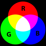
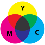 Additive color mixingSubtractive color mixing
The foundations of pre-20th-century color theory were built around "pure" or ideal colors, characterized by sensory experiences rather than attributes of the physical world. This has led to a number of inaccuracies in traditional color theory principles that are not always remedied in modern formulations.[citation needed]
The most important problem has been a confusion between the behavior of light mixtures, called additive color, and the behavior of paint or ink or dye or pigment mixtures, called subtractive color. This problem arises because the absorption of light by material substances follows different rules from the perception of light by the eye.
A second problem has been the failure to describe the very important effects of strong luminance (lightness) contrasts in the appearance of colors reflected from a surface (such as paints or inks) as opposed to colors of light; "colors" such as browns or ochres cannot appear in mixtures of light. Thus, a strong lightness contrast between a mid-valued yellow paint and a surrounding bright white makes the yellow appear to be green or brown, while a strong brightness contrast between a rainbow and the surrounding sky makes the yellow in a rainbow appear to be a fainter yellow, or white.
A third problem has been the tendency to describe color effects holistically or categorically, for example as a contrast between "yellow" and "blue" conceived as generic colors, when most color effects are due to contrasts on three relative attributes that define all colors:
- lightness (light vs. dark, or white vs. black),
- saturation (intense vs. dull), and
- hue (e.g., red, orange, yellow, green, blue or purple).
Thus, the visual impact of "yellow" vs. "blue" hues in visual design depends on the relative lightness and intensity of the hues.
These confusions are partly historical, and arose in scientific uncertainty about color perception that was not resolved until the late 19th century, when the artistic notions were already entrenched. However, they also arise from the attempt to describe the highly contextual and flexible behavior of color perception in terms of abstract color sensations that can be generated equivalently by any visual media.
Many historical "color theorists" have assumed that three "pure" primary colors can mix all possible colors, and that any failure of specific paints or inks to match this ideal performance is due to the impurity or imperfection of the colorants. In reality, only imaginary "primary colors" used in colorimetry can "mix" or quantify all visible (perceptually possible) colors; but to do this, these imaginary primaries are defined as lying outside the range of visible colors; i.e., they cannot be seen. Any three real "primary" colors of light, paint or ink can mix only a limited range of colors, called a gamut, which is always smaller (contains fewer colors) than the full range of colors humans can perceive.
Historical background
Color theory was originally formulated in terms of three "primary" or "primitive" colors—red, yellow and blue (RYB)—because these colors were believed capable of mixing all other colors. This color mixing behavior had long been known to printers, dyers and painters, but these trades preferred pure pigments to primary color mixtures, because the mixtures were too dull (unsaturated).
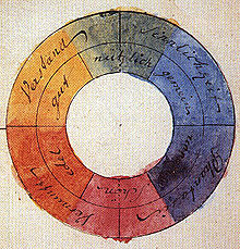 Goethe's color wheel from his 1810 Theory of Colours
The RYB primary colors became the foundation of 18th century theories of color vision, as the fundamental sensory qualities that are blended in the perception of all physical colors and equally in the physical mixture of pigments or dyes. These theories were enhanced by 18th-century investigations of a variety of purely psychological color effects, in particular the contrast between "complementary" or opposing hues that are produced by color afterimages and in the contrasting shadows in colored light. These ideas and many personal color observations were summarized in two founding documents in color theory: the Theory of Colours (1810) by the German poet and government minister Johann Wolfgang von Goethe, and The Law of Simultaneous Color Contrast (1839) by the French industrial chemist Michel Eugène Chevreul.
Subsequently, German and English scientists established in the late 19th century that color perception is best described in terms of a different set of primary colors—red, green and blue violet (RGB)—modeled through the additive mixture of three monochromatic lights. Subsequent research anchored these primary colors in the differing responses to light by three types of color receptors or cones in the retina (trichromacy). On this basis the quantitative description of color mixture or colorimetry developed in the early 20th century, along with a series of increasingly sophisticated models of color space and color perception, such as the opponent process theory.
Across the same period, industrial chemistry radically expanded the color range of lightfast synthetic pigments, allowing for substantially improved saturation in color mixtures of dyes, paints and inks. It also created the dyes and chemical processes necessary for color photography. As a result three-color printing became aesthetically and economically feasible in mass printed media, and the artists' color theory was adapted to primary colors most effective in inks or photographic dyes: cyan, magenta, and yellow (CMY). (In printing, dark colors are supplemented by a black ink, known as the CMYK system; in both printing and photography, white is provided by the color of the paper.) These CMY primary colors were reconciled with the RGB primaries, and subtractive color mixing with additive color mixing, by defining the CMY primaries as substances that absorbed only one of the retinal primary colors: cyan absorbs only red (−R+G+B), magenta only green (+R−G+B), and yellow only blue violet (+R+G−B). It is important to add that the CMYK, or process, color printing is meant as an economical way of producing a wide range of colors for printing, but is deficient in reproducing certain colors, notably orange and slightly deficient in reproducing purples. A wider range of color can be obtained with the addition of other colors to the printing process, such as in Pantone's Hexachrome printing ink system (six colors), among others.
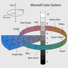 Munsell's color system represented as a three-dimensional solid showing all three color making attributes: lightness, saturation and hue.
For much of the 19th century artistic color theory either lagged behind scientific understanding or was augmented by science books written for the lay public, in particular Modern Chromatics (1879) by the American physicist Ogden Rood, and early color atlases developed by Albert Munsell (Munsell Book of Color, 1915, see Munsell color system) and Wilhelm Ostwald (Color Atlas, 1919). Major advances were made in the early 20th century by artists teaching or associated with the German Bauhaus, in particular Wassily Kandinsky, Johannes Itten, Faber Birren and Josef Albers, whose writings mix speculation with an empirical or demonstration-based study of color design principles.
Contemporary color theory must address the expanded range of media created by digital media and print management systems, which substantially expand the range of imaging systems and viewing contexts in which color can be used. These applications are areas of intensive research, much of it proprietary; artistic color theory has little to say about these complex new opportunities.[citation needed]
Traditional color theory
Complementary colors
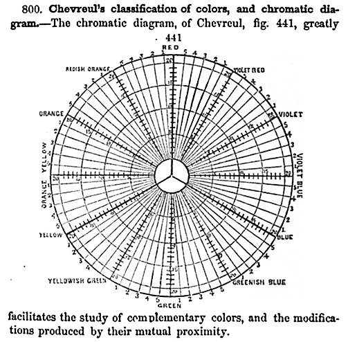
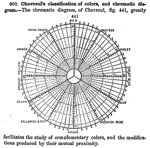 Chevreul's 1855 "chromatic diagram" based on the RYB color model, showing complementary colors and other relationshipsMain article: Complementary color
For the mixing of colored light, Newton’s color wheel is often used to describe complementary colors, which are colors which cancel each other's hue to produce an achromatic (white, gray or black) light mixture. Newton offered as a conjecture that colors exactly opposite one another on the hue circle cancel out each other's hue; this concept was demonstrated more thoroughly in the 19th century.[citation needed]
A key assumption in Newton's hue circle was that the "fiery" or maximum saturated hues are located on the outer circumference of the circle, while achromatic white is at the center. Then the saturation of the mixture of two spectral hues was predicted by the straight line between them; the mixture of three colors was predicted by the "center of gravity" or centroid of three triangle points, and so on.
 Primary, secondary, and tertiary colors of the RYB color model
According to traditional color theory based on subtractive primary colors and the RYB color model, which is derived from paint mixtures, yellow mixed with violet, orange mixed with blue, or red mixed with green produces an equivalent gray and are the painter's complementary colors. These contrasts form the basis of Chevreul's law of color contrast: colors that appear together will be altered as if mixed with the complementary color of the other color. Thus, a piece of yellow fabric placed on a blue background will appear tinted orange, because orange is the complementary color to blue.
Unfortunately, the artists' primary colors are not the same as complementary colors defined by light mixtures. This discrepancy becomes important when color theory is applied across media. Digital color management uses a hue circle defined around the additive primary colors (the RGB color model), as the colors in a computer monitor are additive mixtures of light, not subtractive mixtures of paints.
One reason the artist's primary colors even work at all is that the imperfect pigments being used have sloped absorption curves, and thus change color with concentration. A pigment that is pure red at high concentrations can behave more like magenta at low concentrations. This allows it to make purples that would otherwise be impossible. Likewise, a blue that is ultramarine at high concentrations appears cyan at low concentrations, allowing it to be used to mix green. Chromium red pigments can appear orange, and then yellow, as the concentration is reduced. It is even possible to mix very low concentrations of the blue mentioned and the chromium red to get a greenish color. This works much better with oil colors than it does with water colors and dyes.
So the old primaries depend on sloped absorption curves and pigment leakages to work, while the new scientifically derived ones depend solely on controlling the amount of absorption in certain parts of the spectrum.
Another reason the correct primary colors were not used by early artists is that they were not available as durable pigments. Modern methods in chemistry were needed to produce them.
Warm vs. cool colors
The distinction between warm and cool colors has been important since at least the late 18th century [1]. It is generally not remarked in modern color science or colorimetry in reference to painting, but is still used in design practices today.[citation needed] The contrast, as traced by etymologies in the Oxford English Dictionary, seems related to the observed contrast in landscape light, between the "warm" colors associated with daylight or sunset and the "cool" colors associated with a gray or overcast day. Warm colors are often said to be hues from red through yellow, browns and tans included; cool colors are often said to be the hues from blue green through blue violet, most grays included. There is historical disagreement about the colors that anchor the polarity, but 19th century sources put the peak contrast between red orange and greenish blue.
Color theory has ascribed perceptual and psychological effects to this contrast. Warm colors are said to advance or appear more active in a painting, while cool colors tend to recede; used in interior design or fashion, warm colors are said to arouse or stimulate the viewer, while cool colors calm and relax. Most of these effects, to the extent they are real, can be attributed to the higher saturation and lighter value of warm pigments in contrast to cool pigments. Thus, brown is a dark, unsaturated warm color that few people think of as visually active or psychologically arousing.
Compare the traditional warm–cool association of color with the color temperature of a theoretical radiating black body, where the association of color with temperature is reversed. For instance, the hottest stars radiate blue light (i.e., with shorter wavelength and higher frequency) and the coolest radiate red.
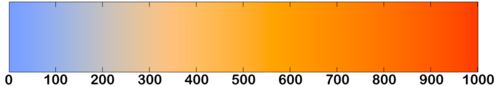 The hottest radiating bodies (e.g. stars) have a "cool" color while the less hot bodies radiate with a "warm" color. (Image in mired scale.)
Achromatic colors
Any color that lacks strong chromatic content is said to be unsaturated, achromatic, or near neutral. Pure achromatic colors include black, white and all grays; near neutrals include browns, tans, pastels and darker colors. Near neutrals can be of any hue or lightness.
Neutrals are obtained by mixing pure colors with either white,black or grey, or by mixing two complementary colors. In color theory, neutral colors are colors easily modified by adjacent more saturated colors and they appear to take on the hue complementary to the saturated color. Next to a bright red couch, a gray wall will appear distinctly greenish.
Black and white have long been known to combine well with almost any other colors; black increases the apparent saturation or brightness of colors paired with it, and white shows off all hues to equal effect.[citation needed]
Tints and shades
Main article: Tints and shadesWhen mixing colored light (additive color models), the achromatic mixture of spectrally balanced red, green and blue (RGB) is always white, not gray or black. When we mix colorants, such as the pigments in paint mixtures, a color is produced which is always darker and lower in chroma, or saturation, than the parent colors. This moves the mixed color toward a neutral color—a gray or near-black. Lights are made brighter or dimmer by adjusting their brightness, or energy level; in painting, lightness is adjusted through mixture with white, black or a color's complement.
It is common among some painters to darken a paint color by adding black paint—producing colors called shades—or lighten a color by adding white—producing colors called tints. However it is not always the best way for representational painting, as an unfortunate result is for colors to also shift in hue. For instance, darkening a color by adding black can cause colors such as yellows, reds and oranges, to shift toward the greenish or bluish part of the spectrum. Lightening a color by adding white can cause a shift towards blue when mixed with reds and oranges. Another practice when darkening a color is to use its opposite, or complementary, color (e.g. purplish-red added to yellowish-green) in order to neutralize it without a shift in hue, and darken it if the additive color is darker than the parent color. When lightening a color this hue shift can be corrected with the addition of a small amount of an adjacent color to bring the hue of the mixture back in line with the parent color (e.g. adding a small amount of orange to a mixture of red and white will correct the tendency of this mixture to shift slightly towards the blue end of the spectrum).
Split primary colors
In painting and other visual arts, two-dimensional color wheels or three-dimensional color solids are used as tools to teach beginners the essential relationships between colors. The organization of colors in a particular color model depends on the purpose of that model: some models show relationships based on Human color perception, whereas others are based on the color mixing properties of a particular medium such as a computer display or set of paints.
This system is still popular among contemporary painters,[citation needed] as it is basically a simplified version of Newton's geometrical rule that colors closer together on the hue circle will produce more vibrant mixtures. However, with the range of contemporary paints available, many artists simply add more paints to their palette as desired for a variety of practical reasons. For example, they may add a scarlet, purple and/or green paint to expand the mixable gamut; and they include one or more dark colors (especially "earth" colors such as yellow ochre or burnt sienna) simply because they are convenient to have premixed.[citation needed] Printers commonly augment a CYMK palette with spot (trademark specific) ink colors.
Color harmony and color meaning
It has been suggested that "Colors seen together to produce a pleasing affective response are said to be in harmony".[2] However, color harmony is a somewhat misleading notion in that responses to color can be influenced by a range of different factors including individual differences (age, gender, etc.); cultural and social differences; as well as contextual, temporal and perceptual factors. The following conceptual model illustrates this approach to color harmony:

Wherein color harmony is a function (f) of the interaction between color/s (Col 1, 2, 3, …, n) and the factors that influence positive aesthetic response to color: individual differences (ID) such as age, gender, personality and affective state; cultural experiences (CE), the prevailing context (CX) which includes setting and ambient lighting; intervening perceptual effects (P) and the effects of time (T) in terms of prevailing social trends.[3]
In addition, given that humans can perceive over 2.8 million different hues,[4] it has been suggested that the number of possible color combinations is virtually infinite thereby implying that predictive color harmony formulae are fundamentally unsound.[5] Despite this, many color theorists have devised formulae, principles or guidelines for color combination with the aim being to predict or specify positive aesthetic response or 'color harmony'. Color wheel models have often been used as a basis for color combination principles or guidelines and for defining relationships between colors. Some theorists and artists believe juxtapositions of complementary color will produce strong contrast, a sense of visual tension as well as 'color harmony'; while others believe juxtapositions of analogous colors will elicit positive aesthetic response. Color combination guidelines suggest that colors next to each other on the color wheel model (analogous colors) tend to produce a single-hued or monochromatic color experience and some theorists also refer to these as 'simple harmonies'. In addition, split complementary color schemes usually depict a range of analogous hues plus a key complementary color. A triadic color scheme adopts any three colors approximately equidistant around a color wheel model. Feisner and Mahnke are among a number of authors who provide color combination guidelines in greater detail.[6][7]
Color combination formulae and principles may provide some guidance but have limited practical application. This is because of the influence of contextual, perceptual and temporal factors which will influence how color/s are perceived in any given situation, setting or context. Such formulae and principles may be useful in fashion, interior and graphic design, but much depends on the tastes, lifestyle and cultural norms of the viewer or consumer.
As early as the ancient Greek philosophers, many theorists have devised color associations and linked particular connotative meanings to specific colors. However, connotative color associations and color symbolism tends to be culture-bound and may also vary across different contexts and circumstances. For example, red has many different connotative and symbolic meanings from exciting, arousing, sensual, romantic and feminine; to a symbol of good luck; and also acts as a signal of danger. Such color associations tend to be learned and do not necessarily hold irrespective of individual and cultural differences or contextual, temporal or perceptual factors.[8] It is important to note that while color symbolism and color associations exist, their existence does not provide evidential support for color psychology or claims that color has therapeutic properties.[9]
Current status
Color theory has not developed an explicit explanation of how specific media affect color appearance: colors have always been defined in the abstract, and whether the colors were inks or paints, oils or watercolors, transparencies or reflecting prints, computer displays or movie theaters, was not considered especially relevant.[citation needed] Josef Albers investigated the effects of relative contrast and color saturation on the illusion of transparency, but this is an exception to the rule.[10]
See also
- Charles Albert Keeley
- Color mixing
- Additive color
- Subtractive color
- Theory of painting
References
- ^ "color temperature". handprint. 2009-04-19. http://www.handprint.com/HP/WCL/color12.html. Retrieved 2011-06-09.
- ^ Burchett, K. E. (2002). Color harmony. Color Research and Application, 27 (1), pp28-31.
- ^ O'Connor, Z. (2010). Color harmony revisited. Color Research and Application, 35 (4), pp267-273.
- ^ Pointer, M. R. & Attridge, G.G. (1998). The number of discernible colors. Color Research and Application, 23 (1), pp52-54.
- ^ Hard, A. & Sivik, L. (2001). A theory of colors in combination - A descriptive model related to the NCS color-order system. Color Research and Application, 26 (1), pp4-28.
- ^ Feisner, E. A. (2000). Colour: How to use colour in art and design. London: Laurence King.
- ^ Mahnke, F. (1996). Color, environment and human response. New York: John Wiley & Sons.
- ^ Bellantoni, Patti (2005). If it's Purple, Someone's Gonna Die. Elsevier, Focal Press. ISBN 0-240-80688-3.
- ^ O'Connor, Z. (2010). Colour psychology and colour therapy: Caveat emptor. Color Research and Application, (Published online in 'EarlyView' in advance of print).
- ^ Albers, Josef (2006). Interaction of Color. Revised and Expanded Edition. Yale University Press. ISBN 0-300-11595-4.
External links
- Color Theory Tutorial by Worqx
- Handprint.com : Color - a comprehensive site about color perception, color psychology, color theory, and color mixing
- Color Theory in Landscape Design
- The Dimensions of Colour - color theory for artists using digital/ traditional media
- Color Thesaurus World's Largest Database of Color Names
- Stanford University CS 178 interactive Flash demo introducing trichromatic color theory.
Eye - Appearance phenomena of the eye by the eye M: EYE
anat(g/a/p)/phys/devp/prot
noco/cong/tumr, epon
proc, drug(S1A/1E/1F/1L)
Color topics Color perception Color vision · Color blindness · Visible spectrum · Color constancy · Color term · Color theory · Complementary color
Color space Basic colors Related Categories:


Wikimedia Foundation. 2010.