- Franklin Gothic
-
Franklin Gothic and its related faces are realist sans-serif typefaces originated by Morris Fuller Benton (1872–1948) in 1902. “Gothic” is an increasingly archaic term meaning sans-serif. Franklin Gothic has been used in many advertisements and headlines in newspapers. The typeface continues to maintain a high profile, appearing in a variety of media from books to billboards. Despite a period of eclipse in the 1930s, after the introduction of such European faces as Kabel and Futura, they were re-discovered by American designers in the 1940s and have remained popular ever since.
Category Sans-serif Classification Grotesque Designer(s) Morris Fuller Benton Foundry American Type Founders Date released 1902–1967 Design based on Akzidenz-Grotesk (Berthold) Also known as Gothic #1, Square Gothic Heavy, Gothic #16 Contents
Franklin Gothic
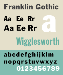
Franklin Gothic is an extra-bold sans-serif type which can be distinguished from other sans serif typefaces, as it has a more traditional double-story g and a. Other main distinguishing characteristics are the tail of the Q and the ear of the g. The tail of the Q curls down from the bottom center of the letterform in the book weight and shifts slightly to the right in the bolder fonts. It draws upon earlier, nineteenth century models, from many of the twenty-three foundries consolidated into American Type Founders in 1892. Historian Alexander Lawson speculated that Franklin Gothic was influenced by Berthold’s Akizdenz-Grotesk types but offered no evidence to support this theory[1] which was later presented as fact by Philip Meggs and Rob Carter.[2] It was named in honor of a prolific American printer, Benjamin Franklin. The faces were issued over a period of ten years, all of which were designed by Benton and issued by A.T.F.[3]
- Franklin Gothic (1903)
- Franklin Gothic Condensed + Extra Condensed (1906)
- Franklin Gothic Italic (1910)
- Franklin Gothic Condensed Shaded (1912)
Some time later, the foundry again expanded the line, adding two more variants:
- Franklin Gothic Wide (1952) designed by John L. “Bud” Renshaw
- Franklin Gothic Condensed Italic (1967) designed by Whedon Davis
Hot Metal Copies
Barnhart Brothers & Spindler copied the face as Gothic #1, while both Linotype and Intertype, called their copies Gothic #16. Monotype’s copy kept the name Franklin Gothic, but because of the demands of mechanical composition, their version was modified to fit a standard arrangement. The Ludlow version was known as Square Gothic Heavy.[4]
Cold Type Copies
Given the post-war popularity of Gothic faces, it is no wonder that most of the producers of cold type offered their own versions of Franklin Gothic under the following names:[5]
- Franklin Gothic — Alphatype, Autologic, Berthold, Dymo, Star/Photon, Mergenthaler, MGD Graphic Systems, Varityper
- Franklin — Compugraphic
- Pittsburgh — Graphic Systems Inc.
Digital Copies
Digital copies have been made by Adobe, International Typeface Corporation, Monotype Imaging, and URW. Victor Caruso drew a multi-weight family for the International Typeface Corporation (ITC) in 1980 and in 1991, ITC commissioned the Font Bureau in Boston to create condensed, compressed and extra compressed versions of ITC Franklin Gothic. Bitstream’s version is called Gothic 744. Microsoft Windows has distributed "Franklin Gothic Medium," one of ITC's variants of the font, in all copies since at least Windows 95.
Alternate Gothic Nos. 1,2,3 Category Sans-serif Classification realist Designer(s) Morris Fuller Benton Foundry American Type Founders Date released 1903 Re-issuing foundries Monotype Design based on Franklin Gothic Also known as Gothic Condensed (Linotype + Intertype + Ludlow) Alternate Gothic
Alternate Gothic was designed by M.F. Benton for A.T.F. in 1903. It is essentially a bold version of Franklin Gothic, made in three numbered widths, (one being condensed, three being extended).
Hot Metal Copies
This face was copied by Monotype under the same name, #1 by Ludlow, Linotype and Intertype as Gothic Condensed. Ludlow’s Trade Gothic Condensed is very similar as well. Two variants were made:
- Alternate Gothic Modernized (1927, Monotype), added thirteen alternate characters drawn by Sol Hess.
- Condensed Gothic Outline (1953, Ludlow), is essentially an outline of Alternate Gothic #2.[6]
Cold Type Copies
Alternate Gothic was copied by Compugraphic as Alpin Gothic.[7]
Digital Copies
Digital copies have been made by URW, Elsner+Flake, Monotype as CG Alternate Gothic #3, and The League of Moveable Type as League Gothic.
Monotone Gothic Category Sans-serif Classification realist Designer(s) Morris Fuller Benton Foundry American Type Founders Date released 1907 Design based on Franklin Gothic Monotone Gothic
Monotone Gothic was designed by M.F. Benton for A.T.F. in 1907. It is essentially a lighter, more extended version of Franklin Gothic. Only one weight was made and it was apparently never copied under that name by any other foundry. Digital versions of Franklin Gothic Light Extended are essentially knock-offs of this face.[8]
News Gothic 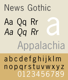
Category Sans-serif Classification realist Designer(s) Morris Fuller Benton Foundry American Type Founders Date released 1908 Design based on Franklin Gothic Also known as Trade Gothic (Linotype), Record Gothic (Ludlow), Balto Gothic, (Baltimore Type & Composition Company) News Gothic
Main article: News GothicNews Gothic was designed by M.F. Benton for A.T.F. in 1908 as a continuing effort to consolidate and systematize the nineteenth century Gothic faces inherited from the company’s predecessors. It is essentially a medium weight version of Franklin Gothic. Morris cut seven variations for A.T.F.:
- News Gothic
- News Gothic Italic
- News Gothic Condensed
- News Gothic Extra Condensed
- News Gothic Extra Condensed Title
- News Gothic Bold
- News Gothic Condensed Bold
As with Franklin Gothic, the foundry expanded the line sometime later, adding two more variants:
- News Gothic Bold (1958) designed by John L. “Bud” Renshaw
- News Gothic Condensed Bold (1965) designed by Frank Bartuska
Hot Metal Copies
Linotype called their copy Trade Gothic while the Ludlow version was known as Record Gothic. Intertype copied the face under the same name and added a variant, News Gothic Bold (1955). Baltimore Type’s copy was called Balto Gothic, while their copy of Inland Type Foundry’s Inland Gothic No. 6 was perversely sold under the name News Gothic.[9]
Hot Metal Variants
In 1916, Sol Hess made alternate rounded characters for News Gothic Extra Condensed and the resulting face was sold by Lanston Monotype as Jefferson Gothic, which was also sold by Baltimore Type as Tourist Extra Condensed In 1935, M.F. Benton did much the same thing for A.T.F. and the face was called Phenix.
Ludlow’s Record Gothic began as a mere knock-off but, between 1956 and 1961, their in-house designer, R. Hunter Middleton made many original additions to the family including:[10]
- Record Gothic Condensed Italic
- Record Gothic Extended + Italic
- Record Gothic Bold + Italic
- Record Gothic Bold Condensed
- Record Gothic Bold Extended + Italic
- Record Gothic Bold Extended Reverse
- Record Gothic Thinline condensed
- Record Gothic Heavy Condensed
- Record Gothic Light Medium-Extended
- Record Gothic Medium-Extended + Italic
- Record Gothic Bold Medium-Extended
- Record Gothic Heavy Medium-Extended
Cold Type Copies
Virtually all producers of cold type offered their own versions of News Gothic under the following names:[11]
- News Gothic — Alphatype, Autologic, Berthold, Compugraphic, Dymo, Harris, MGD Graphic Systems, Monotype, Varityper
- Gothstar Trade — Star/Photon
- Toledo — Graphic Systems Inc.
Digital Copies
Because there is no active descendant of the American Type Founders Corporation making digital typefaces, News Gothic has been revived in digital form in many different versions from different sources. Adobe, Monotype, Linotype, Bitstream and The Font Bureau all have their own versions.
Lightline Gothic Category Sans-serif Classification realist Designer(s) Morris Fuller Benton Foundry American Type Founders Date released 1908 Lightline Gothic
Lightline Gothic was designed by M.F. Benton for A.T.F. in 1908 as a lighter version of News Gothic, which makes it an ultra-light version of Franklin Gothic. Only one weight was made and it was apparently never copied under that name by any other foundry. Digital versions of Franklin Gothic Ultra-Light are essentially knock-offs of this face.
Hot Metal Variants
In 1921, M.F. Benton had the capitals of this face cast in different sizes on identical bodies, thus creating, ex nihilo, a lining Gothic which was sold under the name Lightline Title Gothic[12]
Usage
- New York University lists Franklin Gothic as an official font.[13]
- The Franklin Gothic font was the resident typeface of the PBS series The Electric Company.
- Franklin Gothic is the official typeface of the Museum of Modern Art in New York.
- The film Rocky's title is Franklin Gothic Heavy.
- The computer game You Don't Know Jack.
- Cardiff University uses Franklin Gothic as its main corporate typeface.
- Franklin Gothic Condensed was the typeface used for subtitles in the Star Wars films,[14] but contrary to some reports, News Gothic and Univers are used for the opening crawl.[15]
- Bank of America's logo uses Franklin Gothic Condensed.
- Intertitle during commercials on 1980s Nickelodeon
- Many of Lawrence Weiner's art works are set in Franklin Gothic Extra Condensed.
- AXA Group in the UK use Franklin Gothic Heavy and Book in their Redefining/Standards branding
- The latest Batman film, The Dark Knight, uses Franklin Gothic in its advertising material.
- In the children's book Corby Flood, Franklin Gothic is a member of the evil Brotherhood of Clowns.
- CBS Sports used this font for their graphics during the early–mid 1980s; with a slight variation in that there was no serif on the number "1".
- TNT used this font for their graphics during the early 1990s.
- Lady Gaga's cover text on her second album, The Fame Monster.
- Various section headlines of The New York Times.
- ESPN used the font for in-game graphics from 2006 to 2009; it is also the typeface for their sports-talk show Pardon The Interruption. it was deemphasized beginning with the Monday Night Football telecasts in 2009.
- The printed version of The Onion uses Franklin Gothic Extra Condensed for all headline text.
- Showtime uses this font in its logo.
- Frederator Studios uses this font on its website.
- Loesje uses this font on its posters.
- Van Morrison's cover text on his single Brown Eyed Girl.
- Nickelodeon's show Bucket & Skinner's Epic Adventures uses this typeface in its logo.
- The Conservative Party of Canada uses this font in their logo.
References
- ^ Lawson, Alexander S., Anatomy of a Typeface, Godine, Boston, 1990, ISBN 978-0-87923-333-4, pp. 295–307.
- ^ Meggs, Philip and Carter, Rob, Typographic Specimens: The Great Typefaces, Van Nostrand Rheinhold, 1993, ISBN 0-442-00758-2, pp. 151.
- ^ MacGrew, Mac, "American Metal Typefaces of the Twentieth Century," Oak Knoll Books, New Castle Delaware, 1993, ISBN 0-938768-34-4, pp. 142 - 143.
- ^ MacGrew, "American Metal Typefaces of the Twentieth Century," pp. 142 - 143.
- ^ Lawson, Alexander, Archie Provan, and Frank Romano, "Primer Metal Typeface Identification," National Composition Association, Arlington, Virginia, 1976, pp. 34 - 35.
- ^ MacGrew, "American Metal Typefaces of the Twentieth Century," pp. 10 - 11.
- ^ Wheatley, W.F., "Typeface Analogue," National Composition Association, Arlington, Virginia, 1988, p. 5.
- ^ MacGrew, "American Metal Typefaces of the Twentieth Century," pp. 222 - 223.
- ^ MacGrew, "American Metal Typefaces of the Twentieth Century," pp. 230 - 231.
- ^ MacGrew, "American Metal Typefaces of the Twentieth Century," pp. 264 - 267.
- ^ Lawson, Provan, and Romano, "Primer Metal Typeface Identification," pp. 34 - 35.
- ^ MacGrew, "American Metal Typefaces of the Twentieth Century," pp. 200 - 201.
- ^ http://www.nyu.edu/web.communications/standards/identity.html
- ^ http://www.starwars.com/episode-i/bts/production/news19990302.html
- ^ http://www.starwars.com/episode-iii/bts/production/f20050126/index.html
- Baines, Phil, Hastam, Andrew (2005). Type and Typography. Watson-Guptill Publications. ISBN 0-8230-5528-0.
- Lawson, Alexander S. (1990). Anatomy of a Typeface. Godine. ISBN 978-0879233334.
- Meggs, Phillip B. (2002). Revival of the fittest. RC Publications, Inc. ISBN 1-883915-08-2.
- Meggs, Phillip B. (1993). Typographic Specimens: The Great Typefaces. Van Nostrand Reinhold. ISBN 0-442-00758-2.
Categories:- American Type Founders typefaces
- Grotesque sans-serif typefaces
- Newspaper and magazine typefaces
- Letterpress typefaces
- Photocomposition typefaces
- Virtual typefaces


Wikimedia Foundation. 2010.