- News Gothic
-
Category Sans-serif Designer(s) Morris Fuller Benton Foundry American Type Founders News Gothic is a realist sans-serif typeface designed by Morris Fuller Benton, and released by the American Type Founders (ATF) in 1908. The typeface was originally drawn in two lighter weights, a medium text weight using the title News Gothic, and a closely related light weight marketed under the name Lightline Gothic. The typeface family was enlarged in 1958 with the addition of two bold weights. News Gothic is similar in proportion and structure to Franklin Gothic also designed by Benton.
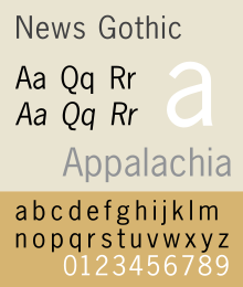
News Gothic, like other Benton sans serif typefaces, follows the grotesque model. Shapes which distinguish it from the neo-grotesque are the two-story lowercase a and the two-story lowercase g. Also distinctive are the blunt terminus at the apex of the lowercase t, and the location of the tail of the uppercase Q completely outside the bowl. The letter forms are compact, and descenders are shallow. The typeface differs from other realist sans-serifs in its organic shapes and subtle transitions of stroke width, all contributing to a less severe, humanist tone of voice. For much of the twentieth century News Gothic was used in newspaper and magazine publishing.
News Gothic is available in standard, condensed, and extra condensed widths, each with a matching bold and italic. The standard width typeface is available in light, standard, demi, and bold weights, each with a matching italic. The condensed and extra condensed widths are ideal for use in tables and parts lists.
Because there is no active descendant of the American Type Founders Corporation making digital typefaces, News Gothic has been revived in digital form in many different versions from different sources. Adobe, Monotype, Linotype, Bitstream and The Font Bureau all have their own versions.
The use of the term "Gothic" is an early twentieth century misnomer for sans-serifs, found mostly in the United States and Canada. In the UK the term Gothic is occasionally used, but more often the term "grotesque" is used for sans-serifs. In Germany the term "Grotesk" is used.
Contents
News Gothic No. 2
No. 2 is an enhanced version of News Gothic produced by the D. Stempel AG type foundry in 1984. It adds more weights to the News Gothic family than were available in other versions.
The OpenType version of the No. 2 family comes in 6 weights with complementary italic fonts, supports ISO Adobe 2, Adobe CE, Latin Extended character sets.
Variants
Benton Sans is an expanded font family from the Font Bureau, based on News Gothic.
Linotype Gothic, which was based on Heidelberg Gothic,[1][2] is a variant with italic type glyphs.
A Cyrillic version was developed for ParaType in 2005 by Dmitry Kirsanov, based on Bitstream's version of News Gothic.
Usages
- The identity for the Brooklyn Academy of Music, designed by Michael Beirut, heavily uses News Gothic.
- The bold variant of News Gothic is used in the logo for the Swedish pop group ABBA, a logo conceived in 1976 by Rune Söderqvist. It should also be noted that the scanning used for the logo comes from Adobe, not Monotype.[3] The font is/was also used in promotional materials for the group, as well as CD and DVD liner notes.
- News Gothic Bold is also used in the artwork for The Fame Monster by Lady Gaga, possibly in a deliberate stylistic homage to ABBA.
- News Gothic Bold was used in the Star Wars opening crawl for the main body of the text.
- News Gothic Bold was used in Saul Bass' opening title sequence for Alfred Hitchcock's 1960 thriller, Psycho.
- The version of News Gothic which was on IBM typesetters was used widely by Fluxus artists such as George Maciunas (in his Fluxpublications) and George Brecht (in his event scores)[4][5]
- The logo adopted by Polaroid Corporation in the late 1950s, designed by Paul Giambarba, is set in News Gothic, as was much of the type on the company's packaging and documentation up until the 1980s.
Bibliography
- Baines, Phil, Hastam, Andrew. Type and Typography. Watson-Guptill Publications: 2005. ISBN 0-8230-5528-0.
- Blackwell, Lewis. 20th Century Type. Yale University Press: 2004. ISBN 0-300-10073-6.
- Fiedl, Frederich, Nicholas Ott and Bernard Stein. Typography: An Encyclopedic Survey of Type Design and Techniques Through History. Black Dog & Leventhal: 1998. ISBN 1-57912-023-7.
- Jaspert, W. Pincus, W. Turner Berry and A.F. Johnson. The Encyclopædia of Type Faces. Blandford Press Lts.: 1953, 1983. ISBN 0-7137-1347-X.
- Macmillan, Neil. An A–Z of Type Designers. Yale University Press: 2006. ISBN 0-300-11151-7.
- Meggs, Phillip B. Revival of the Fittest. RC Publications, Inc: 2002. ISBN 1-883915-08-2.
References
- ^ Professionals in Print
- ^ (x) negative sans serif text - News Gothic {Chesh}
- ^ hem.bredband.net/b138451/logo/
- ^ www.amazon-noir.com/BOOKS/6_%20The_Fluxus_Reader_Ken_Friedman.pdf
- ^ ubu.clc.wvu.edu/historical/gb/index.html
External links
Categories:- American Type Founders typefaces
- Grotesque sans-serif typefaces
- Newspaper and magazine typefaces

Wikimedia Foundation. 2010.