- DIN 1451
-

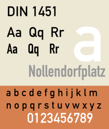
Category Sans-serif Foundry Linotype GmbH, FSI FontShop International DIN 1451 is a realist sans-serif typeface that is widely used for traffic, administration and business applications. It has been defined by the German standards body Deutsches Institut für Normung since 1936.
Contents
Overview
The DIN 1451 typeface is very legible and easy to reproduce. Both a medium and a narrow version are defined today; an older broad version is no longer used, but may still be encountered on some very old road signs in Germany. The typeface has gained popularity due to its wide exposure and has been also used by non-governmental organisations and businesses. For graphic design and desktop publishing, FSI FontShop International offers an extended version of this typeface called FF DIN.
The origins of this typeface go back to 1905, when the Königlich Preußische Eisenbahn-Verwaltung (Royal Prussian Railway Administration) standardized the lettering to be used on all its rolling stock in a design instruction known as Musterzeichnung (pattern drawing) IV 44. A number of the glyphs have since been changed, in particular those for "t", "6" and "9".
The article series "The history of the design of a contemporary typeface" provides more information about the origins of the typeface.
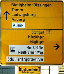
DIN 145 is a widely used standard typeface for traffic, administration, and business applications. In particular, it is the typeface commonly used on road and railway signage in Germany and a number of other countries. It was also used for many years on German car number plates, until replaced there in November 2000 by FE-Schrift, a font especially designed to make the plates more tamper-proof and to optimize automatic character recognition.
Linotype version
It consists of DIN 1451 MittelSchrift and the condensed DIN 1451 EngSchrift fonts.
OpenType version supports ISO Adobe 2, Adobe CE, Latin Extended character sets. OpenType features include alternates.
DIN 1451 Pro W1G MittelSchrift
It is a version of DIN 1451 MittelSchrift supporting ISO Adobe 2, Adobe CE, Latin Extended, Greek, Cyrillic character sets.
DIN Next
It is a variant based on DIN 1451 Engschrift and Mittelschrift, designed by Akira Kobayashi of Linotype. Changes include fixing inconsistencies in the old fonts, rounded corners at terminals to emulate the machine cuts of the original fonts, altered terminal angles to reproduce the machine cuts of DIN 1451.
The family includes 21 fonts in 7 weights and 2 widths, with complementary italics for the widest width fonts. It supports ISO-Adobe, Adobe CE, Latin Extended character sets. OpenType features include small caps (lightest 4 weights roman fonts only), old style figures, subscript/superscript, alternates.
Alternates include:
- Uppercase C and G with flat stroke or diagonal endings.
- Serif and sans-serif forms of uppercase I.
- Single-storey lowercase a.
- Lowercase q with an upstroke at the descender end.
- ß ligature composed by long-s and long-z.
- 1 with base serif.
- Rounded 6 and 9.
- Slashed 0.
- 7 and capital Z with horizontal strokes through their diagonals.
DIN Next Rounded
It is a rounded variant of the font family.
The family includes 4 fonts in 4 weights and 1 width, with no italics. OpenType features include old style figures, subscript/superscript, alternates.
Usage examples
Corporate branding
- Logotype and corporate typeface of Sapient corporation
- Logotype of JetBlue Airways
- Logo of the video game Half-Life, with the "A" supplanted by the lower case lambda symbol. Its sequel, "Half-Life 2", uses this font in various places as well, including HUD.
- Logo of the video game "Portal" and its sequel, "Portal 2", with the uppercase "O" replaced with a blue portal.
- Early 2000s on-screen branding of Channel 4 (British television station)
- An adapted version, Habitat DIN, is used by Habitat (retailer)
- Corporate branding of The New West End Company (the Business Improvement District company for London's West End)
- Belgian VRT news service (De Redactie) for logo and news broadcasts.
- Plone logo
- Dutch website DigitaalMedia.nl for logo and the news broadcasts.
- Primary font used in Simon Fraser University documents
- Font for Nine News for their title
- Used on Test The Nation's question graphics
- Primary font used in York Region Transit
- On-air newscasts of most NBC Owned-and-Operated stations (i.e. KNBC, WCAU, WRC-TV, etc.)
- Corporate font used by Birmingham City University
- Opening titles of Dexter (TV series)
- Font for many license plates throughout Europe, including Poland,older German plates, Lithuania, Latvia, Sweden, and Romania.
- Used as one of the interface and HUD fonts for the video game Grand Theft Auto IV and its expansion packs.
See also
- Typography
- Public signage typefaces
References
The series of articles "The history of the design of a contemporary typeface" in which Albert-Jan Pool published many of his findings on the history of the typefaces of DIN 1451 is a vault of references on this subject. The series was published in the e-magazine 'Encore', issues 13-15, 17-18. These are direct links to the articles.
- Industrial Archeology – DIN, the first German Corporate Typeface?
- The Constructivist Connection – DIN, Bauhaus and the New Typography
- Siemens sets a Standard – DIN 1451 on its way up
- DIN for All: From the Economic Miracle to Art and Vernacular Typography – FF DIN: New at the Start
- How German is the DIN typeface? – Fahren, fahren, fahren at the Autobahn
Further reading
- DIN 1451-2: Schriften – Serifenlose Linear-Antiqua – Verkehrsschrift. Deutsches Institut für Normung, 1986-02.
- Made with FontFont: FF DIN – The history of a contemporary typeface, article by Albert-Jan Pool in collaboration with Jan Middendorp, BIS Publishers, 2006.
This is an updated version of the series of articles in Encore Magazine that were published in 2004–2005.
External links
- Download of public domain fonts used on roadsigns
- A free implementation of Fette Engschrift, an early version of the DIN 1451 typeface
- A minisite from Fontshop regarding FF DIN, includes history and specs as well as an interview with FF DIN's author.
Traffic signs Signs Warning sign · Regulatory sign · Priority to the right · Yield sign · Stop sign · Prohibitory traffic sign · One-way traffic · Speed limit (by country) · Advisory speed limit · Mandatory sign · Special regulation sign · Information sign · Direction, position, or indication sign · Variable-message sign · Bilingual sign · Comparison of European traffic signs · Driver location signs · CrossbuckBy country Lights Typefaces Allerta · Austria (typeface) · Clearview · DIN 1451 · Drogowskaz · FHWA Standard Alphabets for Traffic Control Devices · Frutiger · Caractères · NPS Rawlinson Roadway · Trafikkalfabetet · Transport · TratexConventions Geneva Convention on Road Traffic · Vienna Convention on Road Traffic · Vienna Convention on Road Signs and Signals · Manual on Uniform Traffic Control Devices (USA) · Traffic Signs Regulations and General Directions (UK)Categories:- Government typefaces
- Grotesque sans-serif typefaces
- DIN standards
Wikimedia Foundation. 2010.

