- DIN (typeface)
-
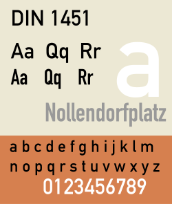 DIN 1451 typeface adopted by the Deutsches Institut für Normung in 1936.
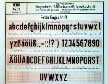
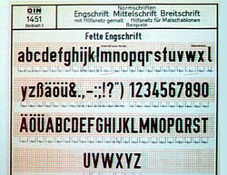 Early DIN-Fette Engschrift specimen. Fette Engschrift is a single weight of the DIN 1451 typeface.
DIN, an acronym for the German Deutsches Institut für Normung (German Institute for Standardization), and the name of an increasingly large realist sans-serif typeface family. In 1936 the German Standard Committee selected DIN 1451 as the standard typeface for use in the areas of engineering, technology, traffic, administration and business. Among the other recommendations adopted by this committee was an early precursor to the typographic grid.
The earliest version of a DIN typeface was released by the D Stempel AG foundry in 1923. Stempel's design was based on a 1905 typeface for the Königlich Preußische Eisenbahn-Verwaltung (Royal Prussian Railway Administration) and was applied mostly to schematics and blueprints. This version later became the basis for DIN-Engschrift (Condensed). In 1929, the Berthold foundry released a version, and it, too, was used mostly for technical drawings. Both of the early DIN typefaces were made available as lettering templates cut from an acetate material for drafting use. Both of the earliest DIN typefaces were used primarily in oblique form.
Popularity grew rapidly, once the DIN typeface was adopted. The most widely-used of the DIN-1451 group was DIN-Mittelschrift (Medium). It was released as a metal type, as acetate stencils for smaller applications, as larger metal stencils for application to vehicles and in train yards, and as cast metal lettering for street and building signage. Polish and Cyrillic variants of the face were developed in the 1940s.
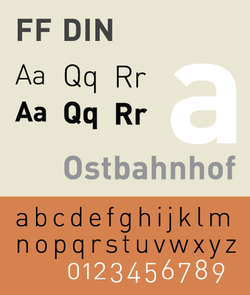
Though Bauhaus used a DIN-inspired logo in catalogs and in a periodical during the 1930s, DIN did not become popular in print until the 1960s. The transferable-lettering-sheet company, Letraset made several variants available in the 1970s. By the late 1980s, use of DIN typefaces were appearing in European and North American graphics work. In 1995, Dutch typeface designer Albert-Jan Pool drew a multi-weight version, eventually licensing it to FontShop International as FF DIN. The FF DIN family, unlike DIN 1451, uses simplified-standard weight names.
References
- Blackwell, Lewis. 20th Century Type. Yale University Press: 2004. ISBN 0-300-10073-6.
- Fiedl, Frederich, Nicholas Ott and Bernard Stein. Typography: An Encyclopedic Survey of Type Design and Techniques Through History. Black Dog & Leventhal: 1998. ISBN 1-57912-023-7.
- Jaspert, W. Pincus, W. Turner Berry and A.F. Johnson. The Encyclopædia of Type Faces. Blandford Press Lts.: 1953, 1983. ISBN 0-7137-1347-X.
- Macmillan, Neil. An A–Z of Type Designers. Yale University Press: 2006. ISBN 0-300-11151-7.
- DIN 1451-2: Schriften–Serifenlose Linear-Antiqua–Verkehrsschrift. Deutsches Institut für Normung, 1986-2002.
External links
Categories:- Stempel typefaces
- Grotesque sans-serif typefaces


Wikimedia Foundation. 2010.