- Clarendon (typeface)
-

Category Serif Classification Slab serif Designer(s) Robert Besley Foundry Fann Street
(Show all characters)Sample Clarendon is an English slab-serif typeface that was created in England by Robert Besley for Thorowgood and Co. (or Thorowgood and Besley.), a type company formerly known as the Fann Street Foundry until approximately 1838. The font was published in 1845 after Besley, an employee of the foundry since 1826, was made a partner in the firm.[1] Due to its popularity, Besley registered the typeface under Britain's Ornamental Designs Act of 1842. The patent expired three years later, and other foundries were quick to copy it.[2] Clarendon is considered the first registered typeface, with the original matrices and punches remaining at Stephenson Blake and later residing at the Type Museum, London. They were marketed by Stephenson Blake as Consort, though some additional weights (a bold and italics) were cut in the 1950s.
It was named after the Clarendon Press in Oxford. Designs for wood type were made from the mid 1840s on. The typeface was reworked by the Monotype foundry in 1935. It was also revised by Hermann Eidenbenz and Edouard Hoffmann in 1953, Freeman Craw as Craw Clarendon, an American version released by American Type Founders, in 1955,[3] and by Aldo Novarese as Egizio, complete with italics, in 1958, among others.
The font was used extensively by the government of the German Empire for proclamations during World War I,[citation needed] and was also common in wanted posters of the American Old West.[4]
Contents
Appearances
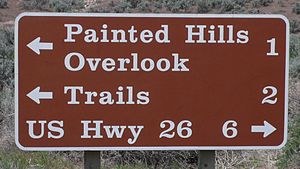
 Clarendon Bold on a U.S. National Park Service sign
Clarendon was used by the United States National Park Service on traffic signs,[5] but has been replaced by NPS Rawlinson Roadway. In 2008, the typeface was utilized extensively by the Ruby Tuesday restaurant chain in the re-launch of their corporate identity.[6] Via, the travel magazine of the American Automobile Association, uses the typeface for its logo and headline copy.[7]
Clarendon can also be seen in the logotypes of corporations such as Sony, Pitchfork Media, Wells Fargo, the Spanish newspaper El País and the Swedish house manufacturer Älvsbyhus. Fortune, or Volta, a typeface based on Clarendon designed by Konrad F. Bauer and Walter Baum in 1956,[8] was used for the wedge spaces on the Wheel of Fortune dollar amount wheel. Hermann Eidenbenz's Clarendon Bold is now used. The American rock band Switchfoot also utilizes a slightly distressed and altered version of the font for the band name on all of their albums and publications since the release of The Beautiful Letdown in 2003.[9]
French Clarendon
In the late nineteenth century the basic Clarendon face was radically altered by foundries in the United States resulting in the production of the French Clarendon type with enlarged block serifs. This devlopement is usually recognized as the type used in circus posters and wanted notices in western movies.[10] Other names are also used for this type. Jasper's Encyclopedia of Typefaces refers to the type as Reversed Egyptian, while DeVinne calls it Italian and says "To be hated, it needs but to be seen."[11] P. T. Barnum is an example of this typeface.
References
- ^ Haralambous, Yannis; P. Scott Horne (2007). Fonts & Encodings. O'Reilly. p. 397. ISBN 0596102429.
- ^ http://popperfont.com/2008/06/27/fontlove-clarendon/
- ^ McGrew, Mac (1986). American Metal Typefaces of the Twentieth Century. Oak Knoll Books. pp. 110–111. ISBN 0938768395.
- ^ http://stbride.org/friends/conference/badtype/wood-type.html
- ^ Yaffa, Joshua (2007-08-12). "The Road to Clarity". The New York Times. http://www.nytimes.com/2007/08/12/magazine/12fonts-t.html. Retrieved 2010-04-30.
- ^ http://blog.pentagram.com/2007/10/new-work-ruby-tuesday.php
- ^ http://www.viamagazine.com/images/via-cover-ja11175x230gif
- ^ http://new.myfonts.com/fonts/ef/volta/
- ^ http://www.switchfoot.com
- ^ Provan, Archie, and Alexander S. Lawson, 100 Type Histories (volume 1), National Composition Association, Arlington, Virginia, 1983, pp. 20-21.
- ^ De Vinne, Theodore Low, The Practice of Typography, Plain Printing Types, The Century Co., N.Y.C., 1902, p. 333.
External links
- How wood type tamed the west
- List of fonts of the Clarendon typeface family at MyFonts.com
- List of fonts of the Clarendon typeface family at Fonts.com
- List of fonts of the Clarendon typeface family at Linotype.com
Categories:- Slab serif typefaces
- 1845 introductions
- Letterpress typefaces
- Photocomposition typefaces
- Virtual typefaces
Wikimedia Foundation. 2010.

