- List of typefaces designed by Frederic Goudy
-
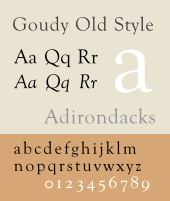 A sample of Goudy Old Style.
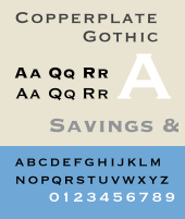 A sample of Copperplate Gothic.
The following is a list of typefaces designed by Frederic Goudy
- Camelot (1896, Dickinson Type Foundry), Goudy designed only the capitals, lower-case letters were evidently added by Dickinson/ATF designer Joseph W. Phinney.
- Unnamed (1896) this was a second set of drawings sent to Dickinson Type Foundry that he sent them after they had accepted Camelot. It was neither accepted nor cast, but Goudy numbered it among his faces.
- Display Roman (1897, nc), Goudy numbered it among his designs, though even he was unsure of what it was or if it were ever cast.
- Devinne Roman (1898, Central Type Foundry, ATF), a book face based on Theodore Low DeVinne's display type.
- Pabst Old Style or Pabst Roman (1902, ATF), based on hand lettering done by Goudy for advertisements for the Pabst Brewing Company, though commissioned by Schlesinger & Mayer, a Chicago department store. Cast by ATF with the proviso that the department store would have the exclusive use of the font for a time before it would be offered to the public. These were the first matrices cut by Wiebking for Goudy.
- Pabst Roman Italic (1903, ATF)
- Powell (1903, Keystone Foundry), commissioned by one Mr. Powell, then advertising manager for Mandel Brothers department store (earlier he had commissioned Pabst Old Style for another store), and named after him.
- Village series
- Village (1903, Wiebking, Harding & Co.[1]), cut by Wiebking. Originally designed for Kuppenheimer & Company, who later decided it would be too expensive to cast, it was later bought by Frederick Sherman. The mats are still extant and cast by Dale Guild Foundry.
- Village No. 2 (1932, Continental, later Lanston Monotype), cut by Goudy for an edition of Theodore Low De Vinne's The Old and the New, later marketed by Monotype.
- Village Italic (1934, Continental + Lanston Monotype), cut by Goudy. A companion to the No. 2 face.
- Baron's Boston News Letter (1904, ATF), a private face cut for Joseph Baron's financial newsletter, matrices cut by Wiebking.
- Engravers' Roman (1904, nc), Goudy was uncertain if this type had ever been cast, and there is no mention of it in ATF's records.
- Chushing Italic Sometime after 1904, Goudy claimed that Clarence C. Marder asked him to draw an italic to complement ATF's existing Cushing Roman, but ATF catalogs show it as existing as early as 1898, thus precluding Goudy from having designed it.
- Copperplate Gothic Heavy (1905, ATF), originally designed for Marder, Luse, & Co., ATF immediately adopted it and made it the first in a hugely successful series. Clarence C. Marder and Morris Fuller Benton later cut dozens of variations for ATF.
- Caslon Revised (1905, nc), Clarence C. Marder of ATF had asked Goudy to draw a more regular version of William Caslon's famous face, but the result was never cast.
- Caxton Initials (1905, ATF), font included twenty-six capitals and one leaf ornament only.
- Globe Gothic Bold (1905, ATF), a companion to Morris Fuller Benton's Globe Gothic.
- Monotype 38E Roman + Italic (1908, Lanston Monotype), originally made for use in Life Magazine and later marketed as Goudy Light and Goudy Light Italic. Sometimes known as Gimbel because of its constant use in ads for Gimbel's Department Store.
- Norman Capitals (1910, privately cast by ATF), cut for Munder-Thompson Company, a Baltimore printing firm, and named for Norman Munder. Mats engraved by Wiebking.
From 1911 to 1926 (with a few exceptions) Goudy's designs were cut by Wiebking. Some were private commissions, others were cut first and then offered for sale.
- Kennerley series
- Kennerley Old Style (1911, Village Letter Foundry + 1920, Lanston Monotype + 1927 Continental), cut for New York publisher Mitchell Kennerley
- Kennerley Italic (1918, Village Letter Foundry + 1920, Lanston Monotype + 1927 Continental)
- Kennerley Bold + Bold Italic (1924, Lanston Monotype + Continental)
- Forum Title (1911, Lanston Monotype), capitals only, based on the lettering on the Arch of Titus in the Roman Forum.
- Sherman (1912), privately cast for publisher Frederick Sherman who disliked it and never used it.
- Goudy Old Style (1912, Village Letter Foundry), in 1915, when ATF requested this name for his new face for them, Goudy agreed and re-named this face Goudy Antique. When Lanston Monotype bought and issued the face, it was again renamed, in honor of Tolbert Lanston, under its most common name, Goudy Lanston. Issued in England, with some alterations, by Caslon under the name Ratdolt. Evidently, this altered English version, was issued under the names Foster and Moore by Barnhart Brothers & Spindler along with a "matching" italic (see below).
- Klaxon (1914, cut for Klaxon Auto Warning Signal Company), the matrices, which were cut by Wiebking, were lost in Goudy's 1939 studio fire.
- Goudy Roman (1914), originally designed for Louis Orr of the Bartlett Press who was supposed to have them cast by Caslon Foundry, but Caslon refused to take on new work due to a "war scare". Later, Barnhart Brothers & Spindler expressed interest in the project cut trial matrices, which Goudy did not like, so he eventually cut the matrices himself. It is unclear if the type was ever cast in quantity.
- Goudy Italic, a companion to Goudy Roman which never progressed past initial drawings which were then destroyed in Goudy's 1939 studio fire.
In 1915 and 1916, Goudy was on retainer for American Type Founders and all of his matrices were cut in house by ATF.
- Goudy Old Style series (ATF)
- Goudy Old Style + Italic (1915)
- See below for many variations cut by others.
- Goudy Cursive (1916, ATF)
- National Old Style (1916, ATF), quite similar to his Nabisco. Often used on inter-title cards for silent movies.
- Booklet Old Style (1916, ATF), apparently never marketed by ATF.
- Unnamed (1917), Goudy had zinc etchings made of this face and pulled proofs, which dissatisfied him. He scrapped the face and the drawings are now in the Library of Congress.
- Advertiser's Roman (1917, nc), patterns were cut but never cast, all traces lost in Goudy's 1939 studio fire.
- Cloister Initials (1918, ATF), designed to be used with Morris Fuller Benton's Cloister.
- Hadriano Title (1918, Lanston Monotype + 1927, Continental), matrices cut by Wiebking.
- Hadriano Lower Case (1930, nc), designed by Goudy for Monotype but never cut. In 1932 Monotype released a full-font that consisted of Hadriano Title matched with Kennerley Bold lower case letters.
- Goudy Open (1918, Village Letter Foundry + 1924, Monotype Ltd. + 1927, Continental), matrices cut by Wiebking.
- Goudy Modern (1918, Village Letter Foundry + 1924, [[Monotype Corporation|Monotype Ltd. + 1927, Continental), basically just a "filled in" version of Goudy Open, matrices cut by Wiebking.
- Goudy Open Italic + Modern Italic (1919, Village Letter Foundry + 1924, Monotype Ltd.), matrices cut by Wiebking.
- Collier Old Style (1919, ATF), a private type for Proctor & Collier, a Cincinnati advertising agency, matrices cut by Wiebking.
- Lining Gothic (1921, nc), drawings for this face were complete, but when Wiebking was late in cutting the matrices, the order was canceled.
- Nabisco (1921, privately cast), cut for the National Biscuit Company based on the hand-lettered logotype he had done for them twenty years ago, matrices cut by Wiebking.
- Garamont + Italic (1921, Lanston Monotype + 1927, Continental), based on the faces of Claude Garamond.
- Goudy Newstyle (1921, Village Letter Foundry + 1927, Continental + 1941 Lanston Monotype), re-cut in 1935 and sold to Monotype who then marketed it as Goudy Bible. This face was then adapted by Bruce Rogers and Sol Hess for the famous Oxford Lectern Bible of 1948.
- Italian Old Style + Italic (1924, Lanston Monotype + 1927, Continental)
- Goudy Heavy Face + Italic (1925, Lanston Monotype + 1927, Continental), intend to compete with Cooper Black.
- Marlborough (1925, Village Letter Foundry + 1927, Continental), a private face designed for a printer who lost interest in the project before completion. The matrices were cut by Wiebking and a few fonts were cast by Goudy, and these were destroyed in Goudy's studio fire of 1939. A revised version of this design was sold to Lanston Monotype in 1942, but Monotype, evidently, did nothing with it thereafter.
- Venezia Italic (1925, Monotype Ltd.), made at the request of type designer George W. Jones to accompany his Venezia Roman.
From 1926 until his death, Goudy cut all of his own faces (at least in the pilot sizes).[2] From 1927-1929, Goudy cast type at his own Village Letter Foundry and marketed them through the Continental Type Founders Association. After 1929 he ceased casting his own fonts and they were cast for Continental by the New England Type Foundry.[3]
- Goudy Antique (1926, privately cast by Village Letter Foundry + 1927, Continental), the first type matrices actually cut by Goudy himself.
- Aries (1926), privately cast for Spencer Kellogg's Aries Press.
- Goudy Uncials (1927, nc), drawings were completed, all traces lost in Goudy's 1939 studio fire.
- Companion Old Style + Italic (1927, Lanston Monotype), a private face cut for the Woman's Home Companion magazine.
- Deepdene series
- Deepdene (1927, Continental, later Lanston Monotype) Changes made to fit Monotype's machine composition were not done by Goudy himself.
- Deepdene Italic (1928, Continental, later Lanston Monotype), matrices cut by Bertha M. Goudy.
- Deepdene Medium (1931, nc), designed for Lanston Monotype but evidently never cast.
- Deepdene Bold + Bold Italic (1934, Lanston Monotype)
- Remington Typewriter (1927, Lanston Monotype), though intended to be used on Remington typewriters, it was eventually picked up by Monotype.
- Record Title (1927), privately cast for Architectural Record magazine at the commission of Charles DeVinne, grandson of the famous printer and type designer, Theodore Low De Vinne.
- Goudy Dutch (1927, nc), designs complete but never cut, all traces lost in Goudy's 1939 studio fire.
- Goudytype (1928, ATF), designed and cut in 1916, not cast and sold until later.
- Goudy Black (1928, Continental), later cast as Goudy Text by Lanston Monotype).
- Inscription Greek (1929, nc), a font of the eleven Greek capitals that don't exist in the Roman alphabet. These were intended to be used with Kennerley Old Style small caps to form a Greek font. No casting information available.
- Lombardic Capitals (1929, Continental + Lanston Monotype), capitals only, intended to serve as alternate, decorative capitals for Goudy Text.
- Goudy Sans Serif series
- Goudy Sans Serif Heavy or Sans Serif Bold (1929, Lanston Monotype)
- Goudy Sans Serif Light (1930, Lanston Monotype)
- GoudySans Serif Light Italic (1931, Lanston Monotype)
- Kaatskill (1929, Continental), a private face cut for the Limited Editions Club edition of Rip Van Winkle.
- Strathmore Title (1929), designed as part of a project for Strathmore Paper Company, only fourteen letters were cut before the project was abandoned.
- Goudy Forum (1929, Continental + 1932, Lanston Monotype)
- Unnamed (two faces) (1930), two designs with job numbers from 1930 were destroyed in the fire of 1939. Nothing else known.
- Trajan Title (1930, Continental, later Monotype Ltd.), a private face in the U.S., it was marketed in England and Europe by British Monotype.
- Mediaeval (1930, Continental)
- Truesdell + Italic (1930, Continental), designed for a preface published in the Colophon No. 5 and named for Goudy's mother.
- Truesdell Italic (1931, Continental)
- Goudy Ornate or Ornate Title (1930, Continental), capitals only.
- Advertisers Modern (1930, privately cast), cut for the Manuel Rosenberg, publisher of The Advertiser.
- Deepdene Open Text (1931, Continental), cut as headings for a book by Edmund G. Greiss. Capitals only.
- Deepdene Text (1931, Continental), basically just a "filled-in" version of Deepdene Open Text.
- Foster Abstract (1931, Continental), designed by Robert Foster with matrices cut by Goudy and cast privately.
- Goethe (1932, Continental), basically a lighter version of Goudy Modern, cut for the Goethe Centenary Exhibition in Leipsig.
- Goethe Italic (1932, Continental), cut for the Limited Editions Club edition of Frankenstein.
- Quinian Old Style (1932, nc), named for the editor of American Mercury who commissioned the type, however the drawings were rejected and subsequently perished in Goudy's studio fire of 1939.
- Mostert (1932, nc), project never progressed beyond first round of proofs.
- Aries (re-cut) (1932, Continental), later sold to Edwin Grabhorn, a San Francisco printer, who had it cast by Lanston Monotype and re-named it Franciscan. Subsequently cast by McKenzie & Harris.
- Goudy Boldface (1932, nc), level of completion uncertain, records lost in Goudy's 1939 studio fire.
- Goudy Book (1933, nc), designs complete but never cut, all traces lost in Goudy's 1939 studio fire.
- Mercury (1933, nc), designs complete but never cut, all traces lost in Goudy's 1939 studio fire.
- Saks Goudy + Italic + Bold Caps (1934), a private type cast for Saks Fifth Avenue department store.
- Saks Goudy Bold Caps actually consists of the small capitals of larger sizes cast on larger bodies.
- Hasbrouck (1934, nc), designs complete but never cut, all traces lost in Goudy's 1939 studio fire
- Textbook Old Style (1934, nc), designs complete but never cut, all traces lost in Goudy's 1939 studio fire..
- Tory Text (1935, Continental), based on the letters of Geoffroy Tory. Used only for one book, though one of Goudy's favorites. Capitals later cannibalized for New Village Text.
- Atlantis (1935, nc), designs complete but never cut, all traces lost in Goudy's 1939 studio fire.
- Millvale (1935, nc), designs complete but never cut, all traces lost in Goudy's 1939 studio fire.
- Bertham (1936, Continental), Goudy's 100th typeface, done by request for American Printer Magazine. Based on Leonard Holle's 1482 design and named for Goudy's wife, Bertha M. Goudy.
- Pax (1936, nc), matrices were cut, but Goudy was disappointed with the results and never cast the type.
- Friar (1937, Continental), designed for his own amusement, Goudy only cast a few fonts of this face in 12 point.
- University of California Old Style + Italic (1938, Continental) cut for the University of California Press and reissued in 1958, by Lanston Monotype as Californian and Californian Italic. Later famously digitized as Berkeley Old Style.
- New Village Text (1938, Continental), not a new face but a mongrel cast by Goudy's son consisting of capitals from Tory Text and lower-case letters from Deepdene Text.
- Murchison (1938, Photostat Corporation), Goudy's only excursion into cold type. Named for the president of Photostat Corporation.
- Goudy Stout (1939, Continental), only cut in 24 pt. capitals, few ever cast.
- Bulmer (1939, nc), an attempt to design a lower-case for fine capitals by William Bulmer, never completed.
- Scripps College Old Style (1941), a private face cast for Scripps College. Commissioned by college librarian Dorothy Drake, it was intended for the use of students interested in book making.
- Scrips College Italic (1944)
- Spencer Old Style + Italic (1943, nc), commissioned for a large book printing firm but never accepted due to wartime restrictions. Later the design was given to Syracuse University and named for H. Lyle Spencer, dean of the School of Journalism.
- Marlborough Text (1944, Continental), a private face for International Printing Company. Though a complete design, only the letters to print "Certificate of Honor" were ever cut.
- Hebrew University (1945, nc), a font of Hebrew letters commissioned by the American Friends of the Hebrew University in Jerusalem. No casting information available.
- Goudy Thirty (1953, Lanston Monotype), cut with the intention of being issued after Goudy's death, "thirty" being a newspaper term for the end of the story. Goudy finished work on it in 1942 and Monotype waited several years after his death in 1947 before issuing the font.
"Goudy" faces designed by others
- Hearst (1902, Inland Type Foundry). Goudy claimed that this had been copied from lettering he had done for a book of verses for children, and it is similar to his Pabst Roman.
- Powell Italic (1908, Keystone Foundry), designed in-house by Keystone. Has the distinction of being the first "non-kerning" italic where no character overhangs the body, an idea that proved quite popular.
- Goudy Bold (1916, ATF) and Goudy Bold Italic (1919, ATF), were designed by Morris Fuller Benton as companions to Goudy Old Style. The Lanston Monotype version of the italic includes cursive capitals by Sol Hess.
- Goudy Title (1918, ATF) is a full size variation on Goudy's small capitals from his Goudy Old Style and was designed by Morris Fuller Benton.
- Goudy Catalog (1919, ATF) and Goudy Catalog Italic (1921, ATF), were designed by Morris Fuller Benton as medium weight companions to Goudy Old Style.
- Goudy Handtooled + Italic (1922, ATF), were in-line versions of Goudy Bold + Italic and were probably designed by Charles H. Becker, though other authorities credit either Morris Fuller Benton or Wadsworth A. Parker. Again, the Lanston Monotype version of the italic includes cursive capitals by Sol Hess.
- Italian Old Style Wide (1924, Lanston Monotype), designed by Sol Hess as a companion to Goudy's Italian Old Style.
- Number Eleven series (1924, Ludlow), are out-and-out copies of the Goudy Old Style series.
- Kennerley Open Capitals (1925, Lanston Monotype), were designed by Sol Hess.
- Goudy Heavy Face Open (1926, Lanston Monotype) and Goudy Heavy Face Condensed (1927, Lanston Monotype), were designed by Sol Hess.
- Goudy Extra Bold + Italic (1927, ATF), were a further extension of the Goudy Old Style series by Morris Fuller Benton.
- Foster Italic and Moore Italic (1927, BB&S), were designed by Richard N. McArthur, and based on the English alteration of Goudy Lanston mentioned above.
- Hadriano Stone Cut (1932, Lanston Monotype), was an in-line version of Hadriano Title designed by Sol Hess.
- Goudy Text Shaded (Lanston Monotype), was designed in house by Monotype.
- Pabst Old Style Condensed (Mergenthaler Linotype), was designed in house by Linotype. Pabst Extra Bold, though also cast by Linotype, has no relation to Goudy's face and is actually a knock-off of Cooper Black.
References
- ^ Lawson, Alexander, Anatomy of a Typeface. Boston: David R. Godine, Publisher, 1990. ISBN 0-87923-332-X. p. 112.
- ^ Rollins, Carl Purlington American Type Designers and Their Work. in Print, V. 4, #1.
- ^ Specimen Book of Continental Types, Continental Type Founders Association, N.Y.C., 1929, p. 123.
Additional sources
- Rollins, Carl Purlington American Type Designers and Their Work. in Print, V. 4, #1.
- MacGrew, Mac, "American Metal Typefaces of the Twentieth Century," Oak Knoll Books, New Castle Delaware, 1993, ISBN 0-938768-34-4.
- Bruckner, D.J.R., "Frederic Goudy," Documents of American Design series, Harry N. Abrams, Inc., Publishers, New York City, 1990, ISBN 0-8109-1035-7.
Categories:- Lists of typefaces


Wikimedia Foundation. 2010.