- Chicago (typeface)
-
Chicago 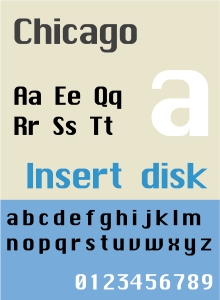
Category Sans-serif Designer(s) Susan Kare Foundry Bigelow & Holmes Chicago is a sans-serif typeface designed by Susan Kare for Apple Computer. It was used in the Macintosh operating system user interface between 1984 and 1997 and was an important part of Apple’s brand identity. It is also used in early versions of the iPod user interface. While initially a bitmap font, Apple commissioned the type foundry Bigelow & Holmes to create a TrueType version, as the OS’s capabilities improved. The typeface is named after the U.S. city of Chicago.
According to Susan Kare, Chicago was the first font to be developed for the Macintosh.[citation needed] Before the team settled on the familiar “world cities” naming convention for the fonts, it was called Elefont (Elefont is also the name of a bold semi-serif typeface designed by Bob McGrath in 1978). The first bitmap version included only a 12 pt. version. This font, with only very minor changes to spacing, was used for menus, dialogs, window titles and text labels in up to and including version 7.6 of the system. The TrueType version had many differences from the bitmap version, which became more apparent at greater sizes. One of Chicago’s major features was that it could remain legible while being made “grey” (to indicate a disabled menu item) by the removal of every other pixel (since actual grey type was impossible on a black-and-white monitor). The zero was slashed.
German versions of System 7.x had a different rendering of Chicago. The “w” had two dips instead of one at the end of the letter, and the “I” (capital “i”) appeared more like a column than a vertical line. A mix of this and the original Chicago was used in the original iPod.
In Mac OS 8, Charcoal replaced Chicago as the default system font. Chicago continued to be distributed as a standard component of the system, and Apple even urged developers to keep designing user interfaces for the Chicago typeface, since the new alternate fonts used the Chicago metrics as a foundation.
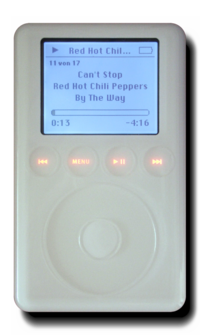 A third-generation iPod using an altered Chicago typeface in its user interface.
Chicago was also used in Apple marketing materials. It was also common to find this font in early amateur desktop publishing productions, since it was available as part of the system. While Apple gravitated away from Chicago following the adoption of Charcoal as part of the platinum theme in Mac OS, it was later revived in the user interface for the iPod music player, where legibility on a low resolution black-and-white screen became once again an asset. With the introduction of the iPod mini, a smaller typeface was needed, and the Espy Sans font from the Apple Newton was used. Finally, with the introduction of the iPod photo, the color iPod interface changed to Podium Sans—a bitmap font similar to the Myriad Pro typeface which Apple has adopted gradually for its marketing since 2002.
Chicago is a registered trademark (“typeface fonts recorded on computer software”), belonging to Apple since August 1996.
See also
- Fixedsys
- Apple typography
References
- Susan Kare. World Class Cities. Retrieved September 21, 2004.
- MyFonts. Chicago font family. Retrieved September 21, 2004.
- Apple Computer, Inc. Human Interface Guidelines for Mac OS 8. Retrieved September 21, 2004
- Notes on 4 Apple Fonts—a description of the design of the TrueType versions of Chicago, New York, Geneva and Monaco.
Categories:- Apple Inc. typefaces
- Sans-serif typefaces

Wikimedia Foundation. 2010.