- Bell (typeface)
-
Category Serif Classification Scotch Roman Designer(s) Richard Austin Foundry British Letter Foundry Bell (sometimes known as John Bell) is a Scotch Roman typeface designed in 1788 by Richard Austin. After a short initial period of popularity, the face fell until disuse until it was revived in the 1930s, after which it enjoyed an enduring acceptance as a text face.
Contents
Visual Distinctive Characteristics
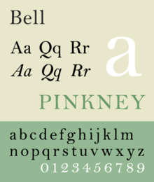
Characteristics of this typeface are:
lower case: square dot over the letter i. double storey a.
upper case: dropped horizontal element on A.
figures:
History
John Bell, impressed by the clarity and contrast found in contemporary French typefaces cut by Firmin Didot, commissioned Austin, a skilful punch cutter first trained as an engraver, to produce a face for his British Letter Foundry. Bell wanted a sharply serifed face, like Didot in its contrast of thick and thin strokes, but more like Baskerville in its use of bracketed, less rectilinear, serifs. The result was the first Scotch Roman face, later described by Stanley Morison as the first English modern typeface. After Bell's foundry was closed, the matrices came into the possession of Stephenson Blake.
The initial success of the face was short lived however, as the introduction of lithography at the beginning of the nineteenth century caused taste in typefaces to change dramatically. Thus, while Bell's type was seldom seen after 1800 in England, it went on to be come a favorite in the United States. When the Boston publisher Henry Houghton went to Europe to purchace type for his Riverside Press he selected Bell. Back in Boston the face was called copperplate.[1] In 1900, when Bruce Rogers found the face at the Riverside Press, he used it for book work under the name Brimmer. D.B. Updike used another font of this type at his Merrymount Press where it was called Mountjoye.[2]
In 1926 Stanley Morison came upon a sample of the type and arranged for itr revival by Monotype Corporation which appeared in 1930. The 1932 Monotype revival included a wide range of Austin's character variants, including swash versions of the uppercase characters A, J, N, Q, T, V, and Y. The figures are distinct for being lining, and proportioned to set at approximately three-quarter the height of the capitals. The designer Jan Tschichold favored the typeface Bell in much of his book design, and mentioned it in his book Typographische Gestaltung.
The face should not be confused with the sans-serif typefaces Bell Gothic and Bell Centennial developed for AT&T, which are not related.
Foundry Type
- Bell (1788, British Letter Foundry)
- Bell (1930, English Monotype)
- Bell (1940, Lanston Monotype)[3]
- Bell (1949 Stephenson Blake[4]
Digital Versions
Monotype's contemporary digital version was developed under the supervision of Robin Nicholas.
References
- Blackwell, Lewis. 20th Century Type. Yale University Press: 2004. ISBN 978-0-300-10073-0.
- Jaspert, W. Pincus, W. Turner Berry and A.F. Johnson. The Encyclopædia of Type Faces. Blandford Press Lts.: 1953, 1983. ISBN 978-0-7137-1347-3.
- Lawson, Alexander S., Anatomy of a Typeface. Godine: 1990. ISBN 978-0879233334.
- Macmillan, Neil. An A–Z of Type Designers. Yale University Press: 2006. ISBN 978-0-300-11151-4.
- ^ Provan, Archie, and Alexander S. Lawson, 100 Type Histories (volume 1), National Composition Association, Arlington, Virginia, 1983, p. 22.
- ^ McGrew, Mac, American Metal Typefaces of the Twentieth Century, Oak Knoll Books, New Castle Delaware, 1993, ISBN 0-938768-34-4, p. 29.
- ^ McGrew, Mac, American Metal Typefaces of the Twentieth Century, Oak Knoll Books, New Castle Delaware, 1993, ISBN 0-938768-34-4, p. 29.
- ^ Macmillsn, Niel.An A-Z of Type Designers. Yale University Press, 2006 (pg. 38-39)
External links
Categories:- Transitional serif typefaces
- Modern serif typefaces
- Monotype typefaces
- Letterpress typefaces
- Photocomposition typefaces
- Virtual typefaces

Wikimedia Foundation. 2010.