- Didot (typeface)
-

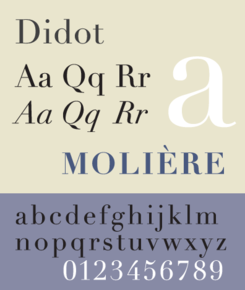
Category Serif Classification Didone Shown here Linotype Didot
by Adrian FrutigerDidot is a name given to a group of typefaces named after the famous French printing and type producing family. The classification is known as modern, or Didone. The typeface we know today was based on a collection of related types developed in the period 1784–1811. Firmin Didot (1764–1836) cut the letters, and cast them as type in Paris. His brother, Pierre Didot (1760–1853) used the types in printing. His edition of La Henriade by Voltaire in 1818 is considered his masterwork. The typeface takes inspiration from John Baskerville's experimentation with increasing stroke contrast and a more condensed armature. The Didot family's development of a high contrast typeface with an increased stress is contemporary to similar faces developed by Giambattista Bodoni in Italy. Didot is described as neoclassical, and is evocative of the Age of Enlightenment.
The "Foundry Daylight" version of Didot was commissioned and used by broadcast network CBS for many years alongside its famous "eye" logo.[1] While the network's use of Didot with its logo is not as prevalent as it once was, it is still a common sight.
Several revivals of the Didot faces have been made, most of them for hot metal typesetting. Like Bodoni, early digital versions suffered from a syndrome called "dazzle"–the hairline strokes in smaller point sizes nearly disappearing in printing. Among the more successful contemporary adaptations are the ones drawn by Adrian Frutiger for the Linotype foundry, and by Jonathan Hoefler for H&FJ. Both designs anticipate the degradation of hairline in smaller point sizes by employing heavier weighted strokes in the smaller point sizes.
Visual Distinctive Characteristics
Characteristics of this typeface are:
lower case: square dot over the letter i. double storey a.
upper case: dropped horizontal element on A.
figures:
References
- Blackwell, Lewis. 20th Century Type. Yale University Press: 2004. ISBN 0-300-10073-6.
- Fiedl, Frederich, Nicholas Ott and Bernard Stein. Typography: An Encyclopedic Survey of Type Design and Techniques Through History. Black Dog & Leventhal: 1998. ISBN 1-57912-023-7.
- Lawson, Alexander S. Anatomy of a Typeface. Godine: 1990. ISBN 0-87923-333-8.
- Macmillan, Neil. An A–Z of Type Designers. Yale University Press: 2006. ISBN 0-300-11151-7.
- Meggs, Philip and Rob Carter. Typographic Specimens: The Great Typefaces. Van Nostrand Reinhold: 1993. ISBN 0-442-00758-2.
- Meggs, Philip B. and Roy McKelvey. Revival of the Fittest. RC Publications, Inc.: 2000. ISBN 1-883915-08-2.
- Updike, Daniel Berkley. Printing Types Their History, Forms and Use Dover Publications, Inc.: 1937, 1980. ISBN 0-486-23929-2.
External links
- Stephen Coles. "The Didot You Didn't Know". Typographica blog. 26 March 2004
- Jean François Porchez. "L’Ambroise en détails". Typographic 59. 2001. Online version at Porchez Typofonderie website. Discusses the history of Didot, and the process of creating the modern revival "Ambroise".
Categories:- Modern serif typefaces
Wikimedia Foundation. 2010.
