- Optima
-
For other uses, see Optima (disambiguation).
Category Sans-serif Designer(s) Hermann Zapf Foundry Linotype Variations Optima Nova Optima is a humanist sans-serif typeface designed by Hermann Zapf between 1952 and 1955 for the D. Stempel AG foundry, Frankfurt, Germany.
Contents
Characteristics
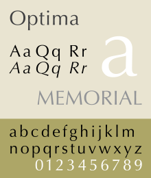
Though classified as a sans-serif, Optima has a subtle swelling at the terminal producing a suggestion of a glyphic serif. Optima’s design follows humanist lines, but its italic variant is merely an oblique, essentially a sloped roman without characteristic italic letterforms such as a single storey a and rounded base of v and w. This is more typical of a realist sans-serif such as Helvetica or Univers. Also unconventional for the contemporary sans, Optima's capitals (like Palatino's) are directly derived from the classic Roman monumental capital model (one other well executed example is Meier's Syntax). It is clear from the reverence in Zapf's designs that he regards the Roman capitals as ideal forms, and his executions in type prove the thesis. Like Palatino, another Zapf design, Optima is both widely admired and much imitated. Optima and Palatino are trade marks of Linotype (a Monotype company).
In the Bitstream font collection, Zapf Humanist is provided as an Optima clone. Other Optima clones include Optane from the WSI Fonts collection, Opulent by Rubicon Computer Labs Inc., Ottawa from Corel, CG Omega and Eterna. Freely available implementations include MgOpen Cosmetica (Available with open source license) and URW Classico (available with URW Font package from Ghostscript).
Optima Greek (1973)
It is a Greek variant designed by Matthew Carter, based on sketches from Hermann Zapf.[1] Digital version has not been produced.
Optima Classified (1976)
It is a variant designed by Matthew Carter, based closely on Optima Medium. Digital version has not been produced.
Optima nova (2002)
Optima nova is a redesign of the original font family, designed by Hermann Zapf and Linotype GmbH type director Akira Kobayashi. The new family contains 7 font weights, which adds light, demi, heavy font weights, but removed extra black weight. Medium weight is readjusted to between medium and bold weights in the old family scale. Glyph sets are expanded to include Adobe CE and Latin Extended characters, with light to bold weight fonts supporting proportional lining figures, old style figures, small caps. Italic fonts include italic type features instead of just tilted romans. Even in roman fonts, letters such as Q, a, f are redesigned. The overall bounding boxes were widened in Optima nova.
Optima nova Condensed
It is a condensed variant is which consist of light to bold weights, but no italic fonts. Glyph set does not support proportional lining figures, old style figures, small caps.
Optima nova Titling
It is a titling capitals variant, which contains only capital letters, with restyled letterform. Glyph set is same as Optima nova Condensed, except it also includes extra ligatures.
In the tradition of hand lettering and lapidary inscription, the titling face shares similarities with the work of Zapf's friend Herb Lubalin especially the exuberant ligatures (for which Lubalin's ITC Lubalin Graph and ITC Avant Garde are notable). Further influence of A.M. Cassandre and Rudolf Koch, whose work greatly inspired the young Zapf, can also be seen in Optima.
Usages
The typeface Optima is used for the Vietnam Veterans Memorial and was used by the 2008 John McCain presidential campaign.[2] Optima is also used as the official branding typeface for Estée Lauder Companies, the University of New South Wales,[3] the University of Calgary,[4] by Aston Martin, Movado and British retailer Marks & Spencer. Optima is used iconically for Traveller, and Diaspora used it to pay homage to Traveller.[5]
Optima was used for lettering on Premier League kits until May 2006, when it was replaced by a different typeface.[6]
Marks and Spencer used the font for its corporate logo [7][8][9] and as the default on all internal correspondence from 2000 but since 2007 it is gradually being phased out on all signage and packaging as part of another re-branding exercise.
Optima was chosen as the font to be used for the names of those who lost their lives in the September 11 attacks, carved into bronze parapets, at the National September 11 Memorial & Museum, which is named "Reflecting Absence".[10]
References
- ^ magazine TYPO.18 December 2005 issue
- ^ Tschorn, Adam (March 30, 2008). "The character issue". Los Angeles Times. http://articles.latimes.com/2008/mar/30/image/ig-font30.
- ^ http://my.unsw.edu.au/unsw/Fonts.html
- ^ http://www.ucalgary.ca/universityrelations/coat-of-arms/
- ^ http://phreeow.net/pipermail/diaspora_phreeow.net/2009-October/000096.html
- ^ Neijnens, Sander. "FA Premier League". http://www.letterbeeld.nl/shirtnumbers/leagues/fapremierleague.html. Retrieved May 01, 2011.
- ^ http://www.brandrepublic.com/news/69064/M-S-launches--rsquofresh-rsquo-brand-identity/?DCMP=ILC-SEARCH
- ^ http://en.wikipedia.org/wiki/Marks_%26_Spencer#Change_of_historic_logo
- ^ http://www.fontco.com/font-facts/optima.php
- ^ Tina Susman, Los Angeles Times (26 August 2011). "Architect's vision takes shape in Sept. 11 memorial". http://www.latimes.com/news/nationworld/nation/september11/la-na-911-memorial-architect-20110826,0,7520092.story. Retrieved August 26, 2011.
- Margaret Re, Johanna Drucker, Matthew Carter, James Mosley. Typographically Speaking: The Art of Matthew Carter. Princeton Architectural Press: 2003. ISBN 1568984278, ISBN 978-1568984278.
- Blackwell, Lewis. 20th Century Type. Yale University Press: 2004. ISBN 0-300-10073-6.
- Fiedl, Frederich, Nicholas Ott and Bernard Stein. Typography: An Encyclopedic Survey of Type Design and Techniques Through History. Black Dog & Leventhal: 1998. ISBN 1-57912-023-7.
- Jaspert, W. Pincus, W. Turner Berry and A.F. Johnson. The Encyclopedia of Type Faces. Blandford Press Lts.: 1953, 1983. ISBN 0-7137-1347-X.
- Lawson, Alexander S., Anatomy of a Typeface. Godine: 1990. ISBN 978-0879233334.
- Macmillan, Neil. An A–Z of Type Designers. Yale University Press: 2006. ISBN 0-300-11151-7.
- Zapf, Hermann. Manuale Typographicum. The MIT Press: 19534, 1970. ISBN 0-262-24011-4.
External links
Categories:- Stempel typefaces
- Linotype typefaces
- Humanist sans-serif typefaces

Wikimedia Foundation. 2010.