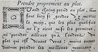
- Civilité
-
Civilité type (in French: "Caractères de civilité") is a typeface invented in 1557 by the French engraver Robert Granjon. These characters imitate French cursive gothic letters of the Renaissance.
History
The first book in the new type was Dialogue de la vie et de la mort, a French version of Innocenzo Ringhieri's dialogue, in the dedication of which Granjon explains his purpose in cutting the new design. He calls the typeface "lettres françaises" and suggests that France like other nations should have a type based on the national hand; his model was contemporary handwriting. The popular name for the type came from the titles of two early books in which it was used: Erasmus's La Civilité puerile, Jean Bellère, Antwerp, 1559, and La Civile honesteté pour les enfans, R. Breton, Paris, 1560. "Civilité" meant "good manners" and it was thought an advantage that children should learn to read from a book printed in a book printed in a type resembling current handwriting. Between 1557 and 1562 Granjon printed some 20 books in this type. Two other Paris printers had typefaces made that were very similar and Granjon himself supplied his version to Guillaume Silvius and to Christophe Plantin at Antwerp.[1]
They were mostly employed to print books in Flanders, Holland,[2][3] England, and France. In the latter, they were used until the second half of the 19th century to print children's lesson-books teaching civility and manners from which the type got its name.[4] Civilité type did not win great popularity in France although used occasionally at all periods. Another version of civilité were used in one book printed in 1597 by Claude Micard, and two others in two books printed by Jean de Tournes in 1581 and 1598. In the mid 19th century Louis Perrin of Lyons printed J. Soulary's Sonnets humouristiques in civilité. Granjon's experiment cannot be said to have been a success: one of the grave disadvantages was that many ligatures were required and some letters had more than one variant.[5]
References
- ^ Johnson, A. F. (1966) Type Designs; 3rd ed. London: Andre Deutsch; pp. 138-40
- ^ In the Netherlands the type was more popular than in France but mostly in a form based on the contemporary Flemish hand which was devised by Ameet Tavernier of Bailleul by 1559.--Johnson (1966), p. 140
- ^ E.g. Vlacq, Michiel et al. (1607) Den nieuwen verbeterden Lust-Hof, gheplant vol uytgelesene, eerlijcke, amoreuse ende vrolijcke ghesanghen. [with:] (Bruylofts Bancket. Verghemaeckt door M[ichiel]. V[acq]. binnen der Goude verriert met ... copere figusren. ... Den derden druck gebetert en veel vermeerdert. Amstelredam: Dirck Pietersz
- ^ Elias, Norbert, 1978: The Civilizing Process: a History of Manners. Urizen Books, New York. p.54
- ^ Johnson, A. F. (1966) Type Designs; 3rd ed. London: Andre Deutsch; pp. 138-40
- Rémi Jimenes, Les Caractères de civilité. Typographie et calligraphie sous l'Ancien Régime, Gap, Atelier Perrousseaux, 2011.
- Harry Carter & Hendrik Vervliet, Civilité types, Oxford, University Press, 1966.
Categories:- Typefaces
- Design
Wikimedia Foundation. 2010.

