- Composition (visual arts)
-
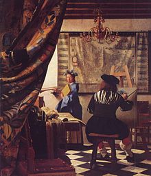
In the visual arts – in particular painting, graphic design, photography and sculpture – composition is the placement or arrangement of visual elements or ingredients in a work of art, as distinct from the subject of a work. It can also be thought of as the organization of the elements of art according to the principles of art.
The term composition means 'putting together,' and can apply to any work of art, from music to writing, that is arranged or put together using conscious thought. In the visual arts, composition is often used interchangeably with various terms such as design, form, visual ordering, or formal structure, depending on the context. In graphic design and desktop publishing, composition is commonly referred to as page layout.
Contents
Elements of design
The various visual elements, known as elements of design, formal elements, or elements of art, are the vocabulary with which the visual artist composes. These elements in the overall design usually relate to each other and to the whole art work.
"Elements of design are:
- Line - the visual path that enables the eye to move within the piece
- Shape - areas defined by edges within the piece, whether geometric or organic
- Color - hues with their various values and intensities
- Texture - surface qualities which translate into tactile illusions
- Form - 3-D length, width, or depth
- Value - Shading used to emphasize form
- Space - the space taken up by (positive) or in between (negative) objects
Line and shape
Literal lines do not exist in nature, but are the optical phenomena created when objects curve away from the viewer. Nonetheless, line-like shapes are for all intents considered line elements by the artist; for example, telephone and power cables or rigging on boats. Any such elements can be of dramatic use in the composition of the image. Additionally, less obvious lines can be created, intentionally or not, which influence the direction of the viewer's gaze. These could be the borders of areas of differing color or contrast, or sequences of discrete elements, or the artist may exaggerate or create lines perhaps as part of his style, for this purpose. Many lines without a clear subject point suggest chaos in the image and may conflict with the mood the artist is trying to evoke.
Movement is also a source of line, and blur can also create a reaction. Subject lines by means of illusion contribute to both mood and linear perspective, giving the illusion of depth. Oblique lines convey a sense of movement and angular lines generally convey a sense of dynamism and possibly tension. Lines can also direct attention towards the main subject of picture, or contribute to organization by dividing it into compartments.
The brain often unconsciously reads near continuous lines between different elements and subjects at varying distances.
Straight lines
Straight lines are called linear when used in a piece of art work. Straight lines add affection and can make it look more detailed and challenging. Horizontal, vertical, and angled lines often contribute to creating different moods of a picture. The angle and the relationship to the size of the frame both work to determine the influence the line has on the image. They are also strongly influenced by tone, color, and repetition in relation to the rest of the photograph. Horizontal lines, commonly found in landscape photography, can give the impression of calm, tranquility, and space. An image filled with strong vertical lines tends to have the impression of height, and grandeur. Tightly angled convergent lines give a dynamic, lively, and active effect to the image whereas strongly angled, almost diagonal lines generally produce tension in the image. Viewpoint is very important when dealing with lines particularly in photography, because every different perspective elicits a different response to the photograph. By changing the perspective only by some degrees or some centimeters lines in images can change tremendously and a totally different feeling can be transported.
Curved lines
Curved lines are generally used to create a sense of flow within an image. They are also generally more aesthetically pleasing, as we associate them with soft things. Compared to straight lines, curves provide a greater dynamic influence in a picture.
In photography, curved lines can give gradated shadows when paired with soft-directional lighting, which usually results in a very harmonious line structure within the image.
Color
Colour is characterized by attributes such as hue, brightness, and saturation. Colours have been associated with different moods, dependent on the society of the time. For example, white has long been viewed as purity, whereas it can also take slightly different meanings such as peace, or innocence. However, in some places (like Japan) it signifies death.
Principles of organization
The artist determines what the center of interest (focus in photography) of the art work will be, and composes the elements accordingly. The gaze of the viewer will then tend to linger over these points of interest. Elements are arranged with consideration of several factors (known variously as the principles of organization, principles of art, or principles of design) into a harmonious whole which works together to produce the desired statement – a phenomenon commonly referred to as unity. Such factors in composition should not be confused with the elements of art (or elements of design) themselves. For example, shape is an element; the usage of shape is characterized by various principles.
Some principles of organization affecting the composition of a picture are:
- Shape and proportion
- Positioning/Orientation/Balance/Harmony among the elements
- The area within the field of view used for the picture ("cropping")
- The path or direction followed by the viewer's eye when they observe the image.
- Negative space
- Color
- Contrast: the value, or degree of lightness and darkness, used within the picture.
- Geometry: for example, use of the golden mean
- Lines
- Rhythm
- Illumination or lighting
- Repetition (Sometimes building into pattern; rhythm also comes into play, as does geometry)
- Perspective
- Breaking the rules can create tension or unease, yet can it add interest to the picture if used carefully
Viewpoint
The position of the viewer can strongly influence the aesthetics of an image, even if the subject is entirely imaginary and viewed "within the mind's eye". Not only does it influence the elements within the picture, but it also influences the viewer's interpretation of the subject.
For example, if a boy is photographed from above, perhaps from the eye level of an adult, he is diminished in stature. A photograph taken at the child's level would treat him as an equal, and one taken from below could result in an impression of dominance. Therefore, the photographer is choosing the viewer's positioning.
A subject can be rendered more dramatic when it fills the frame. There exists a tendency to perceive things as larger than they actually are, and filling the frame fulfills this psychological mechanism. This can be used to eliminate distractions from the background.
In photography, altering the position of the camera can change the image so that the subject has fewer or more distractions with which to compete. This may be achieved by getting closer, moving laterally, tilting, panning, or moving the camera vertically.
Compositional techniques
There are numerous approaches or "compositional techniques" to achieving a sense of unity within an artwork, depending on the goals of the artist. For example, a work of art is said to be aesthetically pleasing to the eye if the elements within the work are arranged in a balanced compositional way.[1] However, there are artists such as Salvador Dali whose sole aim is to disrupt traditional composition and challenge the viewer to rethink balance and design elements within art works.
Conventional composition can be achieved by utilizing a number of techniques:
Rule of thirds
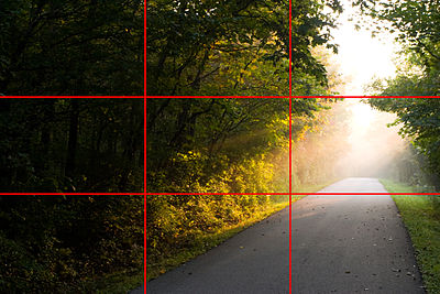
The rule of thirds is a guideline commonly followed by visual artists. The objective is to stop the subject(s) and areas of interest (such as the horizon) from bisecting the image, by placing them near one of the lines that would divide the image into three equal columns and rows, ideally near the intersection of those lines.
The rule of thirds is thought by many <who?> to be a simplification of the golden mean. The golden mean is a ratio that has been used by visual artists for centuries as an aid to composition. When two things are in the proportion of 1:1.618 (approximately 3/8 to 5/8), they are said to be in the golden mean.
Dividing the parts of an image according to this proportion helps to create a pleasing, balanced composition. The intersection points on a golden mean grid appear at 3/8 in and 3/8 down/up, rather than at 1/3 in and 1/3 down/up on the grid of thirds.
Rule of odds
The "rule of odds" states that by framing the object of interest in an artwork with an even number of surrounding objects, it becomes more comforting to the eye, thus creates a feeling of ease and pleasure. It is based on the assumption that humans tend to find visual images that reflect their own preferences/wishes in life more pleasing and attractive.
An image of a person surrounded/framed by two other persons, for instance, where the person in the center is the object of interest in that image/artwork, is more likely to be perceived as friendly and comforting by the viewer, than an image of a single person with no significant surroundings.
Rule of space
The rule of space applies to artwork (photography, advertising, illustration) picturing object(s) to which the artist wants to apply the illusion of movement, or which is supposed to create a contextual bubble in the viewer's mind.
This can be achieved, for instance, by leaving white space in the direction the eyes of a portrayed person are looking, or, when picturing a runner, adding white space in front of him rather than behind him to indicate movement.
Simplification
Images with clutter can distract from the main elements within the picture and make it difficult to identify the subject. By decreasing the extraneous content, the viewer is more likely to focus on the primary objects. Clutter can also be reduced through the use of lighting, as the brighter areas of the image tend to draw the eye, as do lines, squares and colour. In painting, the artist may use less detailed and defined brushwork towards the edges of the picture.
Limiting focus
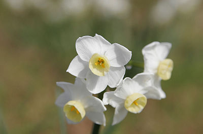
In photography, and also (via software simulation of real lens limitations) in 3D graphics, one approach to achieving simplification is to use a wide aperture when shooting to limit the depth of field. When used properly in the right setting, this technique can place everything that is not the subject of the photograph out of focus.
A similar approach, given the right equipment, is to take advantage of the Scheimpflug principle to change the plane of focus.
Geometry and symmetry
The "rule of odds" suggests that an odd number of subjects in an image is more interesting than an even number. Thus if you have more than one subject in your picture, the suggestion is to choose an arrangement with at least three subjects. An even number of subjects produces symmetries in the image, which can appear less natural for a naturalistic, informal composition.
Related to the rule of odds is the observation that triangles are an aesthetically pleasing implied shape within an image. In a canonically attractive face, the mouth and eyes fall within the corners of the area of an equilateral triangle. Paul Cézanne successfully used triangles in his compositions of still lifes.
Other techniques
- There should be a center of interest or focus in the work, to prevent it becoming a pattern in itself;
- The direction followed by the viewer's eye should lead the viewer's gaze around all elements in the work before leading out of the picture;
- The subject should not be facing out of the image;
- A moving subject should have space in front;
- Exact bisections of the picture space should be avoided;
- Small, high contrast, elements have as much impact as larger, duller elements;
- The prominent subject should be off-centre, unless a symmetrical or formal composition is desired, and can be balanced by smaller satellite elements
- the horizon line should not divide the art work in two equal parts but be positioned to emphasize either the sky or ground; showing more sky if painting is of clouds, sun rise/set, and more ground if a landscape
These principles can be means of a good composition yet they can not be applied separately but should act together to form a good composition.
See also
- Miksang (contemplative photography)
- New Epoch Notation Painting (A notation system for painting)
- Page layout (graphic design)
- CLACL (CLAC-Language) (A Computer Language for composition)
References
- ^ Dunstan, Bernard. (1979). Composing Your Paintings. London, Studio Vista.
Further reading
- Arnheim, Rudolf (1974). Art and Visual Perception. A Psychology of the Creative Eye. ISBN 978-0-520-02613-1.
- Downer, Marion (1965). Discovering Design. Lothrop, Lee & Shepard Co.
- Graham, Peter (2004). An Introduction to Painting Still Life. Chartwell Books Inc. ISBN 0-7858-1750-6.
- Grill, Tom; Scanlon, Mark (1990). Photographic Composition. Watson-Guptill Publications. ISBN 0-8174-5427-6.
- Peterson, Bryan (1988). Learning to See Creatively. Watson-Guptill Publications. ISBN 0-8174-4177-8.
- Langford, Michael (1982). The Master Guide to Photography. New York: Dorling Kindersley Limited.
External links
- Composition in Photography what makes a good photographic structure
- Rules of Composition in Photography
- Percy Principles of Art and Composition, Goshen College Art Department
- Second Picture's photographic composition tutorials
- Making Great Pictures: Composition - slideshow by Life magazine
- Photography Composition
- Basic Photography Composition
- InfoRapid Knowledge Portal - Composition (Visual Art)
Categories:- Artistic techniques
- Photographic techniques
Wikimedia Foundation. 2010.


