- Open-high-low-close chart
-
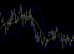
 An OHLC chart, with a moving average and Bollinger bands superimposed.
An open-high-low-close chart (also OHLC chart, or simply bar chart) is a type of chart typically used to illustrate movements in the price of a financial instrument over time. Each vertical line on the chart shows the price range (the highest and lowest prices) over one unit of time, e.g. one day or one hour. Tick marks project from each side of the line indicating the opening price (e.g. for a daily bar chart this would be the starting price for that day) on the left, and the closing price for that time period on the right. The bars may be shown in different hues depending on whether prices rose or fell in that period.
The Japanese candlestick chart is another way of displaying market price data, with the opening and closing prices defining a rectangle within the range for each time unit. Both charts show exactly the same data, i.e. the opening, high, low, and closing prices during a particular time frame. Some traders find the candlestick chart easier to read.
External links
Concepts Support and resistance · Trend line · Breakout · Market trend · Dead cat bounce · Elliott wave principle · Fibonacci retracements · Pivot point · Dow theoryCharts Patterns Head and shoulders · Cup and handle · Double top and double bottom · Triple top and triple bottom · Broadening top · Price channels · Wedge pattern · Triangle · Flag and pennant · Island reversal · GapCandlestickSimpleComplexIndicators Average Directional Index (ADX) · Ichimoku Kinkō Hyō · Moving Average Convergence/Divergence (MACD) · Mass Index · Moving average (MA) · Parabolic SAR (SAR) · Smart Money Index (SMI) · Trix · Vortex Indicator (VI) · Know sure thing oscillator (KST)Relative Strength Index (RSI) · Stochastic oscillator · True Strength Index (TSI) · Williams %R (%R)VolumeAccumulation/Distribution Index · Money Flow Index (MFI) · On-balance volume (OBV) · Volume Price Trend (VPT) · Force Index (FI) · Negative volume index (NVI) · Ease of movement · Put/call ratio (PCR)OtherAdvance–decline line (ADL) · Commodity Channel Index (CCI) · Coppock curve · Keltner channel · McClellan oscillator · Ulcer Index · Ultimate oscillatorCategories:- Financial charts
- Economics and finance stubs
Wikimedia Foundation. 2010.
