- Minion (typeface)
-
Adobe Minion 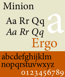
Category Serif Classification Garalde Old style serif Designer(s) Robert Slimbach Shown here Adobe Minion Pro Minion is the name of a typeface designed by Robert Slimbach in 1990 for Adobe Systems. The name comes from the traditional naming system for type sizes, in which minion is between nonpareil and brevier. It is inspired by late Renaissance-era type.
Contents
Minion
It comes in PostScript format, and supports ISO-Adobe character set.
A unique feature is the support of Regular and Display optical sizes in Regular and Italic fonts. Different optical sizes have different stroke contrasts and details, designed to optimize texts for specific applications. Minion Black does not have italic counterpart.
Minion Expert
Minion Expert is a separate font package that include fonts containing small caps, ligatures, old style figures, and swash glyphs. There are also fonts for dingbats (Minion Ornaments), and a Black-weighted font (Minion Black Expert). Swash fonts are included for only the 2 lightest font weights.
Minion Cyrillic
Minion Cyrillic was designed in 1992 by Robert Slimbach and was conceived as a non-Latin counterpart to Slimbach’s Minion typeface family. There were no Display-sized fonts, expert fonts, or Black-weighted fonts in this family.
Minion MM
The Multi Master version of the original Minion family, released in 1992.
Minion Std Black
An OpenType version of the Minion Black font, but includes features found in Expert versions of PostScript Minion Black fonts. In addition, character set was updated to support Adobe Western 2.
Minion Pro
An OpenType update of the original family, released in 2000. The font was designed based on Minion MM, but with redesigns, which include slight changes to the selection of instances, and also alteration of font metrics.[1]
The family comes with 3 (later 4, which adds Medium) weights each in roman and italic, 2 widths, and 4 optical sizes. The Black weight from Minion Black Expert was not included. Each font includes the expert glyphs and dingbats that were previously found in Minion Expert package (swashes available in italic fonts only), Cyrillic Glyphs from Minion Cyrillic. In addition, the font family supports Adobe CE, Adobe Western 2, Greek, Latin Extended, Vietnamese character sets.
Optical sizes Caption Regular Subhead Display Intended point sizes 6–8.4 8.4–13.0 13.0–19.9 19.9–72 Minion Web
A TrueType version of Minion, designed for screen use. It supports ISO-Adobe character set. Version 1.00 of the font was distributed with Internet Explorer 4.0.
Minion Web Pro
An updated version of Minion Web, which supports Adobe CE and Adobe Western 2 character sets.
Minion Math
A variant designed by Johannes Küster from typoma GmbH, for mathematical applications.[2][3]
Minion Math comes in 4 weights and in 5 optical sizes. The current version (October 2011) contains about 2.900 glyphs per font. Minion Math had a working title, typoma MnMath. The final form is expected to include all Unicode mathematical symbols and many additional symbols.[4]
Minion in other font families
The Latin Minion glyphs are also used in other Adobe font families, including Adobe Arabic (Arabic), Adobe Hebrew (Hebrew), Adobe Thai (Thai), and Adobe Song (simplified Chinese).
Usage
- In 2003, Brown University adopted Minion as the typeface for the University logo.[5]
- In 2008, Wake Forest University adopted Minion Pro as its primary serif typeface as part of its project to update the university's visual identity, noting that the font "… exhibits warmth and balance …".[6]
- Trinity College Dublin uses the Minion typeface in its logo.
- Robert Bringhurst's The Elements of Typographic Style uses Minion as its body face.
- Purdue University currently uses the typeface for the body text of all University Business.
- Stieg Larsson's Millennium Triology was set in this typeface.
- ABS-CBN Publishing's Working Mom was set in this typeface from February 2010-present.
- Wolfram Research's Mathematica software logo uses the Minion Pro Italic face.
- John Benjamins Publishing Company sets its journals and books in Minion.
- The trailer for Terrence Malick's The Tree of Life uses this typeface for its credits.
- Haruki Murakami's 1Q84 uses this typeface.
- The Ron Paul presidential campaign, 2012 uses a font in the Minion family for its logo.
Awards
Minion Pro won bukva:raz! 2001 award under Greek category.[7]
References
- ^ Type 1 ("PostScript") to OpenType font conversion
- ^ Minion Math: the design of a new math font family
- ^ Notes from TUG2008 in Cork: Day 2
- ^ typoma fonts
- ^ "Brown University: Visual Identity and Graphic Standards - The New Logo". http://www.brown.edu/webmaster/visual_identity/logo.html. Retrieved 2009-12-15.
- ^ "Section 4: Typography" (PDF). Identity Standards, Standards Guide. Wake Forest University. p. 2. http://www.wfu.edu/identity/guide/wfu_identity.typography.pdf. Retrieved 2008-09-03.
- ^ http://www.tdc.org/news/2001bukvaresults.html
External links
- Minion Pro Opticals
- Minion
- Minion Cyrillic
- Minion Expert
- Minion Std Black
- Minion Regular Web
- Minion Web Pro Regular
- TUG2008 contains info on Minion Math
- MinionPro – LaTeX package
Categories:- Old style serif typefaces
- Adobe typefaces
- Lowercase numerals typefaces
- Mathematical OpenType typefaces

Wikimedia Foundation. 2010.