- City (typeface)
-
Category Serif Classification Slab-serif Designer(s) Georg Trump Foundry H. Berthold AG Date released 1930 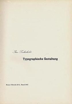 Titlepage for Tschichold's Typographische Gestaltung using City Medium, for the Benno Schwabe & Co. publishing house, 1932.
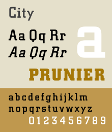
City is a slab serif typeface designed by Georg Trump (1896–1985), and released in 1930 by the Berthold type foundry in Berlin, Germany. Though classified as a slab serif, City displays a strong modernist influence in its geometric structure of right angles and opposing round corners. The typeface takes inspiration from the machine age, and industry. A consistent application of repeated parts: an outer circle softening interior rectilinear spaces, results in a highly unified and refined typeface.
The lowercase a is composed of a two horizontal rectangles in the interior, the outer skin follows the counter but always contrasting the outer stroke with the organic curves. The face was produced in three weights: light, medium, and bold, each in roman and italic. The graphic designer Jan Tschichold helped to popularize the City typeface by his use of it for his book Typographische Gestaltung published by the Basel publishing house Benno Schwabe & Co.
Contents
Commercial uses
- IBM Corporation used variations of City for their corporate logo from 1956 onward[1] and used City Medium on the title pages and covers of their technical manuals for several decades.
- Southern Television used City for titling in their news programme Day by Day.
- The 1998 Anime Series Cowboy Bebop used City for the titles
- A variant of this typeface was also used for the titles and credits of the CBS crime drama series, Mannix.
City Pro
In 2007-9, Berthold released OpenType Pro version of City called City Pro, which supports Central European, Latin Extended A characters. OpenType features include ordinals, proportional lining figures, subscripts and superscripts, fractions.
SquareSlab711
The SquareSlab711 font from BitStream is very similar to City and is available in light, medium, and bold weights.
See also
References
- Blackwell, Lewis. 20th Century Type. Yale University Press: 2004. ISBN 0-300-10073-6.
- Fiedl, Frederich, Nicholas Ott and Bernard Stein. Typography: An Encyclopedic Survey of Type Design and Techniques Through History. Black Dog & Leventhal: 1998. ISBN 1-57912-023-7.
- Macmillan, Neil. An A–Z of Type Designers. Yale University Press: 2006. ISBN 0-300-11151-7.
- Meggs, Philip and Rob Carter. Typographic Specimens: The Great Typefaces. Van Nostrand Reinhold: 1993. ISBN 0-442-00758-2.
- ^ http://www-03.ibm.com/ibm/history/exhibits/logo/logo_7.html IBM Logo History
External links
Categories:- Berthold typefaces
- Slab serif typefaces
- 1930 introductions
- Typefaces
- Letterpress typefaces
- Photocomposition typefaces
- Virtual typefaces
- Typography stubs


Wikimedia Foundation. 2010.