- FF Meta
-
Category Sans-serif Classification Humanist sans-serif Designer(s) Erik Spiekermann Foundry FSI FontShop International FF Meta is a humanist sans-serif typeface family designed by Erik Spiekermann originally as a commission for the Deutsche Bundespost (West German Post Office), but later released by Spiekermann himself in 1991[1] through his FontFont library. According to Spiekermann, FF Meta was intended to be a "complete antithesis of Helvetica," which he found "boring and bland."[2] Throughout the nineties, FF Meta was embraced by the international design community[3] with Spiekermann and E. M. Ginger writing that it had been dubiously praised as the "Helvetica of the 1990s."[4]
FF Meta has been adopted by numerous corporations and other organizations as a corporate typeface, for signage or in their logo.
Contents
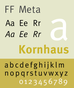
Visual Distinctive Characteristics
Characteristics of this typeface are:
lower case: square dot over the letter i. double storey a.
upper case: dropped horizontal element on A.
figures:
Development
Development began in February 1985[5] when Deutsche Bundespost approached Sedley Place Design, where Spiekermann was working at the time, and commissioned a comprehensive corporate design program. As the typeface would be used repeatedly in small sizes, for identification (rather than copy), require two different weights, and printed quickly on potentially poor paper stock, the brief called for a very legible, neutral, space-saving, and distinguishable (in regards to weight) typeface with special attention to producing unmistakable characters.[6] Whereas traditionally, typefaces are designed to be viewed beautifully large, the goal with this particular typeface was to produce a typeface which worked well for its primary application.[7]
Taking into account research done on six font families and the constraints of the brief, the characteristics of what would become FF Meta began to take shape. The typeface would have to be a sans-serif to match the client, narrow (but not condensed) to save space, feature strokes thick enough to withstand uneven printing but also light so that individual characters do not run together, contain clearly distinguishable characters for similar shaped characters, versatile capitals and figures that are clear but not obtrusive, and curves, indentations, flares, and open joins to combat poor definition, optical illusions, and over-inking. In addition to these demands, to meet Bundespost's needs, the family would also contain three fonts: regular, regular italic, and bold.[8]
After completing and digitizing the typesetting font, mockups were generated for Bundespost's new forms and publications however despite positive interest from the German Minister of Telecommunications among others,[9] Bundespost decided not to implement[10] the new exclusive typeface for fear it would "cause unrest."[11] Bundespost, despite funding the project, continued instead to use a variety of different versions of Helvetica.
Releases
Years later, realizing that Bundespost and Sedley Place Design would never utilize the typeface, Spiekermann with his company MetaDesign decided to continue work on the typeface and eventually published it—along with other orphaned typefaces[12]—under his newly formed publishing label FSI FontShop International resulting in the release of FF Meta in 1991.[13] This version of FF Meta was created by re-digitizing the original outlines and digitizing them in Fontographer on a Macintosh, work which was done by Spiekermann’s interns Just van Rossum and Erik van Blokland between 1988-1989.[14]
- 1991 FF Meta family released containing normal, normal small caps, and bold.[15]
- 1992 FF Meta 2 released as an expansion adding an italics weight, and small caps for bold.[16]
- 1993 FF MetaPlus released featuring some fine tuning of characters, spacing, and kerning along with the introducing three new weights: book, medium, and black in roman, italics, roman small caps, and roman small caps italics except for black which lacked small caps.[17]
- 1998 FF Meta reorganized and released with the following families: FF Meta Normal, FF Meta Book, FF Meta Medium, FF Meta Bold and FF Meta Black, all in roman, italic, small caps and italic small caps, which came with their respective expert and lining figures.[18]
- Sometime before 2005 foreign language versions by Tagir Safayev and Olga Chayeva.,[19] a condensed family, and additional light weights were added as: FF Meta Light, FF Meta Thin, and FF Meta Hairline.[20]
- 2007 A serif companion, entitled FF Meta Serif, was completed and released.
Personnel
Although the design of FF Meta is attributed to Erik Spiekermann, design firms like Sedley Place Design often employ more than a single designer on a typeface project, what follows is a list of those involved in the development and subsequent further development.
- Original sketches, concept, and research for FF Meta by Erik Spiekermann and Michael Bitter at Sedley Place Design, Berlin.[21]
- Design of the completed alphabets by Gerry Barney and Mike Pratley at Sedley Place Design, London.[22]
Notes
- ^ Fay Sweet, MetaDesign : Design from the Word Up (New York: Watson-Guptill Publications, 1999), 17.
- ^ Fay Sweet, MetaDesign : Design from the Word Up (New York: Watson-Guptill Publications, 1999), 16.
- ^ Fay Sweet, MetaDesign : Design from the Word Up (New York: Watson-Guptill Publications, 1999), 16.
- ^ Erik Spiekermann, E. M. Ginger, Stop Stealing Sheep & Find Out How Type Works (Berkeley, California: Adobe Press, 2003), 67.
- ^ Fay Sweet, MetaDesign : Design from the Word Up (New York: Watson-Guptill Publications, 1999), 17.
- ^ Erik Spiekermann, "Post Mortem or how I once designed a typeface for Europe's biggest company," Baseline 9 (1987): 6
- ^ Erik Spiekermann, "Post Mortem or how I once designed a typeface for Europe’s biggest company," Baseline 9 (1987): 7
- ^ Erik Spiekermann, "Post Mortem or how I once designed a typeface for Europe's biggest company," Baseline 9 (1987): 7
- ^ Erik Spiekermann, "Post Mortem or how I once designed a typeface for Europe's biggest company," Baseline 9 (1987): 9
- ^ Fay Sweet, MetaDesign : Design from the Word Up (New York: Watson-Guptill Publications, 1999), 17.
- ^ Erik Spiekermann, "Post Mortem or how I once designed a typeface for Europe's biggest company," Baseline 9 (1987): 9
- ^ Fay Sweet, MetaDesign : Design from the Word Up (New York: Watson-Guptill Publications, 1999), 13.
- ^ Fay Sweet, MetaDesign : Design from the Word Up (New York: Watson-Guptill Publications, 1999), 17.
- ^ Erik Spiekermann, "Post Mortem or how I once designed a typeface for Europe's biggest company," Baseline 9 (1987): 9
- ^ Peters, Yves (2 October 2005). "Meta-morphosis: How FF MetaPlus Became FF Meta". http://fontfeed.com/archives/meta-morphosis-how-ff-metaplus-became-ff-meta/. Retrieved 18 February 2010.
- ^ Peters, Yves (2 October 2005). "Meta-morphosis: How FF MetaPlus Became FF Meta". http://fontfeed.com/archives/meta-morphosis-how-ff-metaplus-became-ff-meta/. Retrieved 18 February 2010.
- ^ Peters, Yves (2 October 2005). "Meta-morphosis: How FF MetaPlus Became FF Meta". http://fontfeed.com/archives/meta-morphosis-how-ff-metaplus-became-ff-meta/. Retrieved 18 February 2010.
- ^ Peters, Yves (2 October 2005). "Meta-morphosis: How FF MetaPlus Became FF Meta". http://fontfeed.com/archives/meta-morphosis-how-ff-metaplus-became-ff-meta/. Retrieved 18 February 2010.
- ^ "FF Meta at ParaType". ParaType Shop. ParaType. Archived from the original on 2008-07-31. http://web.archive.org/web/20080731200828/http://www.paratype.com/pstore/fonts/FF-Meta.htm. "Cyrillic versions were developed for ParaType in 2001 by Tagir Safayev and Olga Chayeva."
- ^ Peters, Yves (2 October 2005). "Meta-morphosis: How FF MetaPlus Became FF Meta". http://fontfeed.com/archives/meta-morphosis-how-ff-metaplus-became-ff-meta/. Retrieved 18 February 2010.
- ^ Erik Spiekermann, "Post Mortem or how I once designed a typeface for Europe's biggest company," Baseline 9 (1987): 9
- ^ Erik Spiekermann, "Post Mortem or how I once designed a typeface for Europe's biggest company," Baseline 9 (1987): 9
References
- Blackwell, Lewis (2004). 20th Century Type. Yale University Press. ISBN 0-300-10073-6.
- Fiedl, Frederich; Nicholas Ott and Bernard Stein (1998). Typography: An Encyclopedic Survey of Type Design and Techniques Through History. Black Dog & Leventhal. ISBN 1-57912-023-7.
- Macmillan, Neil (2006). An A–Z of Type Designers. Yale University Press. ISBN 0-300-11151-7.
- Sweet, Fay (1999). MetaDesign : Design from the Word Up. New York: Watson-Guptill Publications. ISBN 0-8230-1212-3.
- Spiekermann, Erik (1987), "Post Mortem or how I once designed a typeface for Europe's biggest company", Baseline (9): 6–9, http://spiekermann.com/en/wp-content/uploads/2005/05/baseline0785_meta3.pdf
- Spiekermann, Erik; Ginger, E. M. (2003). Stop Stealing Sheep & Find Out How Type Works (Second ed.). Berkeley, California: Adobe Press. ISBN 0-201-70339-4.
External links
Categories:- FontShop typefaces
- Humanist sans-serif typefaces
- Lowercase numerals typefaces

Wikimedia Foundation. 2010.