- Mrs Eaves
-
Category Serif Classification Transitional serif Designer(s) Zuzana Licko, after John Baskerville Foundry Emigre Variations Mrs Eaves Sans Mrs Eaves is a transitional serif typeface designed by Zuzana Licko in 1996, and licensed by Emigre, a typefoundry run by Licko and husband Rudy VanderLans. Mrs Eaves is a revival of the types of English printer and punchcutter John Baskerville, and is related to contemporary Baskerville typefaces.
Contents
Description
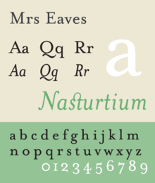
Like Baskerville, Mrs Eaves has a near vertical stress, departing from the old style model. Identifying characters, similar to Baskerville's types, are the lowercase g with its open lower counter and swashlike ear. Both the roman and italic uppercase Q have a flowing swashlike tail. The uppercase C has serifs at top and bottom; there is no serif at the apex of the central junction in uppercase W; and the uppercase G has a sharp spur suggesting a vestigial serif.
Licko's revival is less academic than some, basing as many of its details on contemporary methods of reproduction: the flatness of offset lithography in comparison to letterpress printing, and the resolution of set devices, and on-screen display. The overall stroke weight of Mrs Eaves is considerably heavier than most other revivals, countering the often anemic reproduction of smaller point sizes in other digital revivals of Baskerville, and restoring some of the feeling of letterpress printing's unpredictability.
The typeface family includes roman, italic, petite capitals, small capitals, bold, and roman and italic ligatures. Ligatures in all variants of Mrs Eaves include the standard fi, ffi, and fl ligatures, and resurrect the classic eighteenth century ct and st ligatures. A Just Ligatures variant, available in roman and italic, contain a vast array of new ligatures, many incorporating intertwined and swash characters.
Issue 38, The Authentic Issue, saw the first extensive use of Mrs Eaves in Emigre Magazine. [1]
Licko's selection of the name Mrs Eaves reveals an interesting story. Like his types, John Baskerville was, himself, a controversial character. He hired Sarah Eaves as his housekeeper. Eventually her husband Richard abandoned her and their five children, and Mrs Eaves became Baskerville's mistress and eventual helpmate with typesetting and printing. She married Baskerville within a month of her estranged husband's death. Selection of the name Mrs Eaves honors one of the forgotten women in the history of typography.
In an interview featured in Eye (No. 43, Vol. 11, Spring 2002), Licko explained why she thought Mrs Eaves was a successful typeface:
“ I think Mrs Eaves was a mix of just enough tradition with an updated twist. It’s familiar enough to be friendly, yet different enough to be interesting. Due to its relatively wide proportions, as compared with the original Baskerville, it’s useful for giving presence to small amounts of text such as poetry, or for elegant headlines and for use in print ads. It makes the reader slow down a bit and contemplate the message.[1] ” Prominent Uses
The WordPress logotype is set in Mrs Eaves.[2] It is also used for the titles (but not author names) on the covers and spines of the current Penguin Classics from Penguin Books.
Blacktree's Quicksilver wordmark uses Mrs Eaves. Roman and petite caps.
Bowdoin College uses Mrs Eaves in the college wordmark and in many other official materials.
Radiohead's 2003 album Hail to the Thief prominently used Mrs Eaves in its related artworks.
Spacing issues
Mrs Eaves has been criticised by typographers for its very loose and uneven spacing, and for having few kerning pairs.[3]
References
- ^ Eye, Number 43, Volume 11, Spring 2002.
- ^ http://wordpress.org/about/logos/
- ^ http://www.rightreading.com/typehead/baskerville.htm#mrseaves
Further reading
- Blackwell, Lewis. 20th Century Type. Yale University Press: 2004. ISBN 0-300-10073-6.
- Fiedl, Frederich, Nicholas Ott and Bernard Stein. Typography: An Encyclopedic Survey of Type Design and Techniques Through History. Black Dog & Leventhal: 1998. ISBN 1-57912-023-7.
- Macmillan, Neil. An A–Z of Type Designers. Yale University Press: 2006. ISBN 0-300-11151-7.
- Meggs, Philip B. and Roy McKelvey. Revival of the Fittest. RC Publications, Inc.: 2000. ISBN 1-883915-08-2
- Updike, Daniel Berkley. Printing Types Their History, Forms and Use, Vol. II. Dover Publications, Inc.: 1937, 1980. ISBN 0-486-23929-2
External links
Categories:- Emigre typefaces
- Transitional serif typefaces
- Lowercase numerals typefaces
- 1996 introductions

Wikimedia Foundation. 2010.