- Paul Rand
Infobox_Celebrity
name=Paul Rand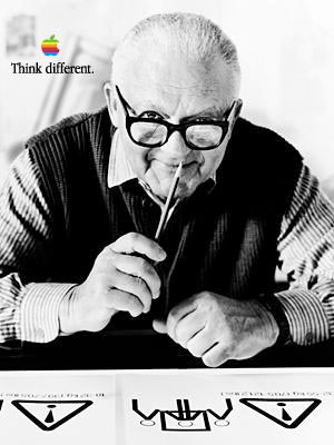
caption=Paul Rand on aThink Different poster in his later years
image_size=250px
birth_date=birth date|mf=yes|1914|8|15|mf=y
birth_place=Brooklyn, New York, United States
death_date=Death date and age|mf=yes|1996|11|26|1914|8|15
death_place=
occupation=Graphic design erPaul Rand (born Peretz Rosenbaum, August 15, 1914 – November 26, 1996) was an American
graphic design er, best known for his corporate logo designs. Rand was educated at thePratt Institute (1929–1932), and the Art Students League (1933–1934). He was one of the originators of the Swiss Style of graphic design. From 1956 to 1969, and beginning again in 1974, Rand taught design atYale University inNew Haven, Connecticut . Rand was inducted into the New YorkArt Directors Club Hall of Fame in 1972. He designed many posters and corporate identities, including the logos forIBM ,Apple , UPS and ABC. Rand died of cancer in 1996. He is buried in Beth El Cemetery inNorwalk, Connecticut .Biography
Early life and education
Peretz Rosenbaum was born on August 15, 1914 in Brooklyn, New York.Behrens, Roy R. “Paul Rand.” "Print", Sept–Oct. 1999: 68+] He embraced design at a very young age, painting signs for his father’s grocery store as well as for school events at P.S. 109.Heller, Steven. “Thoughts on Rand.” "Print", May–June 1997: 106–109+] Rand’s father did not believe art could provide his son with a sufficient livelihood, and so he required Paul to attend Manhattan’s Harren High School while taking night classes at the
Pratt Institute , Rand was by-and-large “self-taught as a designer, learning about the works ofCassandre and Moholy-Nagy from European magazines such as ["Gebrauchsgraphik"] .”Bierut, Michael. “Tribute: Paul Rand 1914–1996.” "ID", Jan–Feb. 1997: 34]Early career
His career began with humble assignments, starting with a part-time position creating
stock image s for a syndicate that supplied graphics to various newspapers and magazines. Between his class assignments and his work, Rand was able to amass a fairly large portfolio, largely influenced by the German advertising style Sachplakat (object poster) as well as the works of Gustav Jensen. It was around this time that he decided to camouflage (and abbreviate) the overtly Jewish identity telegraphed by ‘Peretz Rosenbaum,’ shortening his forename to ‘Paul’ and taking ‘Rand’ from an uncle to form his new surname. Morris Wyszogrod, a friend and associate of Rand, noted that “he figured that ‘Paul Rand,’ four letters here, four letters there, would create a nice symbol. So he became Paul Rand." Roy R. Behrens notes the importance of this new title: “Rand’s new persona, which served as the brand name for his many accomplishments, was the first corporate identity he created, and it may also eventually prove to be the most enduring." Indeed, Rand was rapidly moving into the forefront of his profession. In his early twenties he was producing work that began to garner international acclaim, notably his designs on the covers of "Direction" magazine, which Rand produced for no fee in exchange for full artistic freedom. Among the accolades Rand received were those ofLaszlo Moholy-Nagy :The reputation Rand so rapidly amassed in his prodigious twenties never dissipated; rather, it only managed to increase through the years as the designer’s influential works and writings firmly established him as the "éminence grise" of his profession.
Although Rand was most famous for the corporate
logo s he created in the 1950s and 1960s, his early work in page design was the initial source of his reputation. In 1936, Rand was given the job of setting the page layout for an "Apparel Arts" magazine anniversary issue. “His remarkable talent for transforming mundane photographs into dynamic compositions, which [. . .] gave editorial weight to the page” earned Rand a full-time job, as well as an offer to take over as art director for the Esquire-Coronet magazines. Initially, Rand refused this offer, claiming that he was not yet at the level the job required, but a year later he decided to go ahead with it, taking over responsibility for Esquire’s fashion pages at the young age of twenty-three.The cover art for "Direction" magazine proved to be an important step in the development of the “Paul Rand look” that was not as yet fully developed. The December 1940 cover ("See Figure A"), which uses
barbed wire to present the magazine as both a war-torn gift and a crucifix, is indicative of theartistic freedom Rand enjoyed at "Direction"; in "Thoughts on Design" Rand notes that it “is significant that the crucifix, aside from its religious implications, is a demonstration of pure plastic form as well . . . a perfect union of the aggressive vertical (male) and the passive horizontal (female)."Rand, Paul. "Thoughts on Design." New York: Wittenborn: 1947.] In ways such as this, Rand was experimenting with the introduction of themes normally found in the “high arts” into his new graphic design, further advancing his life-long goal of bridging the gap between his profession and that of Europe’s modernist masters.Corporate identities
Rand’s widely known contribution to graphic design are his corporate identities, many of which are still in use.
IBM , ABC,Cummins Engine , Westinghouse, and UPS, among many others, owe their graphical heritage to him, though UPS recently carried out a controversial update to the classic Rand design. One of his primary strengths, as Moholy-Nagy pointed out, was his ability as a salesman to explain the needs his identities would address for the corporation. According to graphic designer Louis Danziger:[

Ford Motor Company .]Rand’s defining corporate identity was his IBM logo in 1956, which as Mark Favermann notes “was not just an identity but a basic design philosophy that permeated corporate consciousness and public awareness."Favermann, Mark. “Two Twentieth-Century Icons.” "Art New England" Apr–May 1997: 15.] The logo was modified by Rand in 1960, and the striped logo in 1972. The stripes were introduced as a half-toning technique to make the IBM mark slightly less heavy. Two variations of the "striped" logo were chosen (one with thicker lines, one with thinner lines), the mark with thicker lines has become the company's default mark. Rand also designed packaging, marketing materials and assorted communications for IBM from the early 1970s until the early 1990s, including the well known Eye-Bee-M poster ("See Figure B").
Ford appointed Rand in the 1960s to redesign their corporate logo, but afterwards chose not to use his modernized design ("See Figure C").Although his logos may be interpreted as simplistic, Rand was quick to point out in "A Designer’s Art" that “ideas do not need to be esoteric to be original or exciting." His American Broadcasting Company trademark , created in 1962, epitomizes that ideal of minimalism while proving Rand’s point that a logo “cannot survive unless it is designed with the utmost simplicity and restraint.” Rand remained vital as he aged, continuing to produce important corporate identities into the eighties and nineties with a rumored $100,000 price per single solution. The most notable of his later works was his collaboration with
Steve Jobs for the NeXT Computer corporate identity ; Rand’s simple black box breaks the company name into two lines, producing a visual harmony that endeared the logogram to Jobs. If ever there was a pleased client, it was indeed Steve Jobs: just prior to Rand’s death in 1996, his former client labeled him, simply, “the greatest living graphic designer.”Influences and other works
Development of theory
Though Rand was a recluse in his creative process, doing the vast majority of the design load despite having a large staff at varying points in his career, he was very interested in producing books of theory to illuminate his philosophies. Moholy-Nagy may have incited Rand’s zeal for knowledge when he asked his colleague if he read art criticism at their first meeting. Rand said no, prompting Moholy-Nagy to reply “Pity.” Heller elaborates on this meeting's impact, noting that, “from that moment on, Rand devoured books by the leading philosophers on art, including
Roger Fry ,Alfred North Whitehead , andJohn Dewey ." These theoreticians would have a lasting impression on Rand’s work; in a 1995 interview with Michael Kroeger discussing, among other topics, the importance of Dewey’s "Art as Experience", Rand elaborates on Dewey’s appeal:Dewey is an important source for Rand’s underlying sentiment in graphic design; on page one of Rand’s groundbreaking "Thoughts on Design", the author begins drawing lines from Dewey’s philosophy to the need for “functional-aesthetic perfection” in modern art. Among the ideas Rand pushed in "Thoughts on Design" was the practice of creating graphic works capable of retaining their recognizable quality even after being blurred or mutilated ("see Figure D"), a test Rand routinely performed on his corporate identities.
Criticism
Despite the prestige graphic designers place on his first book, subsequent works, notably "From Lascaux to Brooklyn" (1996), earned Rand accusations of being “reactionary and hostile to new ideas about design.”
Steven Heller defends Rand’s later ideas, calling the designer “an enemy of mediocrity, a radical modernist” while Favermann considers the period one of “a reactionary, angry old man.” [Favermann, Mark. “Two Twentieth-Century Icons.” "Art New England" Apr–May 1997: 15] Regardless of this dispute, Rand’s contribution to modern graphic design theory in total is widely considered intrinsic to the profession’s development.Modernist influences
The core ideology that drove Rand’s career, and hence his lasting influence, was the modernist philosophy he so revered. He celebrated the works of artists from
Paul Cézanne toJan Tschichold , and constantly attempted to draw the connections between their creative output and significant applications in graphic design. In A Designer’s Art Rand clearly demonstrates his appreciation for the underlying connections:This idea of “defamiliarizing the ordinary” (or "making the familiar strange," a strategy commonly credited to Russian Formalist critic
Viktor Shklovsky ) played an important part in Rand’s design choices. Working with manufacturers provided him the challenge of utilizing his corporate identities to create “lively and original” packaging for mundane items, such as light bulbs for Westinghouse.References
External links
* [http://paul-rand.com/ Paul-Rand.com]
* [http://design.rit.edu/biographies/rand.html Paul Rand Biography] fromRochester Institute of Technology
* [http://acg.media.mit.edu/events/rand/index.html Misawa Lecture by Paul Rand] fromMIT Media Lab oratory
* [http://www.adcglobal.org/archive/hof/1972/?id=300 Paul Rand Biography] from The Art Directors Club
* [http://www.worldcat.org/oclc/122401763&tab=details Paul Rand Papers] , the archives of Paul Rand, held by Yale University's [http://www.library.yale.edu/mssa/ Manuscripts and Archives]Persondata
NAME=Rand, Paul
ALTERNATIVE NAMES=Rosenbaum, Peretz
SHORT DESCRIPTION=Graphic design er
DATE OF BIRTH=August 15, 1914
PLACE OF BIRTH=Brooklyn, New York, United States
DATE OF DEATH=November 26, 1996
PLACE OF DEATH=
Wikimedia Foundation. 2010.