- Thematic map
-
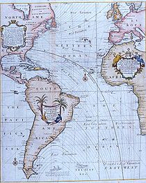 Edmond Halley's New and Correct Chart Shewing the Variations of the Compass (1701), the first chart to show lines of equal magnetic variation.
A thematic map is a type of map or chart especially designed to show a particular theme connected with a specific geographic area. These maps "can portray physical, social, political, cultural, economic, sociological, agricultural, or any other aspects of a city, state, region,nation , or continent".[1]
Contents
Overview
A thematic map is a map that focuses on a specific theme or subject area, whereas in a general map the variety of phenomena—geological, geographical, political—regularly appear together.[2] The contrast between the both of them lies in the fact thematic maps use the base data as coastlines, boundaries and places, only as point of reference for the phenomenon being mapped. In general maps the base data as landforms, lines of transportation, settlements, and political boundaries are there for their own sake.[2]
Thematic maps also emphasize spatial variation of one or a small number of geographic distributions. These distributions may be physical phenomena such as climate or human characteristics such as population density and health issues. Barbara Petchenik[3] described the difference as "in place, about space." While general reference maps show where something is in space, thematic maps tell a story about that place.[4] (e.g. city map)
Thematic map are sometimes referred to as graphic essays that portray spatial variations and interrelationships of geographical distributions. Location, of course, is also important to provide a reference base of where selected phenomena are occurring.
History
An important cartographic element preceding thematic mapping was the development of accurate base maps. Improvements in accuracy proceeded at a gradual pace, and even until the mid-17th century, general maps were usually of poor quality. Still, base maps around this time were good enough to display appropriate information, allowing for the first thematic maps to come into being.
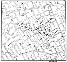 John Snow's Cholera map about the cholera deaths in London in the 1840s, published 1854.
An early contributor to thematic mapping was the English astronomer Edmond Halley (1656–1742).[2] His first significant cartographic contribution was a star chart of the constellation of the Southern Hemisphere, made during his stay on St. Helena and published on 1686. In that same year he also published his first terrestrial map in an article about trade winds, and this map is called the first meteorological chart.[2] In 1701 he published the "New and Correct Chart Shewing the Variations of the Compass", see first image, the first chart to show lines of equal magnetic variation.
Another example of early thematic mapping comes from London physician John Snow. Though disease had been mapped thematically, Snow’s cholera map in 1854 is the best known example of using thematic maps for analysis. Essentially, his technique and methodology anticipate principles of a geographic information system (GIS). Starting with an accurate base map of a London neighborhood which included streets and water pump locations, Snow mapped out the incidents of cholera death. The emerging pattern centered around one particular pump on Broad Street. At Snow’s request, the handle of the pump was removed, and new cholera cases ceased almost at once. Further investigation of the area revealed the Broad Street pump was near a sewer line.
Another 19th century example of thematic maps, according to Friendly (2008), was the earliest known choropleth map in 1826 created by Charles Dupin. Based on this work Louis-Léger Vauthier (1815–1881) developed the population contour map, a map that shows the population density by contours or isolines.[5]
Uses of thematic maps
Thematic maps serve three primary purposes.
- First, they provide specific information about particular locations.
- Second, they provide general information about spatial patterns.
- Third, they can be used to compare patterns on two or more maps.
Common examples are maps of demographic data such as population density. When designing a thematic map, cartographers must balance a number of factors in order to effectively represent the data. Besides spatial accuracy, and aesthetics, quirks of human visual perception and the presentation format must be taken into account.
In addition, the audience is of equal importance. Who will “read” the thematic map and for what purpose helps define how it should be designed. A political scientist might prefer having information mapped within clearly delineated county boundaries (choropleth maps). A state biologist could certainly benefit from county boundaries being on a map, but nature seldom falls into such smooth, man-made delineations. In which case, a dasymetric map charts the desired information underneath a transparent county boundary map for easy location referencing.
Data terminology
A thematic map is univariate if the non-location data is all of the same kind. Population density, cancer rates, and annual rainfall are three examples of univariate data.
Bivariate mapping shows the geographical distribution of two distinct sets of data. For example, a map showing both rainfall and cancer rates may be used to explore a possible correlation between the two phenomena.
More than two sets of data leads to multivariate mapping. For example, a single map might show population density in addition to annual rainfall and cancer rates.
Methods of thematic mapping
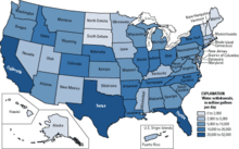 Choropleth map of water use.
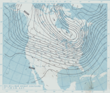 Isarithmic map of barometric pressure.
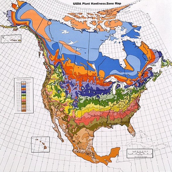
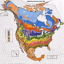 Dasymetric map of climate and plant hardiness zones.
Cartographers use many methods to create thematic maps, but five techniques are especially noted.
Choropleth
Choropleth mapping shows statistical data aggregated over predefined regions, such as counties or states, by coloring or shading these regions. For example, countries with higher rates of infant mortality might appear darker on a choropleth map. This technique assumes a relatively even distribution of the measured phenomenon within each region. Generally speaking, differences in hue are used to indicate qualitative differences, such as land use, while differences in saturation or lightness are used to indicate quantitative differences, such as population.
Proportional symbol
The proportional symbol technique uses symbols of different sizes to represent data associated with different areas or locations within the map. For example, a disc may be shown at the location of each city in a map, with the area of the disc being proportional to the population of the city.
Isarithmic or Isopleth
Isarithmic maps, also known as contour maps or isopleth maps depict smooth continuous phenomena such as precipitation or elevation. Each line-bounded area on this type of map represents a region with the same value. For example, on an elevation map, each elevation line indicates an area at the listed elevation.
Dot
A dot may be used to locate each occurrence of a phenomenon, as in Dr. Snow's map where each dot represented one death due to cholera. Where appropriate, a dot may indicate any number of entities, for example, one dot for every 100 voters.
Dasymetric
A dasymetric map is similar to a choropleth map, but one in which the regions are not predefined but chosen so that the distribution of the measured phenomenon within each region is relatively uniform. The boundaries may be much sharper than in an isarithmic map. For example, planning regulations may lead to adjacent regions in a dasymetric map of population density being internally homogeneous but at opposite extremes. These maps are more difficult to generate and less common than other types.
See also
References
- ^ Thematic Maps Map Collection & Cartographic Information Services Unit. University Library, University of Washington. Accessed 27 Dec 2009.
- ^ a b c d Norman Joseph William Thrower (2007). Maps & Civilization: Cartography in Culture and Society. p.95.
- ^ Barbara Petchenik (1979). From Place to Space: The Psychological Achievement in Thematic Mapping, American Cartographer 1.
- ^ Maps and GIS. Accessed 28 Feb 2009.
- ^ Michael Friendly (2008). "Milestones in the history of thematic cartography, statistical graphics, and data visualization".
Further reading
- P. Muehrcke et al. (2001). Map Use, The University of Chicago Press, 4th Edition.
- Arthur H. Robinson (1982). Early Thematic Mapping in the History of Cartography, The University of Chicago Press,
- Arthur H. Robinson, et al. (1995). Elements of Cartography, Wiley, 6th Edition.
- T. Slocum, et al. (2005). Thematic Cartography and Geographic Visualization, Prentice Hall, 2nd Edition.
- N. Thrower (1996). Maps and Civilization: Cartography in Culture and Society, The University of Chicago Press.
External links
- MapsGeek An online free application to build and share thematic maps.
- StatPlanet Free software for creating online as well as offline interactive thematic maps.
Categories:- Map types
- Diagrams


Wikimedia Foundation. 2010.