- Typographic ligature
-
In writing and typography, a ligature occurs where two or more graphemes are joined as a single glyph. Ligatures usually replace consecutive characters sharing common components and are part of a more general class of glyphs called "contextual forms", where the specific shape of a letter depends on context such as surrounding letters or proximity to the end of a line.
Contents
History
See also: Bind rune and scribal abbreviationAt the origin of typographical ligatures is the simple running together of letters in manuscripts. Already the earliest known script, Sumerian cuneiform, includes many cases of character combinations that over the script's history gradually evolve from a ligature into an independent character in its own right. Ligatures figure prominently in many historical scripts, notably the Brahmic abugidas, or the bind rune of the Migration Period Germanic runic inscriptions.
 Doubles (Geminated consonants) during the Roman Republican era were written as a sicilicus,[1] during the mediaeval era several conventions existed, mostly diacritic marks, but in Nordic texts a particular type of ligature appeared for ll and tt, referred to as broken l and broken t[2]
Medieval scribes, writing in Latin, increased writing speed by combining characters and by introduction of scribal abbreviation. For example, in blackletter, letters with right-facing bowls (b, o, and p) and those with left-facing bowls (c, e, o, d, g and q) were written with the facing edges of the bowls superimposed. In many script forms characters such as h, m, and n had their vertical strokes superimposed. Scribes also used scribal abbreviations to avoid having to write a whole character at a stroke. Manuscripts in the fourteenth century employed hundreds of such abbreviations.
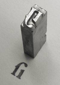
In hand writing, a ligature is made by joining two or more characters in a way they wouldn't usually be, either by merging their parts, writing one above another or one inside another; while in printing, a ligature is a group of characters that is typeset as a unit, and the characters don't have to be joined — for example, in some cases fi ligature prints letters f and i more separated than when they are typeset as separate letters.
When printing with movable type was invented around 1450,[3] typefaces included many ligatures and additional letters, such as the letter þ (thorn) which was first substituted in English with y (e.g. ye olde shoppe), but later written as th. However, they began to fall out of use with the advent of the wide use of sans serif machine-set body text in the 1950s and the development of inexpensive phototypesetting machines in the 1970s, which did not require journeyman knowledge or training to operate. One of the first computer typesetting programs to take advantage of computer-driven typesetting (and later laser printers) was the TeX program of Donald Knuth (see below for more on this). The trend was further strengthened by the desktop publishing revolution around 1985. Early computer software in particular (except for TeX) had no way to allow for ligature substitution (the automatic use of ligatures where appropriate), and in any case most new digital fonts did not include any ligatures. As most of the early PC development was designed for and in the English language, which already saw ligatures as optional at best, a need for ligatures was not seen. Ligature use fell as the number of employed, traditionally-trained hand compositors and hot metal typesetting machine operators dropped.
With the increased support for other languages and alphabets in modern computing, and the resulting improved digital typesetting techniques such as OpenType, ligatures are slowly coming back into use.
Latin alphabet
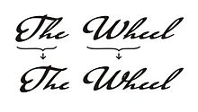
Stylistic ligatures
Many ligatures combine f with an adjacent letter. The most prominent example is fi (or fi, rendered with two normal letters). The tittle above the i in many typefaces collides with the hood of the f when placed beside each other in a word, and are combined into a single glyph with the tittle absorbed into the f. Other ligatures with the letter f include fj,[4] fl (fl), ff (ff), ffi (ffi), and ffl (ffl). Ligatures for fa, fe, fo, fr, fs, ft, fb, fh, fu, fy, and for f followed by a full stop, comma, or hyphen, as well as the equivalent set for the doubled ff and fft are also used, though are less common.
These arose because with the usual type sort for lowercase f, the end of its hood is on a kern, which would be damaged by collision with raised parts of the next letter.
Sometimes, a ligature crossing the morpheme boundary of a composite word (e.g., ff in shelfful[5]) is considered undesirable, and some computer programs (such as TeX) provide a means of suppressing ligatures.
Some fonts include an fff ligature (the Requiem font by Jonathan Hoefler even contains an fffl ligature), intended for German compound words like Sauerstoffflasche ("oxygen tank") and Schifffahrt ("boat trip") (the latter word is written with fff only if the writer follows the spelling reform of 1996). Official German orthography as outlined in the Duden however prohibits ligatures across composition boundaries, and since the sequence fff in German only ever occurs across such boundaries (Schiff-fahrt, Sauerstoff-flasche), these ligatures cannot be correctly employed for German.[6]
Turkish has a dotted and dotless "I" next to "f" in words like fırın ("oven") and fikir ("idea"). The fi ligature would obscure the distinction and is therefore not used in Turkish typography, and neither are other ligatures like that for fl, which correspond to rare letter combinations anyway.
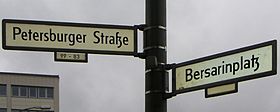
Remnants of ſʒ ("sz") and tʒ ("tz") ligatures from Fraktur, a family of German blackletter typefaces, originally mandatory in Fraktur but now employed only stylistically, can be seen to this day on street signs for city squares whose name contains Platz or ends in -platz.
Sometimes ligatures for st (st), ſt (ſt), ch, ct, Qu and Th are used (e.g. in the typeface Linux Libertine).
German ß
Main article: ßThe German esszett ligature (also called the scharfes s (sharp s)) ß evolved from the ligature "long s over round s" or, in Fraktur, "long s and z". Even though "long s" ſ has otherwise disappeared from German orthography, ß is still considered a ligature, and is replaced by 'SS' in capitalized spelling and in alphabetic ordering. ß is only used in Germany and Austria, nowadays generally never in Switzerland.
Letters and diacritics originating as ligatures
Further information: List of Latin letters The ligatures of Adobe Caslon Pro.
As the letter W is an addition to the Latin alphabet which originated in the seventh century, the phoneme it represents was formerly written in various ways. In Old English the Runic letter Wynn (Ƿ) was used, but Norman influence forced Wynn out of use. By the 14th century, the "new" letter W, originated as two Vs or Us joined together, developed into a legitimate letter with its own position in the alphabet. Because of its relative youth compared to other letters of the alphabet, only a few European languages (English, Dutch, German, Polish, Welsh, Maltese, and Walloon) use the letter in native words.
The character Æ – lower case æ (in ancient times named æsc) when used in the Danish, Norwegian, or Icelandic languages, or Old English, is not a typographic ligature. It is a distinct letter—a vowel—and when alphabetised, is given a different place in the alphabetic order. In modern English orthography Æ is not considered an independent letter but a spelling variant, for example: "encyclopædia" versus "encyclopaedia" or "encyclopedia".
Æ comes from Medieval Latin, where it was an optional ligature in some words, for example, "Æneas". It is still found as a variant in English and French, but the trend has recently been towards printing the A and E separately.[7] Similarly, Œ and œ, while normally printed as ligatures in French, can be replaced by component letters if technical restrictions require it.
In German orthography, the umlauted vowels ä, ö, and ü historically arose from ae, oe, ue ligatures (strictly, from superscript e, viz. aͤ, oͤ, uͤ). It is still acceptable to replace them with ae, oe, ue digraphs when the diacritics are unavailable. While in alphabetic order, they are equivalent not to ae, oe, ue, but to simple a, o, u except in phone books. The convention in Scandinavian languages is different: there the umlaut vowels are treated as independent letters with positions at the end of the alphabet.
The ring diacritic used in vowels such as å likewise originated as an o-ligature.[8] Before the replacement of the older aa with å became a de facto practice, an a with another a on top (aͣ) could sometimes be used, for example in Johannes Bureus's, Runa: ABC-Boken (1611).[9] The uo ligature ů in particular saw use in Early Modern High German, but it merged in later Germanic languages with u (e.g. MHG fuosz, ENHG fuͦß, Modern German Fuß "foot"). It survives in Czech, where it is called kroužek.
The tilde diacritic as used in Spanish and Portuguese, now representing the palatal nasal sound in the letter ñ and nasalization of the affected vowel, respectively, originated as an nn ligature (Espanna = España, anno = año).[10] Similarly, the circumflex in French spelling stems from the ligature of a silent s.[11] The French, Portuguese, Catalan and old Spanish letter ç represents a "c" over a "z".
The letter hwair (ƕ), used only in transliteration of the Gothic language, resembles a hw ligature. It was introduced by philologists around 1900 to replace the digraph hv formerly used to express the phoneme in question, e.g. by Migne in the 1860s (Patrologia Latina vol. 18).
The Byzantines had a unique o-u ligature (Ȣ) that, while originally based on the Greek alphabet's ο-υ, carried over into Latin-based alphabets as well.
Gha (ƣ), a rarely used letter based on Q and G, was misconstrued by the ISO to be an O-I ligature due to its appearance, and is thus known (to the ISO and, in turn, Unicode) as "Oi."
The International Phonetic Alphabet formerly used ligatures to represent affricate consonants, of which six are encoded in Unicode: ʣ, ʤ, ʥ, ʦ, ʧ and ʨ. One fricative consonant is still represented with a ligature: ɮ, and the Extensions to the IPA contain three more: ʩ , ʪ and ʫ.
Rarer ligatures also exist, such as Ꜳꜳ, Ꜵꜵ, Ꜷꜷ, Ꜹꜹ, Ꜻꜻ, Ꜽꜽ, Ꝏꝏ, ᵫ, ᵺ, Ỻỻ, Ꜩꜩ ᴂ and ᴔ.
Symbols originating as ligatures
The most common ligature is the ampersand &. This was originally a ligature of E and t, forming the Latin word "et", meaning "and". It has exactly the same use (except for pronunciation) in French and is used in English. The ampersand comes in many different forms. Because of its ubiquity, it is generally no longer considered a ligature, but a logogram.
Like many other ligatures, it has at times been considered a letter (e.g. in early Modern English); In English it is pronounced "and", not "et," except in the case of &c, pronounced "et cetera." In most fonts, it does not immediately resemble the two letters used to form it, although certain typefaces (such as Trebuchet MS) design & in the form of a ligature.
Similarly, the dollar sign, $, possibly originated as a ligature (for "pesos", although there are other theories as well) but is now a logogram.[12] The Spanish peseta was sometimes symbolized by a ligature ₧ (from Pts).
Digraphs
Digraphs, such as ll in Spanish or Welsh, are not ligatures in the general case as the two letters are displayed as separate glyphs: although written together, when they are joined in handwriting or italic fonts the base form of the letters is not changed and the individual glyphs remain separate. Like some ligatures discussed above, these digraphs may or may not be considered individual letters in their respective languages. Until the 1994 spelling reform, the digraphs ch and ll were considered separate letters in Spanish for collation purposes.
The difference can be illustrated with the French digraph œu, which is composed of the ligature œ and the simplex letter u.
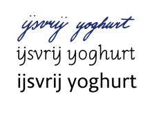
Dutch ij, however, is somewhat more ambiguous. Depending on the standard used, it can be considered a digraph, a ligature or a letter in itself, and its uppercase and lowercase forms are often available as a single glyph with a distinctive ligature in several professional fonts (e.g. Zapfino). Sans serif uppercase IJ glyphs, popular in the Netherlands, typically use a ligature resembling a U with a broken left-hand stroke. Adding to the confusion, Dutch handwriting can render y (which is not found in native Dutch words, but occurs in words borrowed from other languages) as a ij-glyph without the dots in its lowercase form and the IJ in its uppercase form looking virtually identical (only slightly bigger). When written/typed as two separate letters, both should be capitalized —or not— to form a correctly spelled word, like IJs or ijs (ice).
Latin-derived alphabets that use special ligatures
Non-Latin alphabets
See also: Complex Text LayoutLigatures are not limited to Latin script:
- The Brahmic abugidas make frequent use of ligatures in consonant clusters. The number of ligatures employed may be language-dependent; thus many more ligatures are conventionally used in Devanagari when writing Sanskrit than when writing Hindi. Having 37 consonants in total, the total number of ligatures that can be formed in Devanagari using only two letters is 1369, though few fonts are able to render all of them. In particular, Mangal.ttf, which is included with Microsoft Windows' Indic support, does not correctly handle ligatures with consonants attached to the right of the characters द, ट, ठ, ड, and ढ, leaving the virama attached to them and displaying the following consonant in its standard form.
- A number of ligatures have been employed in the Greek alphabet, in particular a combination of omicron (Ο) and upsilon (Υ) which later gave rise to a letter of the Cyrillic alphabet — see Ou (letter).
- Cyrillic ligatures: Љ, Њ, Ы, Ѿ. Iotified Cyrillic letters are ligatures of the early Cyrillic decimal I and another vowel: Ꙗ (ancestor of Я), Ѥ, Ѩ, Ѭ, Ю (descended from another ligature, Оу, an early version of У). Two letters of the Macedonian and Serbian Cyrillic alphabets, lje and nje (љ, њ), were developed in the nineteenth century as ligatures of Cyrillic El and En (л, н) with the soft sign (ь). A ligature of ya (Я) and e also exists: Ԙԙ, as do some more ligatures: Ꚅꚅ and Ꚉꚉ.
- Some forms of the Glagolitic script, used from Middle Ages to the 19th century to write some Slavic languages, have a box-like shape that lends itself to more frequent use of ligatures.
- In the Hebrew alphabet, the letters aleph and lamed can form a ligature (ﭏ). The ligature appears in some pre-modern texts (mainly religious), or in Judeo-Arabic texts, where that combination is very frequent, since [ʔ] [a]l- (written aleph plus lamed, in the Hebrew script) is the definite article in Arabic.
- In the Arabic alphabet, historically a cursive derived from the Nabataean alphabet, most letters' shapes depend on whether they are followed (word-initial), preceded (word-final) or both (medial) by other letters. For example, Arabic mīm, isolated م, tripled (mmm, rendering as initial, medial and final): ممم . Notable are the shapes taken by lām + ʼalif isolated: ﻻ, and lām + ʾalif medial or final: ﻼ. Unicode has a special Allah ligature at U+FDF2: ﷲ.
- Urdu (one of the main languages of South Asia), which uses a calligraphic version of the Arabic-based Nasta`liq script, requires a great number of ligatures in digital typography. InPage, a widely used desktop publishing tool for Urdu, uses Nasta`liq fonts with over 20,000 ligatures.
- In ASL, a ligature of the American manual alphabet is used to sign 'I love you', from the English initialism ILY. It consists of the little finger of the letter I plus the thumb and forefinger of the letter L. The letter Y (little finger and thumb) overlaps with the other two letters.
- The Japanese language uses two ligatures, one for hiragana, ゟ, which is a vertical writing ligature of the characters よ and り, and one for katakana, ヿ, which is a vertical writing ligature of the characters コ and ト.
- Lao uses three ligatures, all comprising the letter ຫ (h). As a tonal language, most consonant sounds in Lao are represented by two consonants, which will govern the tone of the syllable. Five consonant sounds are only represented by a single consonant letter (ງ, ນ, ມ, ລ, ວ), meaning that one cannot render all the tones for words beginning with these sounds. A silent ຫ indicates that the syllable should be read with the tone rules for ຫ, rather than the following consonant. Three consonants can form ligatures with the letter ຫ. ຫ+ນ=ໜ, ຫ+ມ=ໝ and ຫ+ລ=ຫຼ.
Chinese ligatures
Written Chinese has a long history of creating new characters by merging parts or wholes of other Chinese characters. However, a few of these combinations do not represent morphemes but retain the original multi-character (multiple morpheme) reading and are therefore not considered true characters themselves. In Chinese, these ligatures are called héwén (合文) or héshū (合書).
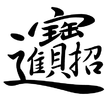
One popular ligature used on chūntiē decorations used for Chinese Lunar New Year is a combination of the four characters for zhāocái jìnbǎo (招財進寶), meaning "ushering in wealth and prosperity" and used as a popular New Year's greeting.
In 1924, Du Dingyou (杜定友; 1898–1967) created the ligature "圕" from two of the three characters 圖書館 (túshūguǎn), meaning "library".[13] Although it does have an assigned pronunciation of tuān and appears in many dictionaries, it is not a morpheme and cannot be used as such in Chinese. Instead, it is usually considered a graphic representation of túshūguǎn.
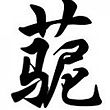
In recent years, a Chinese internet meme, the Grass Mud Horse, has had such a ligature associated with it combining the three relevant Chinese characters 草, 泥, and 马 (Cǎonímǎ).
Similar to the ligatures were several "two-syllable Chinese characters" (雙音節漢字) created in the 19th century for expressing non-Chinese measurement units which have since largely disappeared.
Computer typesetting
TeX is an example of a computer typesetting system that makes use of ligatures automatically. The Computer Modern Roman typeface provided with TeX includes the five common ligatures ff, fi, fl, ffi, and ffl. When TeX finds these combinations in a text it substitutes the appropriate ligature, unless overridden by the typesetter. Opinion is divided over whether it is the job of writers or typesetters to decide where to use ligatures.
The OpenType font format includes features for associating multiple glyphs to a single character, used for ligature substitution. Typesetting software may or may not implement this feature, even if it is explicitly present in the font's metadata. XeTeX is a TeX typesetting engine designed to make the most of such advanced features. This type of substitution used to be needed mainly for typesetting Arabic texts, but ligature lookups and substitutions are being put into all kinds of Western Latin OpenType fonts.
This table below shows discrete letter pairs on the left, the corresponding Unicode ligature in the middle column, and the Unicode code point on the right. Provided you are using an operating system and browser that can handle Unicode, and have the correct Unicode fonts installed, some or all of these will display correctly. See also the provided graphic.
Unicode maintains that ligaturing is a presentation issue rather than a character definition issue, and that, for example, "if a modern font is asked to display 'h' followed by 'r', and the font has an 'hr' ligature in it, it can display the ligature." Accordingly, the use of the special Unicode ligature characters is "discouraged", and "no more will be encoded in any circumstances".[14] Note however that ligatures such as æ and œ are never used to replace arbitrary 'ae' or 'oe' sequences – 'does' can never be written 'dœs'.
Ligatures in Unicode (Latin-derived alphabets)
- This list is incomplete; several medieval ligatures in the U+A732 to U+A73D range, as well as a few others in that vicinity, are not yet listed.
-
Non-ligature Ligature Unicode HTML Et & U+0026 & ſs, ſz ß U+00DF ß AE, ae Æ, æ U+00C6, U+00E6 Æ æ OE, oe Œ, œ U+0152, U+0153 Œ œ IJ, ij IJ, ij U+0132, U+0133 IJ ij ue ᵫ U+1D6B ᵫ ff ff U+FB00 ff fi fi U+FB01 fi fl fl U+FB02 fl ffi ffi U+FB03 ffi ffl ffl U+FB04 ffl ſt ſt U+FB05 ſt st st U+FB06 st
Also, there are separate code points for the digraph DZ and for the Croatian digraphs DŽ, LJ, and NJ. They are not ligatures but digraphs. See Digraphs in Unicode.
Ligatures used only in phonetic transcription:
-
Non-ligature Ligature Unicode HTML db ȸ U+0238 ȸ qp (cp) ȹ U+0239 ȹ lʒ (or lezh) ɮ U+026E ɮ dz ʣ U+02A3 ʣ dʒ (or dezh) ʤ U+02A4 ʤ dʑ (or dz curl) ʥ U+02A5 ʥ ts ʦ U+02A6 ʦ tʃ (or tesh) ʧ U+02A7 ʧ tɕ (or tc curl) ʨ U+02A8 ʨ fŋ ʩ U+02A9 ʩ ls ʪ U+02AA ʪ lz ʫ U+02AB ʫ
U+0238 and U+0239 are called digraphs, but are actually ligatures.[15]
See also
- Complex text layout
- Monogram
- Sigla
Notes and references
- ^ Capelli – Dizionario di abbreviature latine ed italiane
- ^ Medieval Unicode Font Initiative
- ^ Johannes Gutenberg and the Printing Press
- ^ The combination fj is represented in English only in "fjord" and "fjeld", but is encountered in languages where j represents a vocalic or semi-vocalic sound (Norwegian, occasionally in Esperanto) or an affix (Hungarian), or where word-compounding results such ligatures (Hungarian)
- ^ Helmut Kopka; Patrick W. Daly (1999). A Guide to LaTeX, 3rd Ed.. Addison-Wesley. pp. 22. ISBN 0201398257.
- ^ Duden 1, Mannheim 1996, p. 69.
- ^ The Chicago Manual of Style, 14th Ed. Chicago: The University of Chicago Press. 1993. pp. 6.61.
- ^ Nordisk familjebok / Uggleupplagan. 33. Väderlek – Äänekoski / 905–906
- ^ Bureus, J., Runa ABC boken
- ^ "Origen de la 'Ñ'", Aula Hispanica.
- ^ Teach Yourself French. Collier's Cyclopedia, 1901.
- ^ Cajori, Florian (1993). A History of Mathematical Notations. New York: Dover (reprint). ISBN 0-486-67766-4. – contains section on the history of the dollar sign, with much documentary evidence supporting the theory $ began as a ligature for "pesos".
- ^ "'圕'字怎麼念?什麼意思?誰造的?" Sing Tao Daily online. 21 April 2006. Retrieved 15 January 2011.(Chinese)
- ^ Ligatures, Digraphs and Presentation Forms, Unicode FAQ
- ^ Freytag, Asmus; McGowan, Rick; Whistler, Ken (2006-05-08). "Known Anomalies in Unicode Character Names". Unicode Technical Note #27. Unicode Inc. http://www.unicode.org/notes/tn27/tn27-1.html. Retrieved 2009-05-29.
- This article incorporates information from this version of the equivalent article on the Chinese Wikipedia.
External links
- Typedesk.com, Type Desk on ligatures
- Ilovetypography.com, Decline and Fall of the Ligature
- Typgraphy.com, Hoefler & Frere-Jones Requiem font
- Emigre.com, Mrs Eaves ligatures
Aa Bb Cc Dd Ee Ff Gg Hh Ii Jj Kk Ll Mm Nn Oo Pp Qq Rr Ss Tt Uu Vv Ww Xx Yy Zz RelatedTypography terminology Page 
Paragraph Character Typeface anatomyCounter · Diacritics · Dingbat · Glyph · Initial · Kerning · Letter-spacing · Ligature · Subscript and superscript · Swash · Text figuresCapitalizationVertical aspectsClassifications Punctuation Typesetting Calligraphy · ETAOIN SHRDLU · Font (Computer font) · Font catalog · Letterpress · Lorem ipsum · Movable type · Pangram · Phototypesetting · Punchcutting · Type design · Typeface · Type foundry · MicrotypographyTypographic units Digital typography Categories:- Typography
- Ligatures
- Palaeography
- Latin alphabet ligatures
Wikimedia Foundation. 2010.

