- Chromoxylography
-
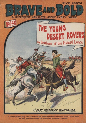
 This cover of a 19th century American boy's magazine Brave and Bold was created with the chromoxylography colour printing method.
Chromoxylography was a colour woodblock printing process popular from the mid 19th to the early 20th century, commonly used to produce illustrations in children's books, serial pulp magazine such as mysteries and romances, and cover art for yellow-backs and penny dreadfuls.[1]
In the 19th century the art of relief engraving and chromoxylography was widely used and perfected for the children's book market, most notably in England by Victorian engraver and printer Edmund Evans. Chromoxylography allowed a variety of hues and tones to be produced by color mixing. The process was complicated and required intricate engraving and printing to achieve good results. Less expensive products, such as pulp magazines, were coloured with as few colours as possible, often only two or three. Paintings were also successfully reproduced with the process, although an engraver and printer might need to use as many as 12 colours for a more complicated work.
Contents
Background
In How to Identify Prints Bamber Gascoigne explains that full-colour printing in the 19th century relied on the relief process and colour wood engraving, writing that the "vast majority of colour wood engravings are reproductive work of the second half of the nineteenth century, at which time they were often referred to as chromoxylographs—meaning colour from wood, just as chromolithograph means colour from stone."[2] In England in the 1830s, George Baxter repopularized colour relief printing, known as chromoxylography, by using a "background detail plate printed in aquatint intaglio, followed by colours printed in oil inks from relief plates—usually wood blocks", as explained by David Pankow.[3] The process involved engraving wood blocks and using a combination of primary colours to create a range of colours.[4] In the mid-19th century, colour printing processes for dime novels, penny dreadfuls, and children's book illustrations were rendered simply and often ineffectively, without the use of colour combinations.[5] Chromoxylography became popular to colour illustrations for inexpensive serialized books and children's books from the mid-19th century to the early-20th century.[6] London printer Edmund Evans perfected the process, often using up to 10 blocks to achieve a variety of colours and hues.[7]
Methods and uses
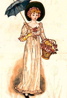
 The frontispiece of 1887 Almanack, illustrated by Kate Greenaway, shows distinct cross-hatchings in the umbrella for a lighter tone of black.
In the chromoxylography process, the printer engraved the image on the woodblock, carving away areas that were not to be printed (or inked).[8] A separate wood block was used for each of the three primary colours, with the ink coating the uncut areas.[9] Gascoigne writes that a "master craftsman who sat with an original painting in front of him and worked out which areas of the image should be printed in which of the available colours to achieve the desired effect."[10] The printer engraved the image to the finer end grain of the woodblock.[11] For more complicated work the carver worked on the end grain of the wood, and with the use of fine hatchings to the wood that were inked separately achieved the look of blended colours. For the children's book market, which had lower profit margins, the printer would use fewer ink colours, which could be optimised by mixing colours such as blue and yellow to create green.[12]
Variations in tone were achieved with skillful carving to create the appearance of stipple.[8] Areas that were intended to be printed in a solid colour were marked; hatching lines in the wood allowed colours to be overprinted, creating a variety of hues and tones. To create a blend of colours, blocks were hatched horizontally and diagonally to allow applications of multiple colours that resulted in browns, greens and greys.[13] Gascoigne explains that a "blockmaker would know whether to engrave thin white lines (for an almost solid tone), medium white lines (a mid-tone) or crosshatchings (leaving larger or smaller lozenges of colour to achieve sometimes little more than a faint tint when seen at a normal viewing distance)." Overlapping diagonal lines were carved to create dot-like shapes on the surface that took less ink and resulted in paler tones.[8]
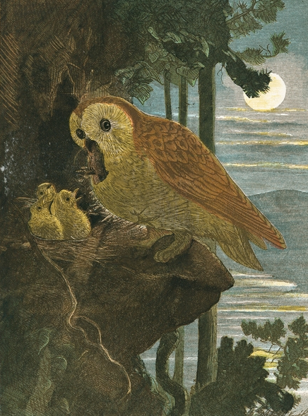
 Chromoxylograph of owls, printed in a nature book, illustrated by Johann Zwecker, engraved by the Dalziel brothers, printed by Edmund Evans
Thicker hatchings were less expensive and easier to produce, but the result was not as attractive. Books that were to be produced as inexpensively as possible showed less engraving work and colour separation.[4] The chief problem was to maintain correct register, achieved by placing small holes in precise positions on each block to which the paper was pinned. If done correctly, the register of colours would match, although sometimes ink squash is visible along the edges of an illustration.[14] An electroplate was produced for each engraved wood block, inked according the block, thereby tinting the paper in specified areas. The colour was applied as a solid, or in stripes of various of thickness, allowing for changes in hue.[4]
According to Gascoigne, 19th century chromoxylographs are identified by embossing on the back of the paper, distinctly delineated outlines, created by pressing the paper against the engraved blocks, and the presence of crosshatchings. He writes that "an impossibly and perfect and delicate area of crosshatching will suggest at first that the graver could not possibly have scooped out such small and regular interstices, but on closer inspection the lines in the two directions will be found to be of slightly different colours."[15]
Because the process was inexpensive, and commonly used to illustrate covers of inexpensive books ("yellow backs" or "dime store novels") or magazines, and in rare instances, newspaper covers, complicated colour combinations generally were not necessary. Most often the printer only used primary colors and black.[4] The inexpensive technique of chromoxylography allowed publishers and printers to design covers as an attraction to purchase the book.[16]
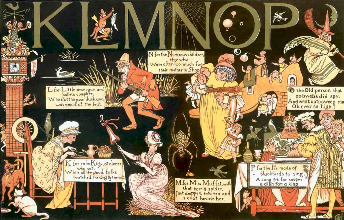
The process was also used to produce higher quality children's books and toy books. Evans considered full colour printing a technique well-suited to the simple illustrations in children's books.[17] Evans reacted against crudely coloured children's book illustrations, which he believed could be beautiful and inexpensive if the print run was large enough to maintain the costs. In doing so, Evans collaborated with Walter Crane, Kate Greenaway and Randolph Caldecott.[18] Books illustrated by Kate Greenaway, Walter Crane and Randolph Caldecott, engraved and printed by Evans, became popular and remain as classic examples of illustrations for children's literature.[17]
Chromoxylography was additionally used to illustrate natural history books and to reproduce paintings. To achieve realistic reproductions an engraver often used 12 or more colour blocks.[19]
Examples of chromoxylography
-
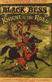
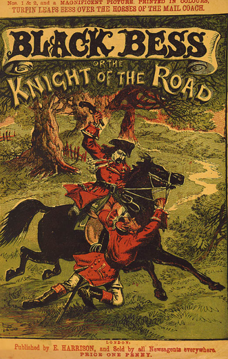
Cover art of Edward Vile's penny dreadful Black Bess or the Knight of the Road showing few hatchings to create variations in hue and tone.
-

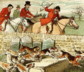
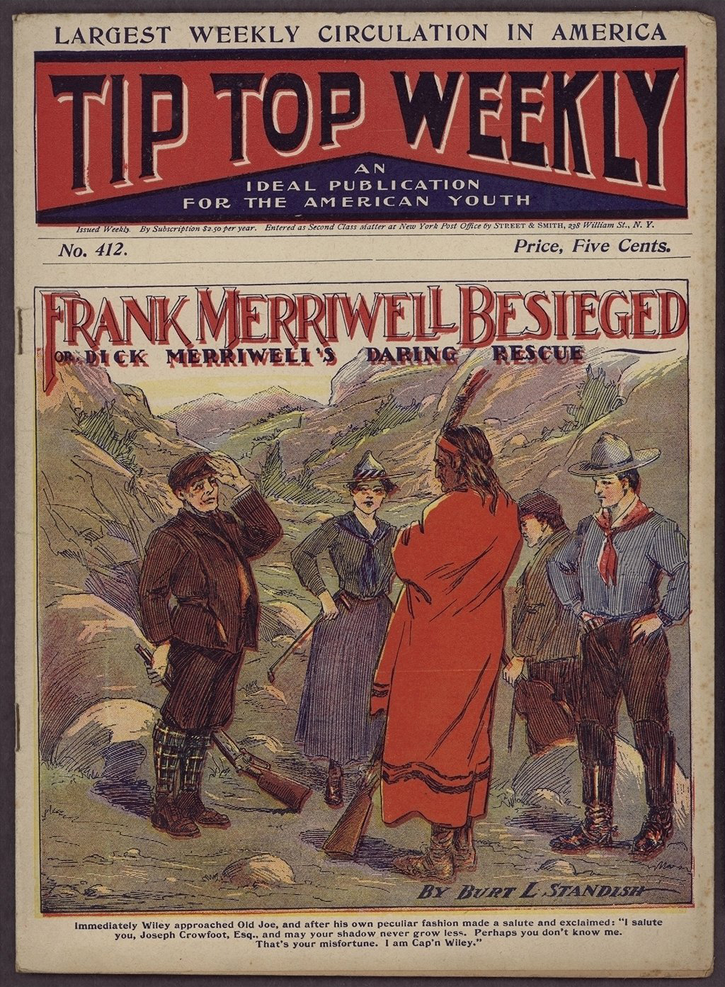
1896 children's magazine cover showing thicker hatchings. The colour register slipped causing the print to blur.
-
A subtle blend of colours is achieved using few colour blocks in this Randolph Caldecott image, printed by Edmund Evans.
-

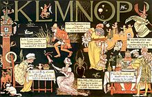
Yellow is used to achieve a variety of hues, and fine hatchings allow for overprinting, as in this illustration by Walter Crane; printed by Edmund Evans in 1878.
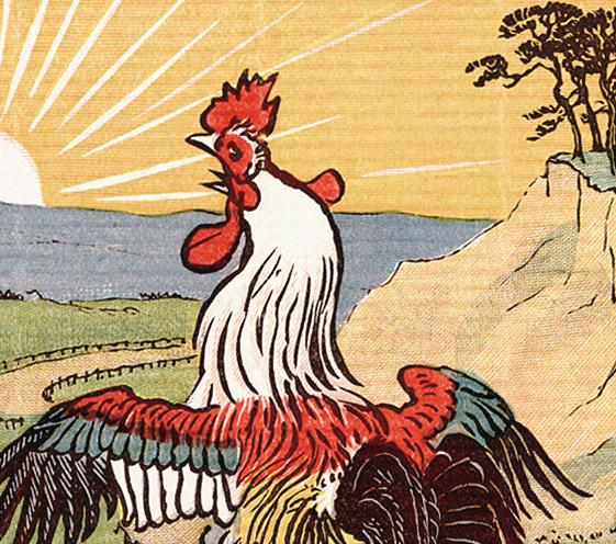
Detail of a chromoxylograph
-
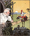
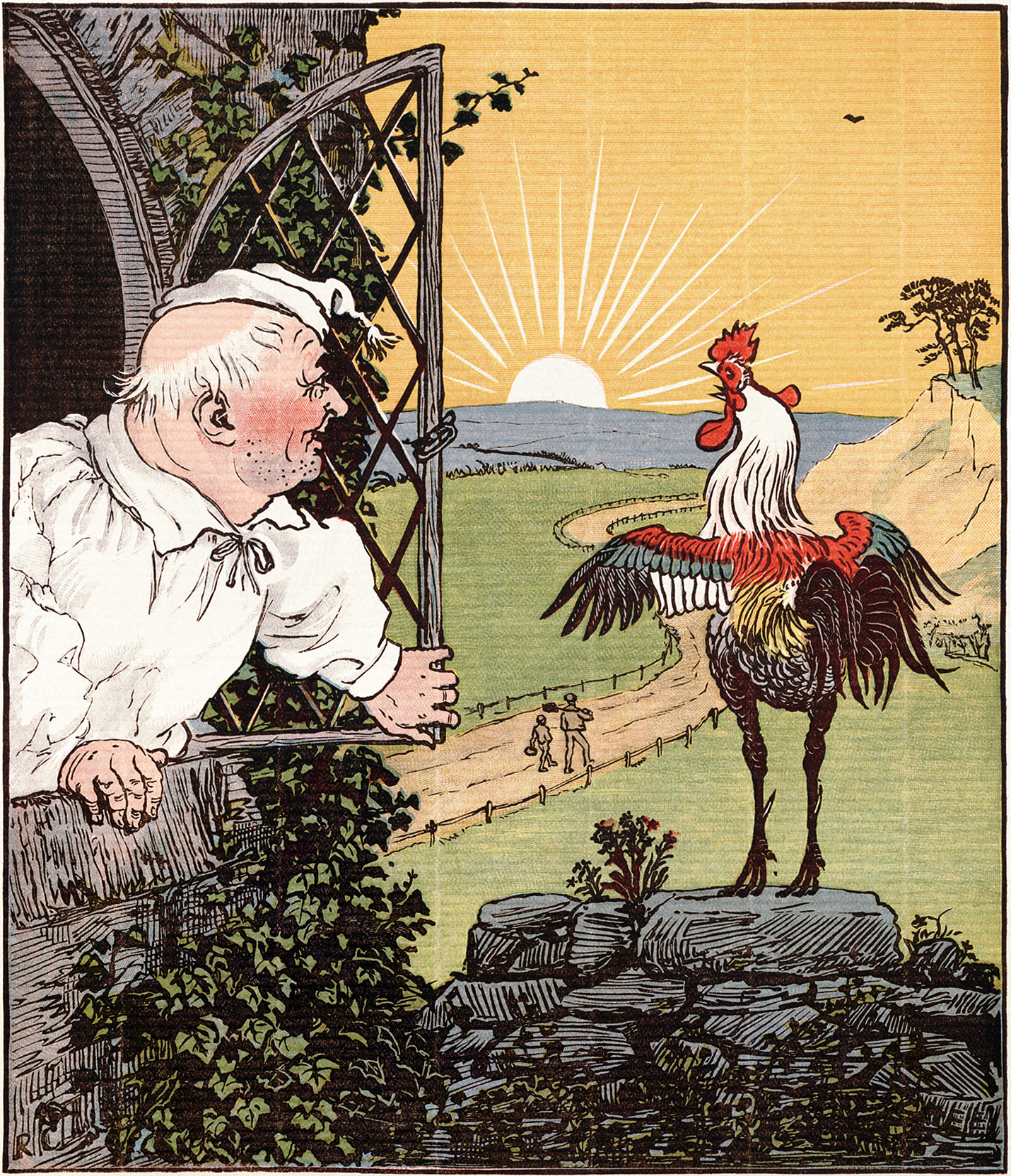
Image from Randolph Caldecott's "The House that Jack Built"
-
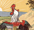
Close-up showing crosshatchings, mixed colours in the meadow, a pale hued sea, delineated sunrays, slight colour squash, and solid colours on the rooster.
References
- ^ Ray, p. 64
- ^ Gascoigne, section 23. a
- ^ Pankow, p. 22
- ^ a b c d "Penny Novels and Penny Dreadfuls". Stanford University Library. http://www-sul.stanford.edu/depts/dp/pennies/print.html. Retrieved 2010-05-30.
- ^ University of Stanford
- ^ Fraser and Banks, p. 59
- ^ Pankow, p. 22
- ^ a b c Gasgoigne, section 53.f
- ^ Fraser and Banks, p. 59
- ^ Gascoigne, section 23.b.
- ^ Gascoigne, section 23.b
- ^ Gascoigne, section 53.f
- ^ Gascoigne, section 23.c
- ^ Gascoigne, section 68
- ^ Gascoigne, section 55.s
- ^ "Aspects of the Victoria Book:Penny Dreadfuls". British Library. Retrieved October 11, 2010
- ^ a b "Color Printing in the Nineteenth Century". University of Delaware Library. http://www.lib.udel.edu/ud/spec/exhibits/color/reliefs.htm. Retrieved 2010-02-28.
- ^ "Randolph Caldecott Papers". de Grummond Collection. University of Southern Mississippi. http://www.lib.usm.edu/~degrum/html/research/findaids/caldecot.htm. Retrieved 2010-02-28.
- ^ Gascoigne, section 23.d
Sources
- Fraser, Tom and Adam Banks. Designer's Color Manual: The Complete Guide to Color Theory and Application. (2004). Chronicle Books. ISBN 9780811842105
- Hardie, Martin. English Coloured Books. (1906). New York: Putnam
- Gascoigne, Bamber. How to Identify Prints. (1986) New York: Thames and Hudson. ISBN 0-500-23454-X
- Pankow, David. Tempting the palette: a survey of colour printing processes (2005). Rochester NY:Rochester Institute of Technology. ISBN 1-933360-00-3
- Ray, Gordon Norton. The Illustrator and the book in England from 1790 to 1914. (1991) New York: Dover. ISBN 0-486-26955-8
Categories:- History of printing
- Printmaking
- Relief printing
-

Wikimedia Foundation. 2010.