- Martin Majoor
-
Martin Majoor (Baarn, 14 October 1960)[1] is a Dutch typedesigner and graphic designer.
Contents
Biography
Martin Majoor has been designing type since the mid-1980s. During his study at the School of Fine Art in Arnhem (1980–1986), he shortly worked in a student placement at URW in Hamburg. It was there that he was able to work with the first digital typedesign system Ikarus. Serré from 1984 – his first digital font – was the result, but it was never released. In 1986 he started as a typographic designer in the Research & Development Department at Océ-Netherlands, where he carried out research into screenfonts. For the production of digital typefaces for laser printers he followed a short education at Bitstream in Boston.
After working at Vredenburg Music Centre in Utrecht, Majoor started as independent typedesigner and book typographer. Since then he designed a few big type families and numerous books and book covers. Several of his book designs where awarded a Best Books prize. He wrote articles for magazines like Items, Eye magazine, 2+3D and tpG tipoGráfica.
From 1990 until 1995 Majoor taught typography at the Schools of Fine Arts in Arnhem and in Breda. He gave lectures at ATypI/Typelab conferences in Budapest, Antwerp, Paris, San Francisco, Barcelona, The Hague and Prague, at TypoBerlin (2002 and 2005), and during other type events in Lure-en-Provence (Rencontres internationales de Lure 1996), Leipzig (TypoTage 2004), Warsaw, Katowice, Stockholm, Hamburg, Caen, Vienna and Dortmund. He gave workshops in Amsterdam (Gerrit Rietveld Academie), Stuttgart (Merz Akademie) and Warsaw. His type designs were exhibited in Amsterdam, Rotterdam, New York (Cooper Union) , Paris, London, Manchester, Berlin, Helsinki and Barcelona. Since 1997 Majoor works as a graphic designer and type designer in both The Netherlands (Arnhem) and Poland (Warsaw).[2]
Type design
Category Serif Classification Humanist Designer(s) Martin Majoor Foundry FSI FontShop International 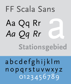
Category Sans-serif Classification Humanist Designer(s) Martin Majoor Foundry FSI FontShop International FF Scala and FF Scala Sans
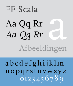
In 1988 Majoor started working as a graphic designer for the Vredenburg Music Centre in Utrecht. The design département of this concert hall was one of the first in the Netherlands to use an Apple Macintosh computer for its printed matter. The fact that there were only 16 typefaces available without features like old style figures, small caps and ligatures, made Majoor decide to make his own typeface. The result was Scala, one of the first Macintosh fonts with all these missing features.
In 1991 he was asked by Erik Spiekermann of FSI FontShop International in Berlin to release FF Scala as its first serious text face in the FontFont Library. In 1993 FF Scala was augmented with a sans-serif version, FF Scala Sans. The sans and the serif versions complement each other, they follow the same principle of form but are two distinct designs. Both FF Scala and FF Scala Sans have become successful throughout the world.
In 1996 Majoor designed FF Scala Jewels, a quartet of classic decorative typefaces based on the capitals of FF Scala Bold. In 1998 the Scala family was augmented with 13 new versions, such as Scala Sans Light, Scala Sans Black and several condensed versions. FF Scala Hands contains several printer’s fists or manicules, based upon a design by Bruce Rogers from 1933.
Telefont
In 1994 Martin Majoor and Jan Kees Schelvis were asked to design the new telephone directory for the Dutch PTT (now KPN). Majoor not only designed the inside typography, more importantly he created the new typeface Telefont for it. Fred Smeijers, fellow student, long-time colleague and friend, assisted Majoor in digitizing the characters.
There are two versions of Telefont. Telefont List is a real workhorse, to be used in the automatically generated phonebook listings, while Telefont Text was designed for the custom-made introductory pages using many more typographic refinements such as small caps and lowercase numbers. Majoor: ‘The most used typeface has the least possibilities, the least used typeface has the most possibilities’.[3]
FF Seria
Majoor’s third major typefamily, FF Seria was released in 2000. It consists of a serif version and a sanserif versions. The first sketches for Seria were made on the train from Berlin to Warsaw in the summer of 1996, using some table napkins from the dining car.
“In its proportions Seria is clearly a book face. The long extenders are remarkable by today’s standards and they immediately brand the type as something that would be used for large amounts of text. Majoor cites Centaur & Trinité as indirect influences on Seria’s proportions, though there aren’t many similarities to those two in the specifics of its construction. As in Scala, the details of Seria’s forms are frequently novel and surprising but the effect at small sizes is harmonious through-and-through. Majoor describes the idea behind Seria’s unconventional curves (e.g. the counter of the ‘o’ or the arch of the ‘n’) as stemming from the principle of being ‘wittingly irregular’ (he attributes this phrase to Trinité’s designer Bram de Does). The classic example of these witting irregularities may be Dwiggins’s work, but Majoor seems to be an expert at executing the concept digitally. And this is one instance when single-master type design actually works out well: the features that ‘you can’t see [at small sizes], but [that] you maybe can feel’ (to quote Majoor) become arresting when the letters scale up.”[4]
In 2001 the FF Seria family was awarded a Certificate of Excellence from the ISTD International TypoGraphic Awards 2001 in London and a Certificate of Excellence in Type Design from the ATypI Type Design Competition ‘Bukva:raz!’ in Moscow.
In 2006/2007 Majoor worked together with Pascal Zoghbi, who designed Sada (the Arabic word for “echo”), a Naskh-style Arabic counterpart for Seria. It was published in the book ‘Typographic Matchmaking’, a project that brought together 5 Arab and 5 Dutch type designers who collaborated on creating good matching Arabic fonts for existing Latin font families. The designers were matched in 5 groups of two: Gerard Unger & Nadine Chahine, Martin Majoor & Pascal Zoghbi, Lucas de Groot & Mounir Al Shaarani, Peter Bilak & Tarek Atrissi, and Fred Smeijers & Lara Assouad Khoury.[5]
In 2009 Pascal Zoghbi designed FF Seria Arabic – an improved version of Sada – to be the first Arabic typeface in the FontFont library, The Regular and Bold are text typefaces, the Light is both display and text type, while the Black is purely a display typeface.
The FF Nexus family
In 2004 the FF Nexus family was released as FSI FontShop International’s first textface in the OpenType format. It is a family of three typefaces that are made according to the same form principle. Therefor the three versions, FF Nexus Serif, FF Nexus Sans, and FF Nexus Mix (a slab serif), are all ‘connected’ (Nexus is the Latin word for connection)
FF Nexus started as an alternative to FF Seria, a typeface Majoor had designed some 5 years earlier. Seria has some strong features like extremely long ascenders and descenders, and an upright italic. Majoor started working on an alternative version of Seria, with shorter ascenders and descenders. But soon this design developed into a new typeface, with numerous changes in proportions and in details and with a redrawn italic. The result was a workhorse typeface like FF Scala with features such as small caps in all weights, four different sorts of numbers and ligatures.
Logically, FF Nexus Sans resulted directly from Nexus Serif, with identical features. But Majoor also developed a new family member: FF Nexus Mix, a slabserif or egyptienne that in its turn was based on Nexus Sans. The addition of the word ‘Mix’ in its name was a result of the idea that a slabserif is a real mixture of a sans and a serif.
In addition to Nexus Serif Italic, two sets of elegantly drawn swash capitals and two sets of swash lowercase endings were designed. Another augmentation was a monospaced or typewriter version in four weights.[6]
In 2006 the FF Nexus family won the first prize at the Creative Review Type Design Awards, in the category Text Families.
Book design
Besides working as a type designer Martin Majoor has always worked as a book typographer and graphic designer. ‘It is my conviction that you cannot be a good type designer if you are not a book typographer.’[7]
He designed several books for Dutch publishers such as Bunge, Nijgh & Van Ditmar, L.J. Veen, Vrij Geestesleven and Elsevier. Three times his book designs were chosen among the Best Dutch Book Designs, especially for its inside book typography, rather than for its covers.
Among these best books was ‘Adieu Aesthetics & Beautiful Pages!’ (Adieu æsthetica & mooie pagina’s!’), published in 1995 as the catalogue for the exhibition ‘The Aesthetic World of Jan van Krimpen, Book Designer and Typographer’ in the Museum of the Book/Museum Meermanno-Westreenianum in The Hague and in the American Institute of Graphic Arts (AIGA) in New York (1995). For this book Majoor was the first to use the digital version of Jan van Krimpen’s typeface Romanée (originally cut in 1928 for the Joh. Enschedé typefoundry), which in 1991 had been digitized by Peter Mattias Noordzij and Fred Smeijers for incorporation into the Enschedé Font Foundry (TEFF).[8]
In 2010, together with the french teacher Sebastien Morlighem, he wrote a book on the works of the french type designer José Mendoza y Almeida. [9]
From 1999 until 2010 Majoor was the graphic designer for the Warsaw Autumn Festival, the largest international Polish festival of contemporary music. The programme books were set in Majoor’s own typeface Seria.
Awards
- 1993 - Encouragement Prize Graphic Design 1994. Amsterdam Arts Foundation, for the Scala family.
- 1995 - Award Best Dutch Book Designs 1995 for ‘Adieu Æsthetica & Mooie Pagina’s!’ about the life and work of Jan van Krimpen.
- 2001 - Award International Typographic Awards in London for the Seria familie.
- 2001 - Award ATypI Type Design Competition Bukva:raz! in Moscow for the Seria familie.
- 2006 - Award Creative Review Type Design Award for the Nexus family in the category Text Families.
Bibliography
- Lupton, Ellen. Graphic Design and Typography in the Netherlands: A View of Recent Work. Princeton Architectural Press: 1992. ISBN 1-878271-62-8.
- Friedl, Frederich, Nicholas Ott and Bernard Stein. Typography: An Encyclopedic Survey of Type Design and Techniques Through History. Black Dog & Leventhal: 1998. ISBN 1-57912-023-7.
- Bringhurst, Robert. The Elements of Typographic Style. Hartley & Marks: 1992. ISBN 0-88179-033-8.
- Middendorp, Jan: Dutch Type, 010 Publishers: 2004, ISBN 978-90-6450-460-0
- Lupton, Ellen. Thinking with Type: A critical guide for designers, writers, editors, & students. Princeton Architectural Press: 2004. ISBN 1-56898-448-0.
- Spiekermann, Erik; Middendorp, Jan: Made with FontFont, Book Industry Services (BIS): 2006, ISBN 978-9063691295
- Thi Truong, Mai-Linh; Siebert, Jürgen; Spiekermann, Erik: FontBook – Digital Typeface Compendium, FSI FontShop International: 2006, ISBN 978-3930023042
- Martin Majoor & Sébastien Morlighem, José Mendoza y Almeida, bilingual edition French-English, Introduction by Jan Middendorp, 176 pages, 03/2010, ISBN 978-2-35654-008-9.
References
- ^ Martin Majoor op myfonts.com
- ^ Macmillan, Neil (2006) An A–Z of Type Designers. Yale University Press. ISBN 0-300-11151-7
- ^ Hall, Peter (1995). Long Distance Savings. New York: I.D. Magazine
- ^ Crewdson, Andy (2002) Seria’s Motives: How Martin Majoor developed his literary typeface. Druk #13-14, FontShop Benelux.
- ^ Smitshuijzen AbiFarès, Huda (2007) Typographic Matchmaking - Building cultural bridges with typeface design. Amsterdam: BIS Publishers / Khatt Foundation. ISBN 978-90-6369-124-0.
- ^ Majoor, Martin (2007) FontFont Focus Nexus. Berlin: FSI FontShop International.
- ^ Majoor, Martin (2002) My Type Design Philosophy. Published in tipoGrafica (tpG) #53, Buenos Aires, Argentina
- ^ Sierman, K. et al.,(1995) Adieu æsthetica & mooie pagina's!: J. van Krimpen en het Schoone Boek. Letterontwerper & Boekverzorger 1852-1958. Amsterdam etc.: De Buitenkant. ISBN 90-70-386739
- ^ Martin Majoor, Sébastien Morlighem, Jan Middendorp (intr.) (2010) José Mendoza y Almeida. Paris: Ypsilon.éditeur, Bibliothèque Typographique. ISBN 978-2-35654-008-9.
External links
- www.martinmajoor.com Martin Majoor’s official website
- FF Scala microsite A website fully dedicated to FF Scala
- Martin Majoor, type designer Interview by Peter Biľak (2003)
- Seria’s motives: How Martin Majoor developed his ‘literary typeface’ by Andy Crewdson (2002)
- FF Seria Arabic by Pascal Zohgbi (2009)
- Types and Characters: Martin Majoor Brochure by Nina Völlink (2007)
- Writing With Scala Typespecimen by Ellen Lupton (2005)
- Martin Majoor on fontshop.com
- Martin Majoor on fontfont.com
- Martin Majoor on identifont.com
Categories:- 1960 births
- Living people
- Dutch graphic designers
- People from Baarn
- Typographers


Wikimedia Foundation. 2010.