Monotype Grotesque

Monotype Grotesque
MonotypeGrotesqueSP.png
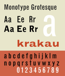
Category Sans-serif
Classification Realist sans-serif
Designer(s) Frank Hinman Pierpont
Foundry Monotype Corporation
Date released 1926
Re-issuing foundries Stephenson Blake, Adobe Type, Linotype

Monotype Grotesque is a realist sans-serif typeface designed by Frank Hinman Pierpont (1860–1937) and released by the Monotype foundry in 1926.

Pierpont based his design for Monotype Grotesque on Ideal, an earlier more idiosyncratic sans-serif by the H. Berthold AG foundry and William Thorowogood's 1832 face titled "Grotesque." Uppercase characters are of near equal width, the G has a spur in some weights, and the M in the non-condensed weights is square. The lowercase characters a, e, g, and t follow the model of twentieth century English romans. Monotype Grotesque is a large extended typeface family with multiple widths from condensed to extended.

Though Monotype Grotesque never achieved the popularity of Akzidenz Grotesk, or its own contemporaries Futura, and Gill Sans, it remained a steady seller through the twentieth century, and is found in early twentieth century avant garde printing from western and central Europe.

Arial is designed based on Monotype Grotesque.

References

  • Friedl, Frederich, Nicholas Ott and Bernard Stein. Typography: An Encyclopedic Survey of Type Design and Techniques Through History. Black Dog & Leventhal: 1998. ISBN 1-57912-023-7.
  • Jaspert, Berry and Johnson. Encyclopaedia of Type Faces. Cassell Paperback, London; 2001. ISBN 1-84188-139-2
  • Macmillan, Neil. An A–Z of Type Designers. Yale University Press: 2006. ISBN 0-300-11151-7.

External links


Wikimedia Foundation. 2010.

Игры ⚽ Поможем написать курсовую

Look at other dictionaries:

  • Grotesque (typeface classification) — Grotesque, or Grotesk in Germany, is a style of sans serif typeface from the 19th century. The name was coined by William Thorowgood, the first person to produce a sans serif type with lower case, in 1832. Capital only faces of this style were… …   Wikipedia

  • Arial — Infobox font name = Arial style = Sans serif classifications = Neo grotesque sans serif date = 1982 creator = Robin Nicholas Patricia Saunders foundry = Monotype Imaging|Arial, sometimes marketed as Arial MT, is a sans serif typeface and computer …   Wikipedia

  • Helvética — Helvetica Categoría Sans serif Diseñador(es) Max Miedinger Empresa …   Wikipedia Español

  • Arial — es una tipografía sin remates (Clasif. Vox: Lineale B Neo Grotesque), técnicamente un clon modificado de la tipografía Helvética diseñado en el año de 1990 por Robin Nicholas y Patricia Saunders de la Fundición Monotype (al parecer el diseño fue… …   Enciclopedia Universal

  • Arial — Présentation Type Sans serif Alias Swiss 721 BT Créée 1982 Auteur(s) …   Wikipédia en Français

  • Franklin Gothic — and its related faces are realist sans serif typefaces originated by Morris Fuller Benton (1872–1948) in 1902. “Gothic” is an increasingly archaic term meaning sans serif. Franklin Gothic has been used in many advertisements and headlines in… …   Wikipedia

  • Arial — Saltar a navegación, búsqueda Arial Categoría Transitional sans serif Fecha de creación 1982 Diseñador(es) Robin Nicholas Patricia Saunders Empresa Monotype …   Wikipedia Español

  • News Gothic — Category Sans serif Designer(s) Morris Fuller Benton Foundry American Type Founders News Gothic is a realist sans serif …   Wikipedia

  • Sans-serif — font Serif font …   Wikipedia

  • Helvetica — This article is about the typeface Helvetica. For the Confœderatio Helvetica, see Switzerland. For the Swiss predecessor state, see Helvetic Republic. For the documentary, see Helvetica (film). Category Sans serif Classific …   Wikipedia

Share the article and excerpts

Direct link
Do a right-click on the link above
and select “Copy Link”